From the desk of Steve Strazza @sstrazza
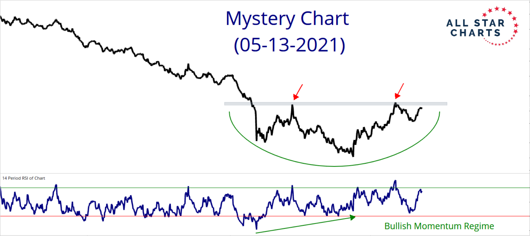
First of all, thanks to everyone as always for participating in this week’s Mystery Chart.
As noted in the Mystery post last week, the rounding bottom in question is a pattern we’ve become all too familiar with since last year.
The reason for this is simple: The chart was merely a derivative – or just another way to illustrate and visualize the overarching theme that’s driving so many of our cross-asset relationships these days… The sustained rotation out of Growth and into Value.
We’ve written a lot about this theme since last year, and more recently have been pounding the table on a new theme that’s taken the forefront for markets across the globe… We believe we’re in for a trendless or rangebound period for risk assets as well as an increasingly bifurcated or mixed market.
Much of this divergence in performance among various groups can be directly attributed to this trend toward value and away from growth.
Not only are we seeing prices roll over for growth areas, but we’re also noticing some concerning deterioration in internals for the first time in over a year. Although at the same time, value and cyclical areas of the market just registered fresh bullish initiation readings in a handful of our breadth indicators. Talk about a mixed market…
Then add the red flags we’re seeing from a sentiment standpoint along with the growing number of critical stock market indexes and commodities running into logical levels of resistance, and we believe a much more cautionary approach is warranted in the near term.
So, back to the Mystery Chart now. Most of you were buyers, and so are we. You can click here to see the original chart.

