From the desk of Steve Strazza @sstrazza and Grant Hawkridge @granthawkridge
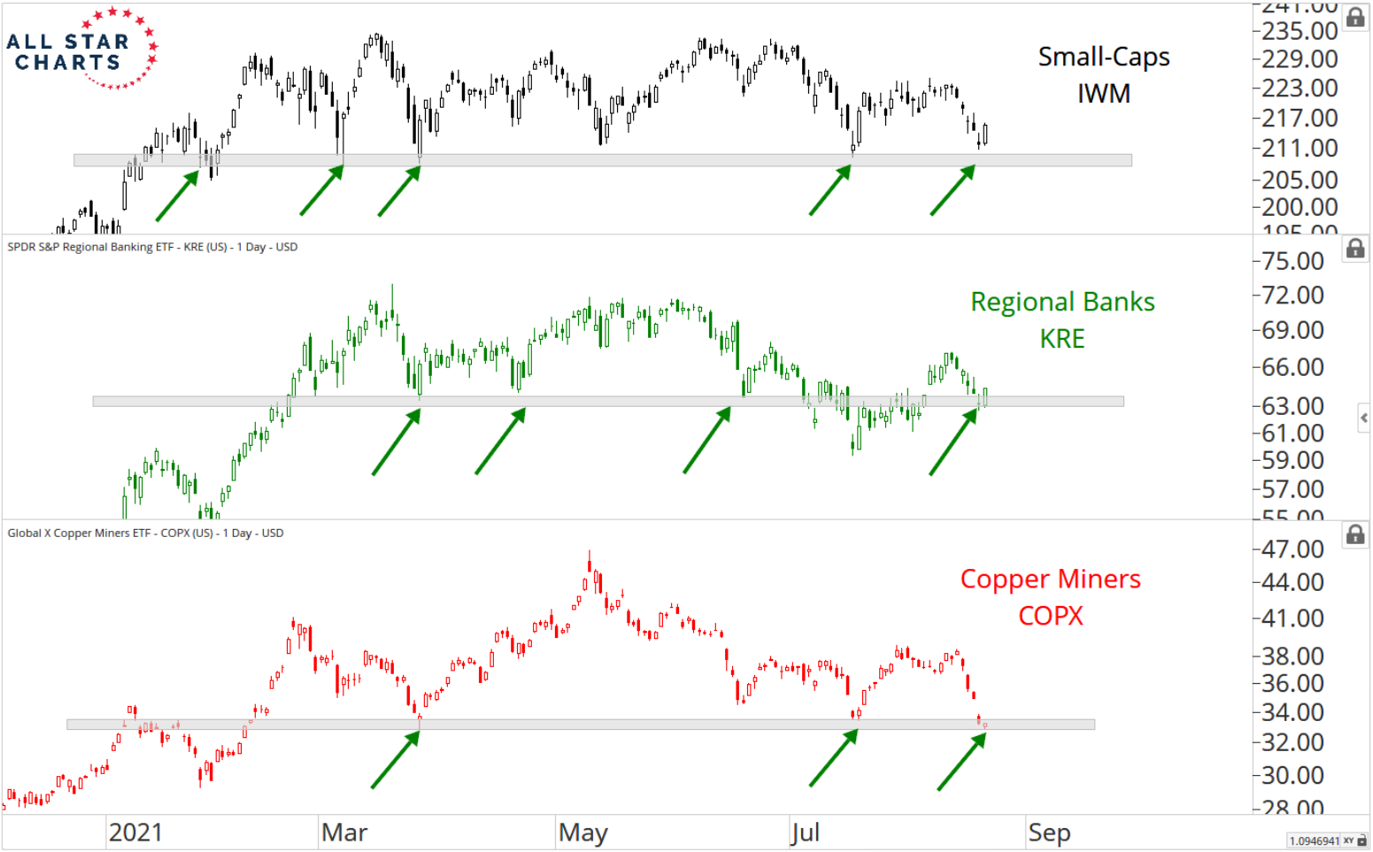
Whether more stocks are going up or down these days simply depends on where you look. Some advance-decline lines are moving higher, but others are moving lower.
Weakness and divergences in these indicators are more often than not resolved over time, but the longer they persist the more concerning they become.
This hasn’t been an issue for most of the major averages, as the S&P 500 and other large-cap indexes keep making new highs with confirmation from their A/D lines.
Yet when we look beneath the surface, and particularly down the cap scale, we’re seeing a different story. Ultimately, some stocks are going up, but most are not.
You’ve probably heard already, but the current environment is an absolute mess as the weight of the evidence continues to hang in the balance. In today’s post, we’ll discuss some charts that do a great job illustrating all the mixed signals out there right now.