For someone who uses Dow Theory every single day, it’s not something that I write about much. I may indirectly reference certain tenets all the time, but rarely do I write specifically about the 130 year old Dow Theory. I think I pretty much laid it all out earlier this year in my post: 5 Things Every Investor Should Know About Dow Theory. The simple minded choose to stick to the Dow Jones Transportation Average and Dow Jones Industrial Average either confirming each other or diverging from one another. And while this may in fact be a one of Charles Dow’s tenets (although they were Railroads back then, not the Transports we have today), it does not even make it into my top 5 most important tenets. [Read more…]
[Premium] Weekly Open Letter About The Current Market Environment
In this week’s members-only letter we discuss the following topics:
- Why Has Latin America Been the Best Place To Invest?
- What Will Further U.S. Dollar Weakness Do To Stocks?
- With Interest Rates Bouncing, What Do We Do With Bonds?
- The Consumer Staples Trade and Coca-Cola
- Gold Miners and Other Metals
- Will Developed Markets Catch Up With Emerging Market Stocks?
- U.S. Small & Micro-Caps vs U.S. Large-caps
- What Does This Strength In Transports Mean?
Video: #SB50Charts Best 50 Charts In The World
In honor of Superbowl 50, we created a countdown of what we consider to be the most important 50 charts in the world. These include U.S. Stocks and Sectors, International Indexes, Currencies, Commodities, Interest Rate Markets and Global Intermarket relationships. Some of these are more actionable than others, but collectively I think they truly tell the story of global market risk, or risk aversion for that matter.
Members of All Star Charts get access to all of this information 24/7, so we would like to invite you to start a 30-Day Risk Free Trial and Join us to see if our community is right for you. We have received incredible feedback from our members and will continue to improve the platform.
Discount Offer & Risk Free Trial: https://allstarcharts.com/superbowl/
Here is the video in full (audio begins immediately, video gets going after 30 seconds)…..Enjoy! [Read more…]
BNN TV Appearance: Dow Jones Industrial Average, Apple & Inverted Yield Curves
This week I sat down with Frances Horodelski over at Business News Network to discuss the disastrous implications of a breakdown in the Dow Jones Industrial Average below last week’s lows. Apple continues to be a ‘sell on any strength’ stock and an inversion of the yield curve is likely to come next year.
Here is the video in full: [Read more…]
About That Outperformance From The Dow Jones Transportation Average
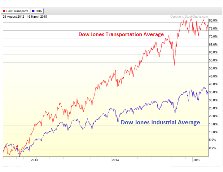
One of the recent developments that we’ve been noticing is the outperformance out of the Dow Jones Transportation Average over the past week or so. We’ve been hearing all year about the Dow Transports struggling compared to some of the other major stock market averages. At the beginning of the month, the Dow Jones Industrial Average was up over 2.5% while the Transports were negative Year-to-date. Where markets close at the end of the year is a number completely arbitrary, so discussing year-to-date returns is one of the more useless exercises performed by market participants and market watchers. But regardless, the headlines were mostly about the Transports underperforming. Not only has this flipped over the past week or so, but bigger picture all the Transports do is outperform. Since 2012, it’s not the DJ Industrials that are leading, it’s the DJ Transports.
Since the Fall of 2012, the Dow Jones Transportation Average has more than doubled the performance of its Industrial counterpart. Here is a comparison chart showing the Transports up over 80% during that time while the Industrials couldn’t return half that:
More importantly, in my opinion, the ratio between the two has been trending beautifully within a very well-defined uptrend channel. The year-to-date headlines don’t tell the whole story. It’s not sexy. But all we’ve seen this year is a tiny correction in the ratio towards the lower of the two parallel trendlines. A buying opportunity is what it looks like from here:
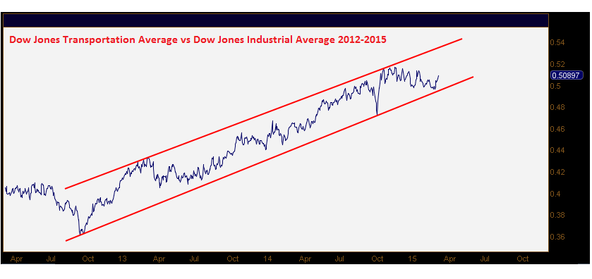
So don’t worry so much about arbitrary year-to-date numbers. They really mean absolutely nothing when it comes to supply and demand dynamics. I think this outperformance out of the Transports should continue. I don’t like to fight the primary trend, that’s Dow Theory. Charlie Dow knew what he was talking about 120 years ago. Who are we to dismiss him?
***
Click Here for more information on our Premium Technical Research Packages

Tags: $DJIA $INDU $DIA $YM_F $TRAN $IYT $DJT $DJI
Video: JC Parets & Paul Vigna Wall Street Journal
On Friday morning I was over at the Wall Street Journal chatting with Paul Vigna about the major US Averages. As you guys know, I haven’t exactly been a huge fan of the indexes for some time, particularly the smaller caps. I still think a bearish to neutral stance will continue to work over the short-term. The 3rd quarter brought big losses to a lot of names, a majority of stocks in fact. So looking elsewhere has definitely worked, and I haven’t seen any evidence yet to suggest changing that approach:
Here is the video in full:
Click here for more information on Managed Assets
Click here for more information on our Premium Technical Research Packages
Source:
Blue Chips Color Market’s Weakness (Wall Street Journal)
Tags: $SPY $IWM $SPX $MDY $DJIA $INDU $ES_F $NYA $RUT $DIA
Small Caps Act Poorly On a Relative Basis
One of the more interesting developments since March began has been the severe underperformance out of the small-cap stocks. Coming into the week, the Russell2000 was actually in negative territory year-to-date. This compares to the large-cap S&P500 which is up 7% for 2014 and Dow Industrials up over 3%. This is a big difference. But the problem is what’s happening behind the scenes to this former leadership group.
Here is a chart of the Russell2000 relative to the Dow Jones Industrial Average. After really leading the way off the 2008/2009 bottom in US Equities, this ratio has potentially put in a deadly failed breakout:
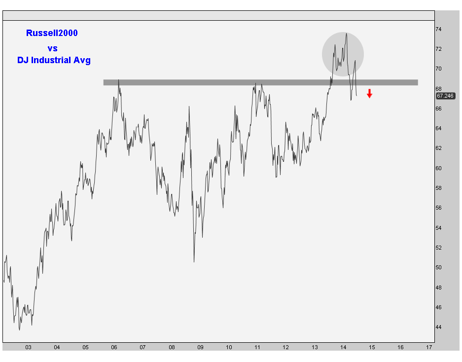
I recall earlier in the year, this “breakout” was getting a lot of attention, especially from the bulls. But in recent months, these guys have been crushed on a relative basis. Since the March 3rd closing highs, the Russell2000 is down 5% with the Dow Jones Industrial Average up over 5% during the same period.
Look at the 2006 and 2011 highs in the ratio serving as important resistance. It looks to me like the ratio is failing hard to stay above those highs. As we know, from false moves come fast ones in the opposite direction. So unless this ratio can get back above 69, the benefit of the doubt has to go to the bears on this one.
As far as market implications go, we want to see leadership out of the small-caps for evidence of risk appetite. We’re seeing some other divergences in the Bond market warning of the same thing. Seasonal studies suggest a week period for Stocks with higher volatility (see here). So this shouldn’t really come as much of a surprise.
I think a more neutral stance in stocks as an asset is likely to be the better position for the rest of the summer. We have some strategies in order to execute that (see here). So I’m going to continue to be cautious with small-caps, particularly on a relative basis. And this recent development to me is just another feather in the hat for the bears, at least for now.
***
REGISTER HERE for more information on how to gain access to these chart on a weekly basis.
Tags: $IWM $RUT $DJIA $DJI $INDU $DIA $YM_F $SPY
Bond Market Keeps Diverging With Stocks
We do a lot of intermarket analysis on a day to day basis either for confirmation or to look for divergences. One of my favorite ways to gauge investor risk appetite is to follow a ratio between Junk Bonds and Treasury Bonds. If there is a real demand to put risk on the table, I want to see flow into Junk outpace that into Treasuries. If managers are worried, you would expect money to be allocated towards risk-free government debt at a faster rate than Junk Bonds.
Today we are taking a look at the Junk to Treasury bond ratio ($HYG vs $TLT) hitting a new 52-week low this week while the Dow Jones Industrial Average hits new all-time highs. We want to see the bond market confirming the action in stocks, not diverging by this much. The bond market is giving us a much different message:
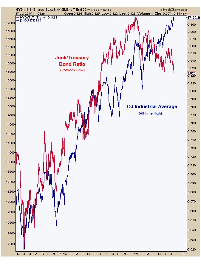
There is an old saying on The Street that the bond market is smarter than the stock market. I don’t know if that’s true or not. I like to think so. But what’s more important here in my opinion is that one is not confirming the other. The flow into risk-free government debt is really outpacing the flow into the riskier Junk Bond market. That’s not a good sign of risk appetite, at least not to me.
The trend in this ratio is still lower. We’re hitting fresh 52-week lows this week as the headlines read, “Dow Jones Industrial Average Hits Another Record High”. Remember the market is not 30 stocks. There’s a lot more going on here. I’m sticking with a cautious stance in US equities as a group for a lot of reasons. There are some individual less correlated stocks out there that I would prefer to be in if we have to be in stocks. Pairs are also a valuable tool that allows us to maintain an equities neutral position.
This is a bearish time of the year. So this makes sense to us from a seasonal perspective as well. Feel free to read some of my recent posts about stocks:
FOX Business: Brazil Over Germany This Summer (July 12, 2014)
The Dog Days Of Summer Are Upon Us (July 8, 2014)
Radio: Winning On Wall Street (July 1, 2014)
***
REGISTER HERE for more information on how to access these charts on a weekly basis.
Tags: $DJIA $INDU $YM_F $HYG $TLT $JNK $ZB_F $TNX $TYX $IEF