You guys know that I prefer to incorporate more of a weight-of-the-evidence approach to markets rather than basing my decision making on a single indicator. We look at stock markets all over the world to find themes, both bullish and bearish, and then take advantage of them within U.S. markets. I then take a similar approach and go sector by sector in the U.S., including a series of sub-sectors, to break it down even further and find themes within the U.S. As you guys well know, the reason we were bullish since January was because of the weight-of-the-evidence internationally, not because of what we saw in the S&P500 or Dow Jones Industrial Average. [Read more…]
[Premium] My Notes From Friday’s Charting Session
Next week I will be out of the office from Monday through Wednesday as I will be traveling for business in New York City and Baltimore. If you are in the New York City area on Tuesday afternoon, come join me at the Marriott Marquis for a discussion on how to use Technical Analysis to approach the Global Marketplace.
On Friday I updated all of the U.S. Sectors & Sub-sectors, Commodities and Currencies on both weekly and daily timeframes in the Chartbook. I took some notes along the way and wanted to share them with you guys. Here are a few things that stood out: [Read more…]
[Premium] Weekly Open Letter About The Current Market Environment
In this week’s members-only letter we discuss the following topics:
- Is the Mean Reversion Higher In Stocks Still In Play?
- What Do We Do Now That Treasury Bonds Hit Our Upside Targets?
- What It Will Take To See Apple, Twitter and Yahoo Rally This Month
- Where is the Euro headed next
- Why It’s Important To Define Your Time Horizon
- The Sectors That Will Lead In February
Seller of Strength, Not a Buyer of Dips
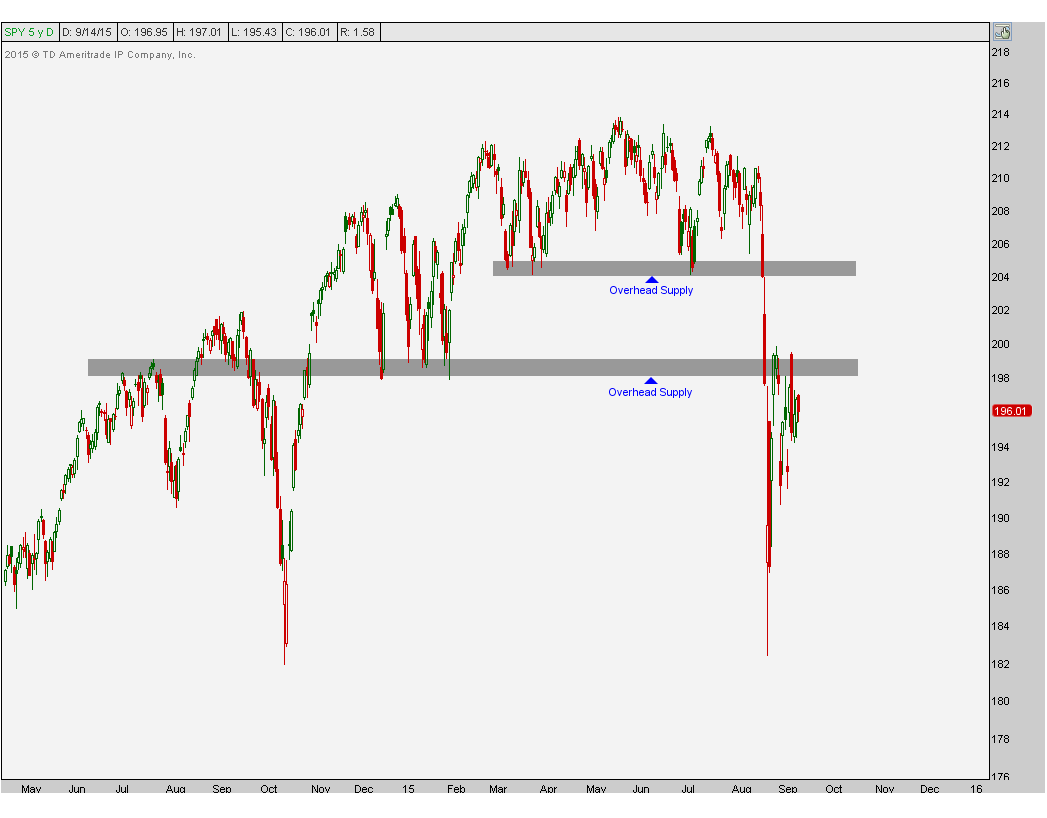
A big theme that I’ve been talking about over the past month is the overhead supply that we have across the U.S. Equities market. Not only are we seeing this in the major averages, but it is also visible throughout a lot of individual sectors and sub-sectors. The questions that I keep getting from investors and financial media revolve around at what point or price would I want to buy U.S. Stocks. The problem is that I don’t have the answer. You see, I’m not trying to buy stocks; I’m trying to sell stocks if we see higher prices. Rather than wanting to buy dips, I prefer to sell into rips. And if we don’t get any rips, then oh well, there are other asset classes and other areas to be both long and short that are uncorrelated to U.S. Stocks. It’s a big world out there. Here is the S&P500 below overhead supply:
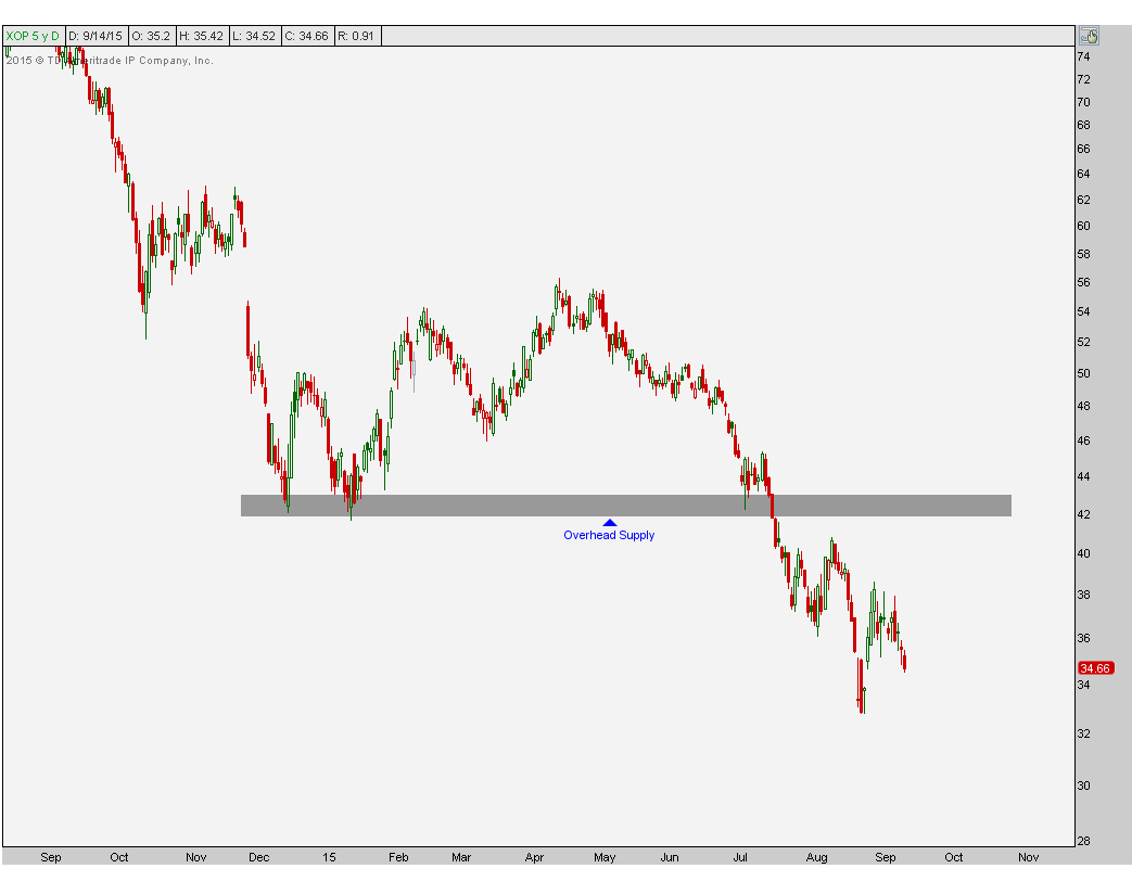
The Energy sector and its sub-sectors are good examples as they hit all of our downside targets late last month. But even if we get bounces from these lows, we will run into the brick wall that is “overhead supply”. When key former support breaks down panicking the longs into selling, those that did not sell are now left holding the bag. That’s the “please just get me back to even” crowd that is sitting there waiting to sell to you. The E&P names are a good example:
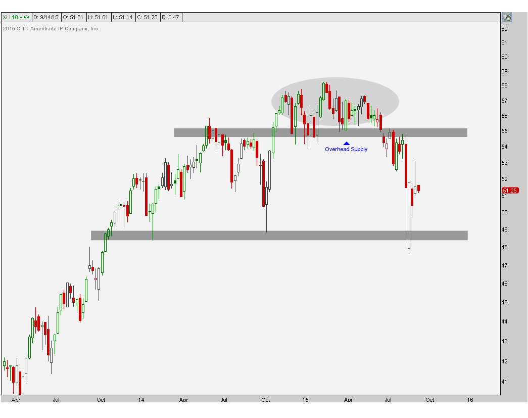
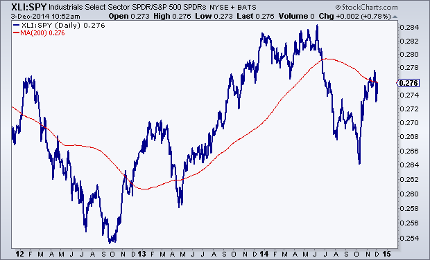
The Industrials are another good example. Although our downside targets in the S&P Industrials ETF $XLI were hit last month, I would rather sell strength than buy these dips. There is very clear support in $XLI that goes back to the lows in 2013 which held again in the summer of 2014 near $48. Looking short-term, however, we are below all of that broken support that goes back to earlier in the year. This is now overhead supply that we want to sell into if we get up there. The weekly timeframe shows this well:
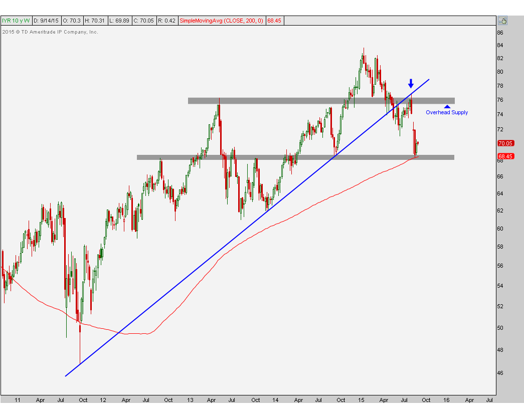
REITs are another good example. We are talking about a sector that broke its uptrend line from the 2011 lows. This was problem #1 and then on any attempt at an advance, prices successfully retested that former trendline support, and sure enough it then turned into resistance. At this point, our downside target has been hit based on the combination of a 200 week moving average and support from last October that had also served as resistance and support back in 2012-2013. The problem now is that all of this broken support in the mid-70s is still overhead supply. I’m not saying that we get back up there, but if we do, I would sell into that very aggressively. The weekly chart also tells the story well:
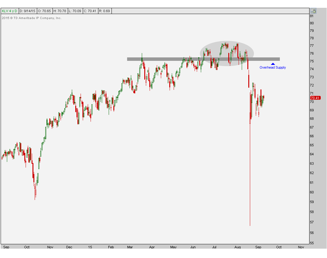
Healthcare is a sector where we’ve been expecting some aggressive selling over the past month (See: Is Healthcare Due For A Collapse?). Once we broke down below $75 we were thrilled to see prices crashing down. At this point, however, this is now fresh overhead supply from those that didn’t sell when they had to. We now want to be aggressive sellers into any strength back towards that area, if we get it:
There are plenty of more examples out there that I can point out, but I’d be here all day. Subscribers to our research have the entire list and receive weekly updates on the progress. You can register here to start receiving our reports.
I just think that looking for places to buy makes less sense than looking for places to sell. That’s how I see it. What do you guys think?
***
Click Here to receive weekly updates on each of these charts complete with 30 sectors and sub-sectors across the S&P500 including Energy, Financials, Gold Miners, Materials and Technology.

Tags: $SPY $XLI $XLE $XLV $IYR $XOP
What Are The Best Sectors In America?
One of the exercises that I find really valuable is comparing the relative performance of each of the S&P sectors to each other. Today we are breaking down 3-year daily line charts of each sector vs the S&P500. I also include a 200-day simple moving average to not only help define the trend, but also to see where prices are compared to the long-term smoothing mechanism.
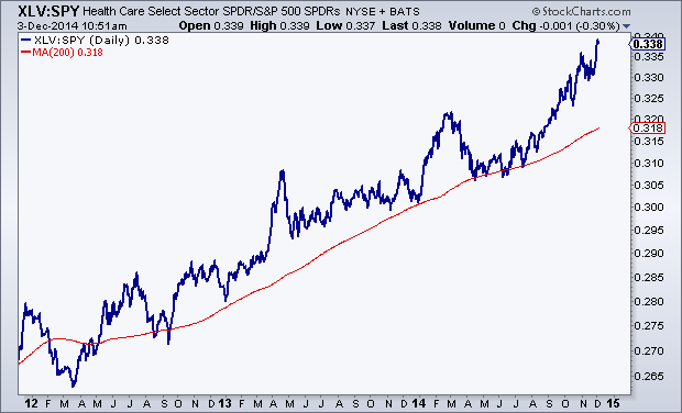
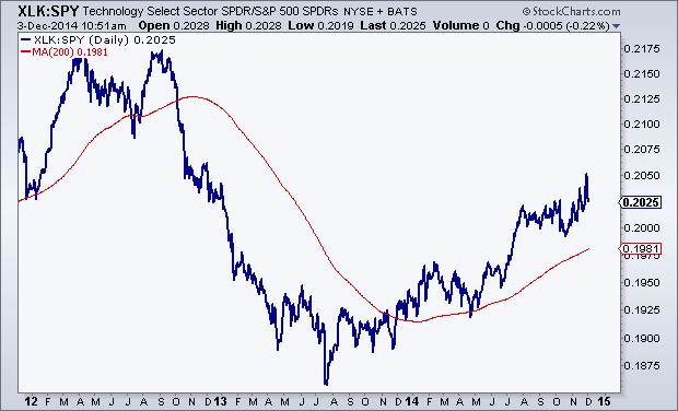
We’ll start with the best looking charts: Healthcare and Technology which have both been nicely above rising 200 day moving averages for some time now.
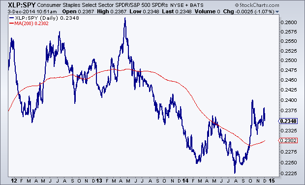
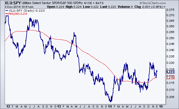
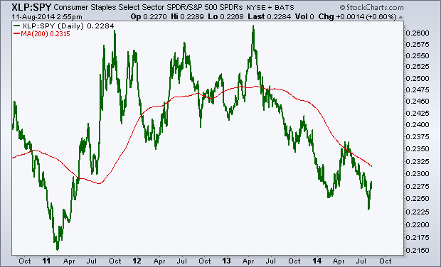
The next two: Staples and Utilities look like bearish to bullish reversals. These were previously in downtrends relative to the S&P500 but now appear to be turning up and trading above upward-sloping 200 days:
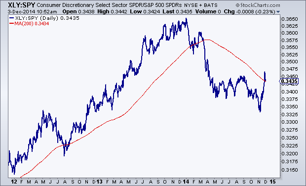
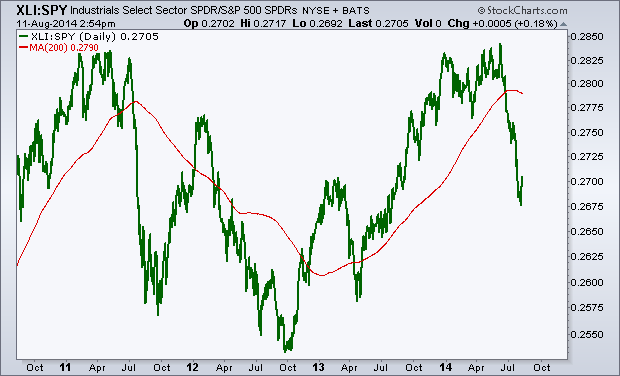
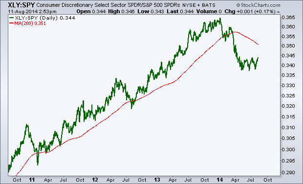
Consumer Discretionaries and Industrials have rallied back to their mean, but with a downward sloping 200 day, a neutral stance from a relative standpoint is likely best here:
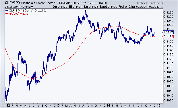
Financials are just kind of there. The lack of trend tells us that they are trading with the market and are right near the mean. So not much to do here, although I would argue that they look better than the previous two above.
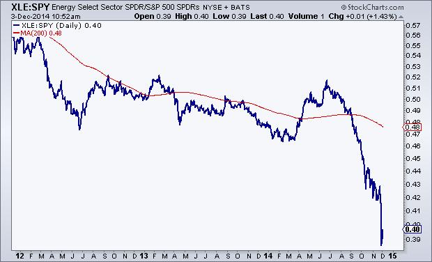
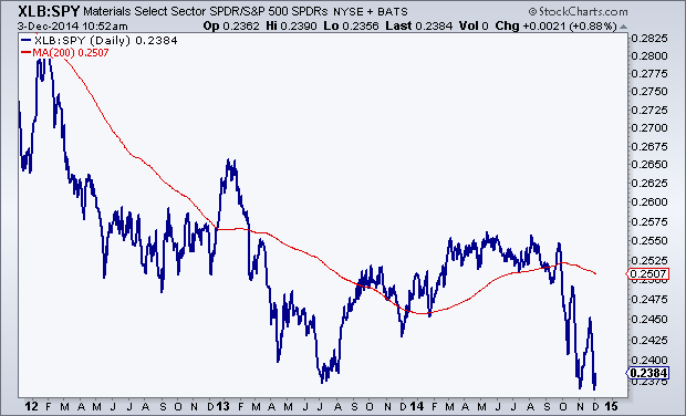
The last three are easily the worst of the bunch: Energy, Materials and Telecom. Each of them on a relative basis are well below downward sloping 200 day moving averages and other than perhaps a brief mean reversion, the trends here are still down. I would not trust these at this point to maintain a sustainable rally relative to the S&P500:

I like to do this periodically to get a good perspective on where money is flowing. I don’t really care what the sell side thinks in terms of over-weighting and under-weighting sectors. To me, price is what pays and the trends here (or lack there of) can be seen very clearly in the charts above. That’s enough as far as I’m concerned.
Members of Eagle Bay Solutions receive weekly updates on each of these charts along with the absolute price action itself. We have 5 different products from Commodities, to US Sectors, Dow Components, Global Equities and the Major US Averages. Click here to see which package is best for you.

Tags: $XLY $XLF $XLI $XLE $XLB $XLV $XLP $XLU $XLK $IYZ $SPY
Which is the Best S&P Sector to be Overweight?
With the S&P500 stuck right in the middle between important support and resistance levels, I think right now is probably best to remain neutral towards US equities from a tactical perspective. One of the ways we take advantage of what I think is going to be a lack of trend over the next 6-8 weeks is to put on pair trades that can add to the bottom line while maintaining a neutral stance in the asset class.
I figured now would be as good of a time as any to go over the relative strength for each of the S&P sectors. Here are the SPDR ETFs using 4-year line charts and a 200 day moving average to help define the trends. I kept them very clean and simple so we can really focus on just price and trends.
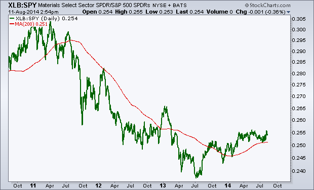
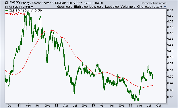
The first three charts: Materials, Energy and Technology appear to be going through bearish to bullish reversals. Materials look to be just breaking out while Tech is already more mature in this reversing process. Energy is somewhere in the middle. But on a relative basis, these 3 looks great. Materials are my favorite.
Materials vs S&P500:
Energy vs S&P500
Technology vs S&P500:
Financials have been underperforming the S&P500 consistently for over a year. This isn’t a good thing for the overall stock market as Financials are one of the more important sectors where we look for leadership. The fact that they’ve been lagging is, in my opinion, an unsustainable divergence. Something’s gotta give, either S&Ps come down and correct, or financials pick up the pace. Unfortunately there is zero evidence of financials starting to outperform, at least not yet.
Financials vs S&P500:
Consumer Staples are another problem child of this market as they have also been underperforming for over a year. This isn’t somewhere we want to be overweight. I would wait for a bottoming process (maybe similar to materials) before getting more optimistic about this space.
Staples vs S&P500:
The next two are former leadership groups that have gotten hit hard on a relative basis. Both Industrials and Consumer Discretionaries were darlings of the 2013 rally. But recently they’ve struggled; breaking trends and now allowing their 200 day moving averages to roll over. Structurally we prefer to stay more neutral in both of these areas, at least for now. I’m not sure they will keep declining, but I find it hard to believe they will emerge as new leaders any time soon.
Industrials vs S&P500:
Discretionaries vs S&P500:
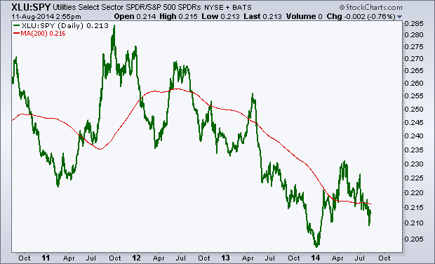
Utilities are still a disaster relative to the S&P500 and I think more time is necessary if this is part of a bottoming process. I’m going to need to see more out of these guys before getting aggressively overweight this space. I’d stay away and just wait.
Utilities vs S&P500:
And finally healthcare. This one is still in a strong uptrend and there is little evidence that the bull run has ended. I would look for a break in this uptrend line and/or break of the 200 day moving average as warning signals for this group. But so far we haven’t seen that.
Healthcare vs S&P500:
I try to review each sector on a consistent basis looking at both the price charts and the relative strength. This helps us, not only keep a neutral positiion towards stocks, but also helps with idea generation and what stocks and sectors to focus my attention on. Right now, it’s the materials that stand out to me the most.
***
REGISTER HERE for more information on how to access these relative sector charts with commentary and annotations on a weekly basis
Tags: $SPY $XLF $XLY $XLK $XLE $XLB $XLI $XLP $XLU $XLV
GE: The Lights Are On But Nobody’s Home
Today I want to talk about the bear case for shares of General Electric. This company is so old that it was actually an original component of Charlie Dow’s Industrial Average back in 1896. So I’m told….
I wish I had nicer things to say about this company headquartered in my old college town of Fairfield, CT. That place will always have a special place in my heart, so it’s unfortunate that I have to speak negatively about them. Oh well, that’s life I guess.
The first thing I want to point out is this beautiful uptrend channel over the last couple of years. Isn’t that nice?
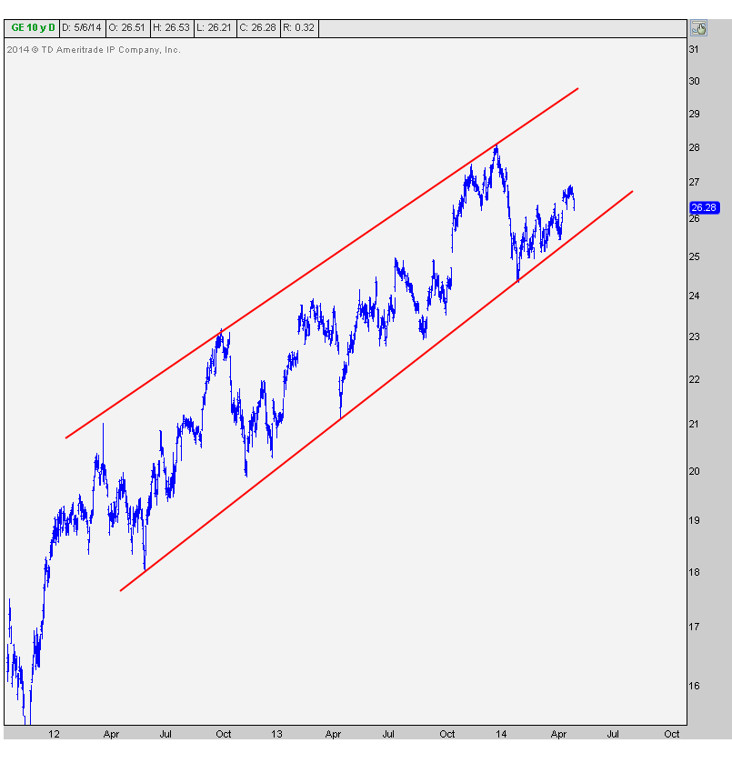
What worries me about this first chart is how many times the lower trendline has been tested. Remember that the more times a level is tested, the higher the likelihood that it breaks. We’re going on arguably 6-7 times depending on how you draw your trendlines. This makes this support extremely vulnerable.
The next chart, and the one that I think really makes the bear case is a daily candlestick chart. The first thing that I notice here is the failed breakout towards the end of December. Coincidentally Naturally, this occurred at the exact same time that US Treasury Bond yields also put in a failed breakout:
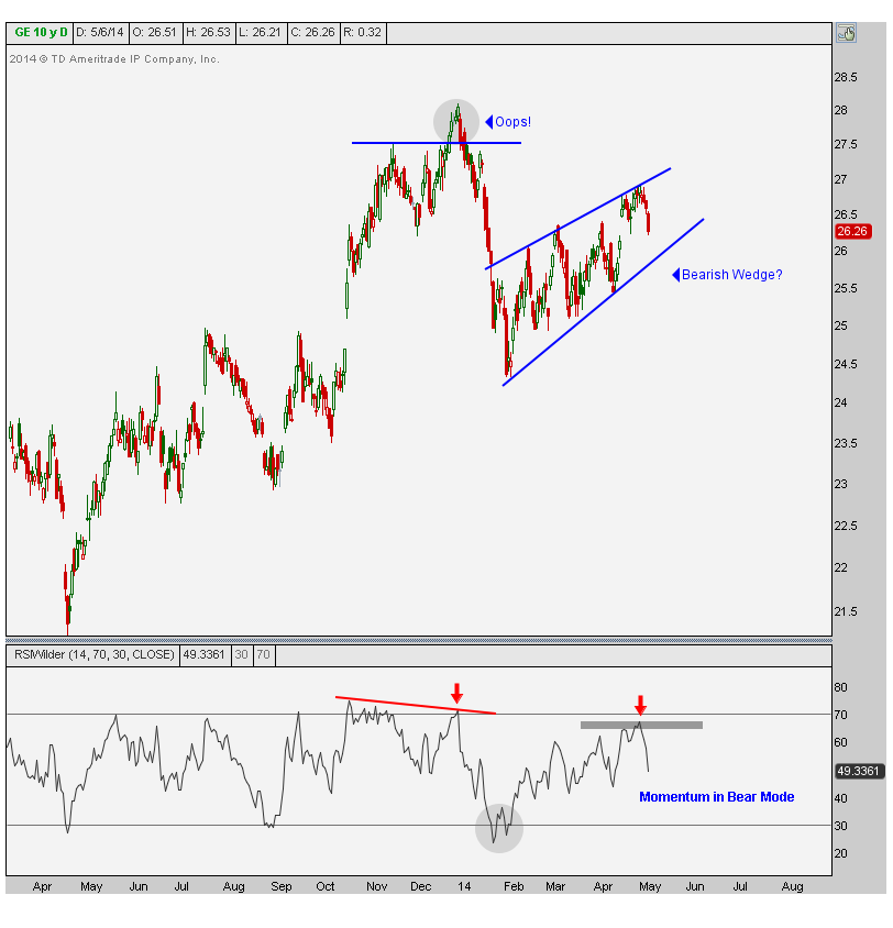
The next thing you can see is the bearish momentum divergence that was being confirmed during that failed breakout. This is how huge sell-offs are born. I’ve seen this a million times. Sure enough, $GE fell 13% over the next month. Now, as usual, nothing goes straight down. Shares of GE retraced 2/3 of that decline back towards former support in January before rolling over again. This bounce back has taken the form of a fairly clean bear wedge-looking pattern.
Also notice how on that January decline, momentum hit oversold conditions but then failed to reach overbought conditions on the bounce back. This puts momentum very much in the bear camp.
It looks to me like $GE is likely to see a 20 handle. This means that the current price is well over 20% away from that target. This is not a name I would want to be long and would be a seller on any and all strength.
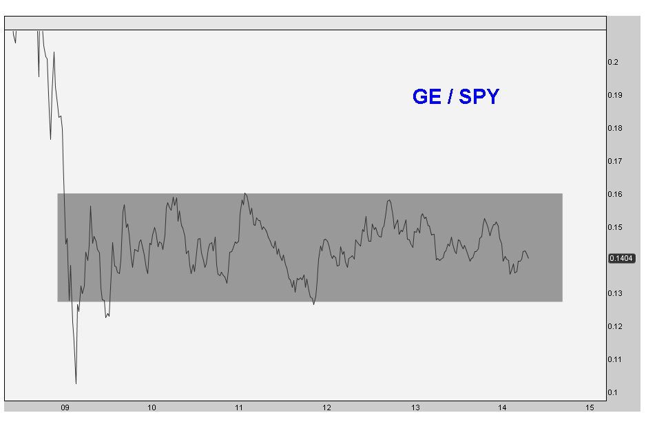
On a relative basis, this has been dead money for a while. Look at a relative strength chart of GE since the 2009 bottom. Nothing sexy to see here at all:
It trades like a financial and I’ve been aggressive bank bear this year. So it makes a lot of sense to me. The positive correlations between GE and XLF are through the roof, especially bigger picture.
Structurally, I clearly think GE is in a lot of trouble. From a tactical perspective I would become more short-term neutral if prices get above 27. But below that and I’m a very very aggressive seller. Look out below.
***
REGISTER HERE for more information on how to access updates on these charts as well as the rest of the 30 Dow Components on a weekly basis.
Tags: $GE $XLF $XLI $TLT $TNX
A Look Back At The First Quarter
Now that we’re officially in the second quarter of 2014, we can look back at Q1 to see what we’ve learned. The big winners were in the commodity space with the equal-weighted commodies index up over 10% for the first quarter. Coming in second were US Treasury Bonds up almost 8% for the quarter. On the equities side, the Dow Jones Industrial Average struggled losing 1.5% for Q1, the S&P500 closed up 50 basis points and the Small-cap Russell2000 was down 1%.
There were a lot of stock market bulls coming into the new year, but we couldn’t find many bond or commodities bulls. It’s fascinating to see sentiment play itself out. We’re starting to hear more chatter about commodities lately but still not many bond bulls. We’ll see what happens in the second quarter.
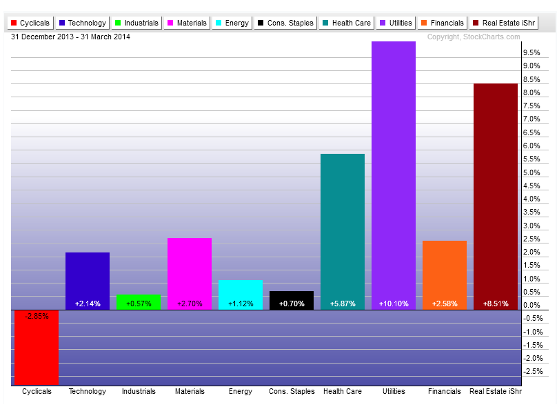
Individual sector-wise, I can’t say I’m surprised with the results. Back in February we noticed that the high yielding Utilities and REITs were leading the way for stocks. As interest rates have been falling (while most expected them to rise), fixed income managers need to find yield. They’re not getting it in bonds, so the flow goes into the sectors with the biggest dividends. I don’t think it’s a coincidence that the historically low yielding Cyclicals and Industrials were the worst performers.
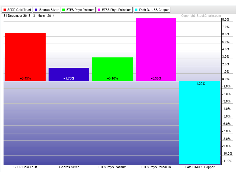
In the metals space Palladium was the big winner finishing up the quarter up 8.5%. This was my favorite chart coming into the new year and the price action so far continues to prove why. Copper was a big time loser getting crushed along with emerging markets. Something else that sticks out is the underperformance of Silver in a positive precious metals environment. That calls me to question this quarter’s rally in that space. I would expect (and want) silver to outperform if this was a real bull market:
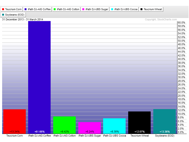
The soft commodities were the big winners for sure. Coffee finished up the quarter up over 60%, after doubling from the Q4 lows. Corn, Wheat and beans all came in with double digit returns and Sugar, Cotton, and Cocoa all finished with solid gains:
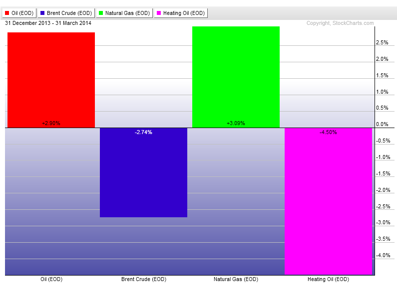
In Energy we had some mixed returns. West Texas Crude finished up close to 3% with Brent Crude down almost3%. Natural Gas finished up 3% and Heating Oil down 4.5%. Mixed signals out of this space:
Going forward what should we expect? I’m not sure that I see anything different than what we saw coming into the new year. I think the price action so far has confirmed a lot of we expected. Rates continue to fall and I don’t see any evidence yet of a rally. Stocks keep struggling with most of the world down this year. The US has been one of the stronger areas within equities and still can’t seem to rally. I would expect more of nothing out them. And in commodities we can continue to pick and choose as the rotation there continues. But as an equal-weighted group, I would expect to keep seeing them outperform.
If the data changes, then we’ll reevaluate. We have our levels, and if any of those are broken, we’ll adjust. But for now, all systems go.
Make sure to REGISTER HERE for more information on how to receive weekly multi-timeframe updates on all of these sectors and asset classes.
Tags: $SPY $DJIA $DIA $SPX $JO $KC_F $CORN $CL_F $USO $BNO $CC_F $NIB $BAL $CT_F $GC_F $SI_F $GLD $SLV $PPLT $PALL $PA_F $PL_F $HG_F $JJC $NG_F $UNG $HO_F $XLY $XLI $XLU $IYR
- « Previous Page
- 1
- 2
- 3
- 4
- …
- 6
- Next Page »