Whether it’s shopping or trading, sometimes you have to go big.
And there’s a retail name that is heavily shorted which is showing signs of getting ready for a possibly big short squeeze.
Expert technical analysis of financial markets by JC Parets
Whether it’s shopping or trading, sometimes you have to go big.
And there’s a retail name that is heavily shorted which is showing signs of getting ready for a possibly big short squeeze.
From the desk of Steve Strazza @Sstrazza
Welcome to the 2 to 100 Club.
Something we’ve been working on internally this year is using various bottoms-up tools and scans to complement our top-down approach. One way we’re doing this is by identifying stocks as they climb the market-cap ladder from small, to mid, to large, and ultimately to mega-cap status (over $200B).
Once they graduate from small-cap to mid-cap status (over $2B) they come on our radar. Likewise, when they surpass the roughly $30B mark, they roll off our list.

But the scan doesn’t just end there. We only want to look at the strongest growth industries in the market as that is typically where these potential 50-baggers come from.
Some of the best performers in recent decades – stocks like Priceline, Amazon, Netflix, and Salesforce, to a myriad of others… all would have been on this list at some point during their journey to becoming the market behemoths they are today.
When you look at the stocks in our table you will notice we are only focused on technology and growth industry groups such as Software, Semiconductors, Online Retail, Solar, etc.
Then like any good technician, we filter the list down to those that are closest to new 52-week highs. This allows the cream of these strongest groups to rise to the top and makes our job easier to identify technical breakouts in the top-performing stocks.
These are the registration details for our Live Monthly Candlestick Strategy Session for Premium Members of All Star Charts.
This month’s Video Conference Call will be held on Monday March 1st @ 6PM ET. As always, if you cannot make the call live, the video and slides will be archived and published here along with every other live call since 2015.
Here are the details for Monday evening: [Read more…]
Our album is #1!
Oh wait, not that kind of platinum. We’re talking about the metal. The guys on the ASC team are starting to get pretty geeked out about the metals space — with good reason. Prices. Are. Breaking. Out. Sometimes it’s just this simple.
From the desk of Steve Strazza @sstrazza
Check out our latest Mystery Chart!
What we do here is take a chart that’s captured our attention and remove the x/y-axes as well as any other other labels that’d help identify it. This chart can be any security of any asset of any timeframe – on absolute or relative basis.
Maybe it’s a ratio, a custom index, or maybe price is inverted. It could be all three!
The point is, when we aren’t able to recognize what’s in front of us, we put aside any biases we may have and scrutinize it objectively.
While you can try to guess the chart, the point is to make a decision…
So let us know what it is… Buy, Sell, or Do Nothing?
From the desk of Willie Delwiche.
Key takeaway: Optimism remains elevated when looking at investor positioning (equity ETFs have seen a quarter trillion dollars of inflows since the end of Q3) and demand for call options (up 60%+ over the past year). But sentiment concerns become more acute (and stocks more vulnerable) when optimism shows evidence of meaningfully unwinding. This week’s featured sentiment chart (ratio between HYG and LQD) suggests that rather than pushing back from the buffet and beginning to tighten their belts, investors continue to have a robust risk appetite. That doesn’t preclude an uptick in market volatility, but it reduces the risk of sustained weakness at this point.
Sentiment Chart of the Week: HYG/LQD Ratio and S&P 500
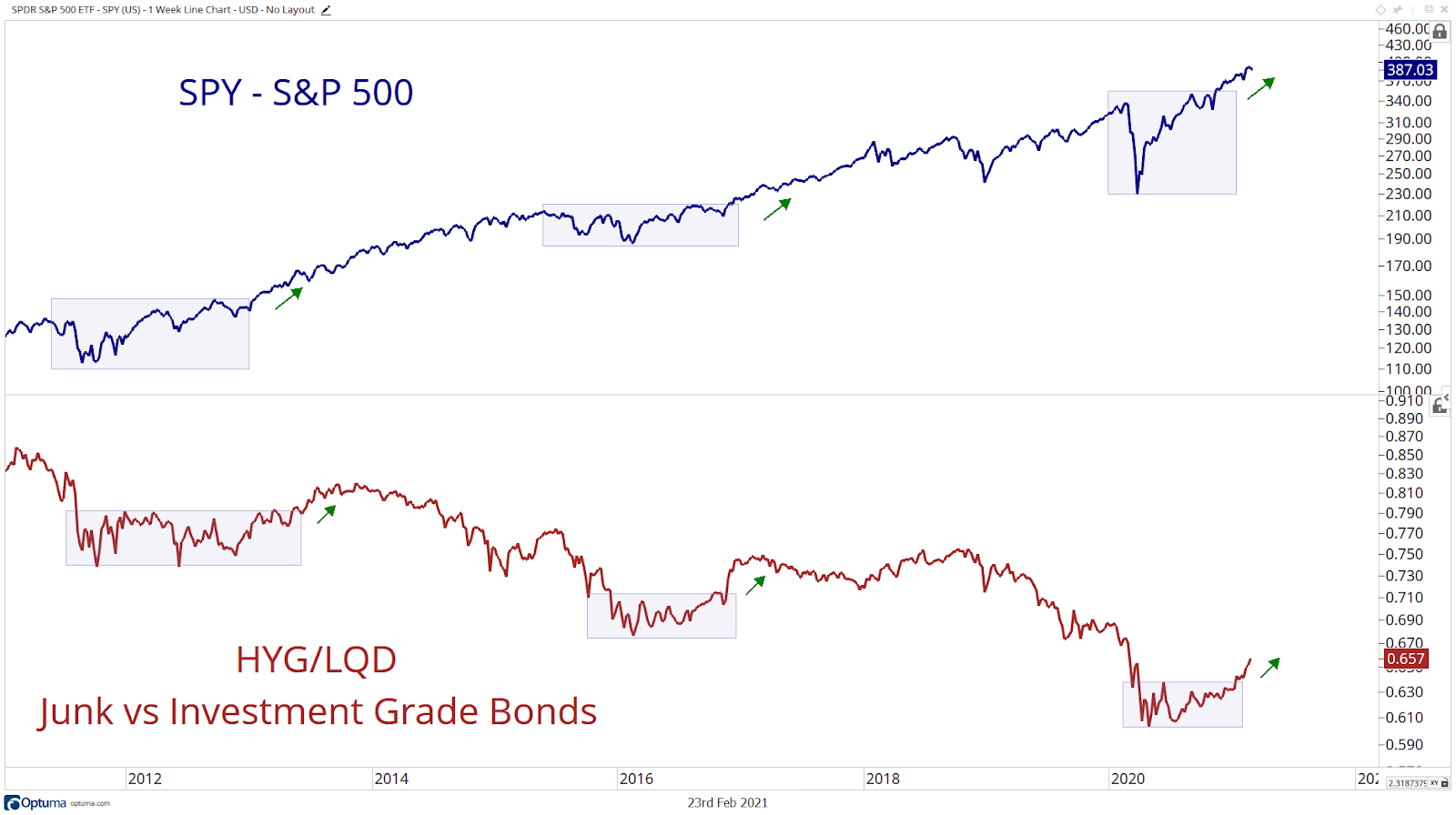
Stretched optimism becomes more problematic once risk appetites reverse & the HYG/LQD ratio suggests this is not yet the case. In fact, this ratio is more consistent with the healthy commencement of a new uptrend.