This weekend I did my regular global macro review. This is when I go country by country analyzing the weekly and daily charts of all of the stock markets around the world. Each chart includes a momentum study (14-period RSI) and a 200 period moving average that we use to help with trend recognition. I trade indexes all over the world, simply because I can. Why wouldn’t I? [Read more…]
[Premium] Why Global Markets Are Signaling A Squeeze Higher
Going country by country all over the world is one of the best tools that we have as market participants. The value that I’ve gotten over the years from looking at the behavior of all of the countries, instead of just the U.S. is a huge factor in why I am such a top/down weight-of-the-evidence guy. There are signs of strength and weakness that we see from international markets that might not be so obvious in the S&P500, for example.
Last September, I promise you that the reason I got bullish tactically was not because of what I was seeing in the United States, but what was happening around the world. There were simply too many bullish momentum divergences and downside objective achieved internationally to ignore. Something was up, and in fact, the counter-trend rally that we got in the U.S. actually exceeded my expectations.
Why America is the Best in the World?
As you guys know I am constantly reviewing the price action from stock markets all over the Globe. To me, the S&P500 is just one index in one country on this giant planet that we call earth. I get the fact that the rest of the world looks at the United States as a leader and other stock markets tend to follow along in terms what happens in the Dow Jones Industrial Average and S&P500. But for the purposes of managing money, it’s just one asset of an infinite amount of liquid assets around the globe.
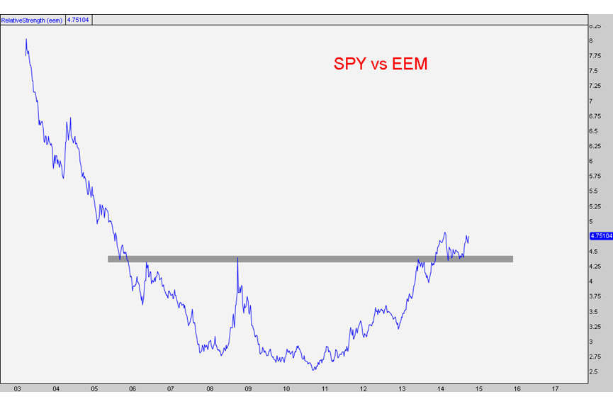
Looking at all of the global averages, I can’t think of one that is not in a downtrend vs the S&P500. Today I wanted to share two charts that I think are good examples of why America is the best in the business.
The first one is Emerging Markets as a group compared with the S&P500. The pair trade, if you will, would be long of SPY and short EEM. The iShares Emerging Markets ETF includes China, South Korea, Taiwan, Brazil, South Africa, India, Russia, Mexico and others. Look how nice this giant bottoming pattern has been over the past 8 years. Also notice the breakout above former resistance to start 2014 and now a successful retest:
The next chart compares the S&P500 with Europe. In this case, this pair is long SPY and short FEZ. The Euro Stoxx 50 ETF includes France, Germany, Spain, Italy, Netherlands, Belgium and Finland. Look at this consolidation over the last couple of years well-defined by these two converging trendlines. These symmetrical triangle sort of formations tend to resolve themselves in the direction of the underlying trend. And in this case that is precisely what has occurred. We are currently hitting fresh highs and it appears very clearly to me that the path of least resistance is higher:
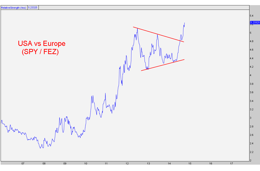
These charts tell me that the United States of America is the best place in the world. Execution-wise, I continue to be a ‘buy the weakness’ guy for these pairs. Risk management-wise any failures where these ratios return back below broken resistance, and a more neutral stance would be appropriate. But from where we stand today, the US rules the world and should continue to head higher on a relative basis.
Here are our current discounted packages:

*if you have any trouble receiving the discount, please email MemberServices@eaglebaycapital.com
Tags: $FEZ $EWG $EWP $EWI $EWN $SPY $EEM $EWZ $EWT $FXI $RSX $EPI $PIN $EEM