From the desk of Willie Delwiche.

Expert technical analysis of financial markets by JC Parets
From the desk of Steve Strazza @Sstrazza
When running through some scans this morning two new stocks came on our radar from our Under The Hood universe.
You can read our most recent report here. It was just published Monday.
Today, we’re going to discuss an Industrial conglomerate and well-known household name, as well as one of the largest Natural Gas companies in the world.
Not only are these stocks in some of our favorite sectors right now, but both are currently flirting with reclaiming key former highs. They also offer clearly defined risk levels to trade against, in addition to profit profiles skewed heavily in favor of the bulls.
We’d be remiss not to share these setups with you, so let’s dive right in and look at them…
Chop Chop Chop….Classic Year 2 Behavior for stocks continues.
Meanwhile, Crude Oil keeps on pressing up against these former highs. A breakout through 66 looks imminent.
This week we dropped a brand new 2-to-100 Club Report. Which names stood out from this week’s scan?
And what about Fried Chicken? Which wine do we pair with that??
All this and more on the latest episode of Bearish or Bullish. Enjoy!
It’s been a while since we’ve had some bearish setups to tackle. My bearish muscles are out of practice!
But the ASC team during the most recent Monthly Charts Session pointed out some bearish developments in the Nasdaq 100.
From the desk of Steven Strazza @Sstrazza and Grant Hawkridge @granthawkridge
Check out our latest Mystery Chart!
What we do here is take a chart that’s captured our attention and remove the x and y-axes as well as any other labels that could help identify it.
This chart can be of any security, in any asset class, on any timeframe. Sometimes it’s an absolute price chart, other times it’s on a relative basis.
It might be a ratio, a custom index, or maybe the price is inverted. It could be all three!
The point is, when we aren’t able to recognize what’s in front of us, we put aside any biases we may have and scrutinize it objectively.
While you can try to guess the chart, the point is to make a decision…
So let us know what it is… Buy, Sell, or Do Nothing?
From the desk of Willie Delwiche.
Key takeaway: Evidence of excessive optimism abounds. Recent articles in the Wall Street Journal provide anecdotes for the data: Conservative German savers are increasing their exposure to stocks and investors in the US are crowding into the market, focusing more on chasing returns than managing risks. Cyclical views trend and strategic positioning point to elevated risks but stocks have been buoyed by a favorable news backdrop (positive economic data surprises and upward earnings revisions) and resilient breadth. If these falter and investor appetite for risk fades, those areas of the market where speculative fever has burned the hottest could be the most vulnerable.
Sentiment Report Chart of the Week: Long Equity Camp Crowded
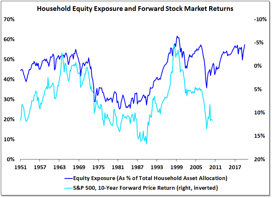
Household equity exposure finished last year near record levels. Preliminary data suggests it has now exceeded its previous peaks. There is a strong inverse correlation between starting household equity exposure and stock market returns over the ensuing decade.
It sure feels like a long time ago now, but it’s been less than a decade since the European Union underwent a rather serious sovereign debt crisis.
This set off a roughly two year bear market for International Stocks as well as a rangebound mess for US stocks.
After this bout of volatility, most risk-assets carved out significant lows in 2016 and rallied higher until global risk peaked in 2018. Then it all fell apart again last year.
This brings us to today, where we’re now seeing European countries and indexes trade right back up to their 2018 or pre-COVID highs left and right.
While diversified global indexes like MSCI EAFE $EFA and MSCI Europe $VGK recently reclaimed their former highs from 2014, 2018, and are already well above their pre-COVID peaks – they are now approaching a far more important area of overhead resistance at their pre-financial crisis highs.
Last week, we used the BRIC countries $BKF to illustrate this theme of more and more international indexes trading at inflection points. Today, we’ll do the same by highlighting some of Developed Europe’s long-term underperformers… the PIGS.