This is incredible. Make sure you read through the whole thing.
(Click Chart to Embiggen)

Source:
The European Super Highway of Debt (Demonocracy)
Tags: $EURUSD $FXE
Expert technical analysis of financial markets by JC Parets
This is incredible. Make sure you read through the whole thing.
(Click Chart to Embiggen)
Source:
The European Super Highway of Debt (Demonocracy)
Tags: $EURUSD $FXE
This one caught my attention this morning:

Today’s Census Bureau data shows the lowest homeownership rate since 1997 with no bottom in site. From Mark J Perry:
“The political obsession with homeownership in the 1990s and early 2000s raised homeownership in the short run to an artificial and unsustainable level of 69% by 2006, but failed in the long run to create a homeownership rate that was sustaintable. In the process, numerous government policies turned good renters into bad homeowners, created a housing bubble, waves of foreclosures, and a subsequent housing meltdown and financial crisis.“
Amazing stuff
Source:
Home Ownership Rate Falls to Lowest Level Since 1997 (CarpeDiem)
We talk about it all the time. Former support turns into resistance and former resistance turns into support. This phenomenon continues to repeat itself over and over again in assets classes all over the world. I’m not sure why so many market participants ignore the most basic principle in technical analysis.
Whether you’re a technician or not, make sure you have a little post-it note to remind you:

Today’s example is in the $EURUSD. The October lows and November lows served as key support around the high 131s & lows 132s. This level was broken in mid-December and the $EURUSD continued lower for another month. We’ve been talking about the amount of Euro shorts that have shown up in the market lately (see Jan 14th & Jan 20th). And we actually saw a nice little rally off those lows.
But now we’re up against some resistance, that’s all. If you thought the market was just going to get back above those key levels without at least recognizing that there is supply, then check your post-it note. It’s normal. It’s healthy.

As you can see in the chart above, this new found resistance level also represents the 38.2% Fibonacci Retracement of the Oct-Jan move. More reason to expect some supply. The US Dollar Index also looks weak to me, so I think some further downside pressure there should be expected. This obviously would help the $EURUSD eventually get over that hump.
So bottom line: I’m not convinced that this is the beginning of a new leg lower for the Euro here, just a well-deserved breather.
Tags: $FXE $UUP $DX_F
We have more important things to worry about.
Technical Analysis is an Art and NOT an exact science. There are a lot of haters out there that just don’t get that. Just because a random talking head says to do something based on some “indicator” doesn’t mean you should do it . And it certainly doesn’t mean that all technical analysts should be grouped together. Think about what you’re looking at with some common sense before making portfolio altering decisions.
In this case, we’re talking about the “Golden Cross” for the S&P500. The media gets all excited (because they get paid to) when the 50 day simple moving average breaks above the 200 day simple moving average. This is happening in the S&P500, and supposedly it’s a sign of good things to come. If you watch enough television you would also be led to believe that the opposite is true when the 50 day drops below the 200 day. They like to call this the “Death Cross”. Sounds scary doesn’t it? It’s supposed to. If you don’t get scared, you don’t buy newspapers or watch financial television.
The stats sound good though. From Bloomberg:
“There were 26 instances in the past 50 years when the S&P 500’s short-term average crossed above the long-term gauge, according to Birinyi. The index rose 81 percent of the time with an average increase of 6.6 percent in the next six months, the data show.
Stocks posted bigger returns when the S&P 500’s 50-day rose above a falling 200-day, Birinyi data show. The index jumped an average 10 percent over the next six months, according to the study.”
But think about what we’re talking about. Moving averages, by definition, are lagging indicators. The 200 day moving average consists of data that goes back almost a year. And the 50 day has data from this Fall (no pun intended). If I’m going to look at moving average crossovers as an indicator, I’m at least going to use Exponential Moving Averages that add more weight to the recent data (But this is a conversation for another day).
Look at the S&P500 with the most recent crossovers in green (golden cross) and red (death cross). Back in July of 2010, the silly death cross would have told you to sell just when you should have been doing the complete opposite. Not only was it NOT time to sell, but it was actually THE BOTTOM and time to be buying. (See Reuters Article from July 6, 2010). The Golden Cross a few months later would have finally told you to buy, but you would have paid up dramatically.

Now look at the next sell signal in August last year. Not only did this “Death Cross Sell Signal” come 3-4 months too late, but once again, it was a time to start buying and NOT selling. Although, the S&P500 made a new low a few months later, more stocks had diverged positively and were already heading higher. So now after a 20% rally it’s time to start buying? Oh ok….
You see how little sense this makes?
For now, I think we have more important things to worry about than whether or not a lagging indicator is crossing above or below an indicator that lags four times as much. Some of those more important things were also mentioned by Birinyi Associates:
“S&P 500 has gained more than 20% in the past 78 trading days, a phenomenon seen 15 times since 1945. On average, they say, the market has gained 6.96% in the six months after those episodes and fallen only twice in those 15 instances.“
The bottom line is that I’m paying more attention to what individual stocks are doing these days than I have in a long time. As we discussed on Friday, it’s important to listen to what the major averages are telling us but I’m relying more on the individual names. There are plenty of stocks to buy and plenty to short out there – I’m not trading the S&P500 Index. We might be back to a ‘market of stocks’ and less of a ‘stock market’. I’m hoping anyway. We’ll see. For now at least, we’ll be taking advantage of it while we can.
Source:
S&P500 Near ‘ Golden Cross’ After 20% Rally (Bloomberg)
Tags: $SPX $SPY $ES_F
 This is great stuff guys.
Legendary Technician Ralph Acampora sits down with Jim Puplava for a nice bullish interview about the Blue Chips. Ralph still sees strength in the components of the Dow Jones Industrial Average. Loves that $IBM and $MCD are making all-time new highs. Names like $INTC and $MSFT are coming out of bottoms and he thinks they’ll be playing a game of catch-up soon.
He says, “Charts are worth a million words” and “I am very very positive on Papa Dow”.
Click here – the interview gets going about 2/5 of the way through:
![]()
Also See:
Ralph Acampora Interview with Maria Bartiromo August 13, 2011
Source:
Ralph Acampora: Stocks Headed for Higher Ground (Financial Sense)
Tags: $DJIA $PFE
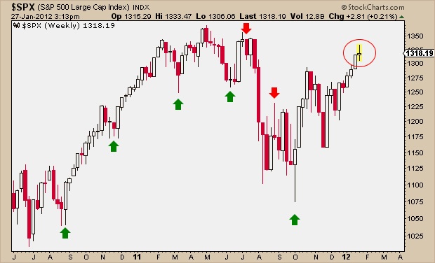
Get ready to hear all about this Long-Legged Doji that appeared in the weekly chart of the S&P500. They’re scary when they show up after a big move. I look at Japanese Candlestick Charts because I think they give us the most information in the simplest way possible. This type of doji candle signals indecision about the future direction of the S&P500.

The fact that it showed up after a big run up in stocks makes the candlestick that much more significant. It’s telling us that the forces of supply and demand are nearing equilibrium. This happens a lot when there is a shift in trend taking place. Look at all of the reversals that came after those long wicks in the candles.
The S&P is up over 22% since the October lows and 14% from the Thanksgiving bottom. That’s a lot fast. So a reversal will come. The question is when? The doji doesn’t necessarily mean that the reversal is here, but it is definitely a warning sign. For example, look at the candlestick the week of August 15th. The extended wick below the candle did NOT precede a reversal. The market continued lower regardless, which is a really bearish sign in and of itself. We will make the same conclusion if the market continues higher in the face of this long-legged doji. That would be intermediate term bullish.
Candlesticks are just one tool of many for a technician. We’re not going to take this single data point and make portfolio altering decisions based on it. But if the stocks in this stock market were all looking toppy and other things we look at were bearish, that’s one thing. But a) I’m not trading the S&P500 Index, and b) there are individual names out there that look great and keep rocking. There are also plenty of stocks that you could sell short. Isn’t it great that we can actually trade individual stocks again? I’m having so much more fun than when it was this ridiculous risk on/off stuff. Hopefully correlations peaked last Fall. We’ll see.
Also some of the other major averages don’t look like the S&P500 this week. Their candles actually look much healthier and constructive. The RSI in weekly S&P just made a new recovery high and there is still plenty of room for it to run. So I’m definitely not in the ‘sell everything’ camp just because of this one candlestick. I think we keep trading what has been working. No need to get cute. A big red filled candle next week would be confirming action of this potential reversal. So we’ll at least be looking out for that.
If you’re interested in learning more about Japanese Candlesticks, Steve Nison is the man. He wrote my favorite book on the subject.
Tags: $SPY $SPX $ES_F

Carter Worth: Dow Jones Industrial Average has Memory here (CNBC)
Psychological Leverage for Traders (DerekHernquist)
‘Extreme’ S&P500 Momentum, $VIX Signal Drop (Bloomberg)
Greg Harmon Charts the Problem in Europe (DragonflyCapital)
James Bianco Charts: Living in a QE World (Ritholtz)
Chart o’ the Day: Spanish Unemployment (TRB)
Arthur Hill: Spot Light Crude Forms Bull Wedge (StockCharts)
US Debt Limit vs Gold Prices (ZeroHedge)
Video: Phil Pearlman on Short Term Trading (GlobeAndMail)
Ugly Action in Regional Banks (ChrisKimble)
All the GDP Charts You’ve Ever Wanted (dshort)
Video: Robert Prechter on the Mind of Money (ElliottWave)
Real GDP Increased 2.8% Annual Rate in Q4 (CalculatedRisk)
Tags: $SPY $DJIA $GOOG $KRE $USO $CL_F $GLD $GC_F
If you’ve turned on the evening news or picked up a newspaper, you would probably think that the stock market is doing great this year. And it has, if you price your stocks in US Dollars.
If you’re comfortable pricing your assets in a denominator that can be diluted at the snap of someone’s finger, then sure, your stocks are knocking the cover off the ball. But if you want to price your assets in REAL money, in a currency that cannot be “printed at will”, then price your stocks in the oldest form of currency that we know of: Gold.
Priced in Gold, instead of in US Dollars, the Dow Jones Industrial Average is actually down Year to Date. On an absolute basis, the $DJIA is up about 4.5% for 2012. But meanwhile, $GC_F is up more than twice that amount:

And this is nothing new. Gold has been outperforming stocks for well over a decade. This secular trend, in my opinion, is stronger than ever. You’ll see rallies in equities vs gold, plenty of them, but they’re just counter-trend moves within a secular bear market.
And remember, counter-trend rallies are typically vicious in nature. We’ve seen a huge move in the Dow/Gold ratio since the August lows. After its peak above 42:1 in 1999, the Dow priced in Gold broke below 6:1 at the end of this summer. Today we’re right around 7.5:1 and I wouldn’t be shocked if it went as high as 10:1, which is a historic average in this ratio. But none of that changes the fact that the trend is still down.

And this year’s action has just been more of the same. Don’t forget that.
Also See:
Talking Gold & Silver with Jeff Macke (January 4, 2011)
Tags: $GLD $DIA $UUP $DX_F
