At this year’s New York City Money Show I sat down to chat with Rob Booker about Technical Analysis and some of the myths out there about what we do as technicians.
Here is the short video:
Source:
Expert technical analysis of financial markets by JC Parets
At this year’s New York City Money Show I sat down to chat with Rob Booker about Technical Analysis and some of the myths out there about what we do as technicians.
Here is the short video:
Source:
Happy 5-Year Anniversary U.S. Bull Market
S&P 666 to 1873 in just 5 years
Do you guys remember those days? 2008-2009? The big joke going around the desks the week that the stock market bottomed was that, “Citigroup’s share price was less than their ATM fees”. That’s one that will always stick with me. Shares dropped below a dollar that week before rallying 400% over the next six months. Ironically enough, the stock is actually flat since August of 2009.
Another one that will always stick with me is the key reversal day that we saw in shares of General Electric. This is THE example of a key reversal that I always point to when people ask me. Look at the market participants just puking out of this one the week S&Ps put in their historic bottom.
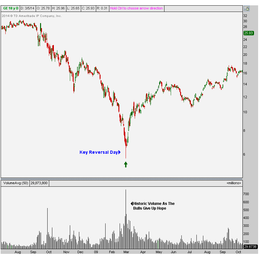
Huge volume on a key reversal day that closed up over 16% off the lows. This is how bottoms are born folks. General Electric closed out 2013 up about 390% from that day’s lows.
There are a lot of stories like this and we can be here forever going over them. But I think what’s probably more valuable is going over some of the leading indicators that pointed to that bottom. Remember the market is forward looking, so it clearly wasn’t the fundamentals. We can start with Sentiment. Everyone KNEW the market was going lower. This wasn’t a secret. We were in trouble. Since then, you’ve just witnessed the power of those extreme sentiment unwinds. Talk about a beauty.
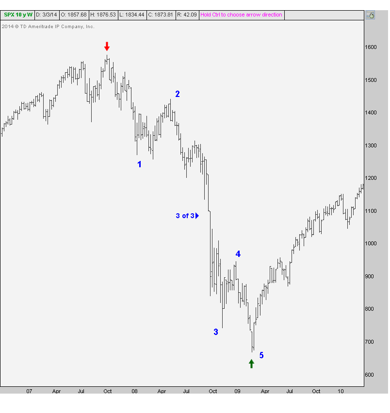
We should also point to the fact that 2009 was the mother of all false breakdowns. Literally, the greatest I’ve ever seen. Look at this weekly candlestick chart of the S&P500 showing the late February break of the 2002 lows. You see this is when all the superlatives come out in the media;
“lowest prices since 1996”, “Worst Decline since…..”. And that’s how bottoms are born:
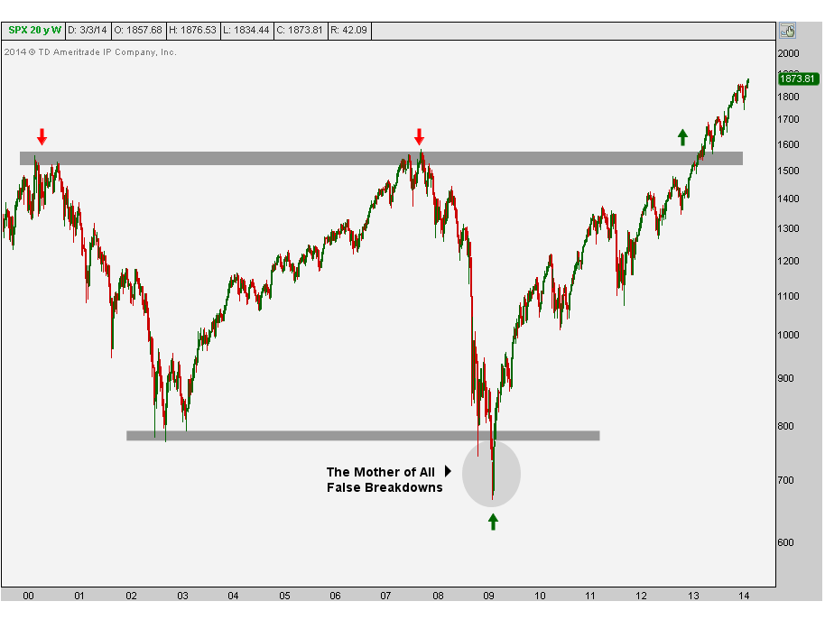
From false moves come fast moves in the opposite direction. In this case, the mother of all false breakdowns caused the fastest move in the opposite direction that we’ve ever seen. The initial rally off the lows broke records. Five years later, we’re still making new historic highs. You want to talk about epic squeezes?
Another favorite chart of mine is the list of NYSE 52-week lows as we approached that bottom. As it turns out, the actual low in terms of individual stocks hitting new lows was back in October. Then at the November lows we saw even fewer NYSE lows. And by the time S&Ps made their historic bottom in March, most of the stocks on the NYSE had already bottomed and begun their epic rally:
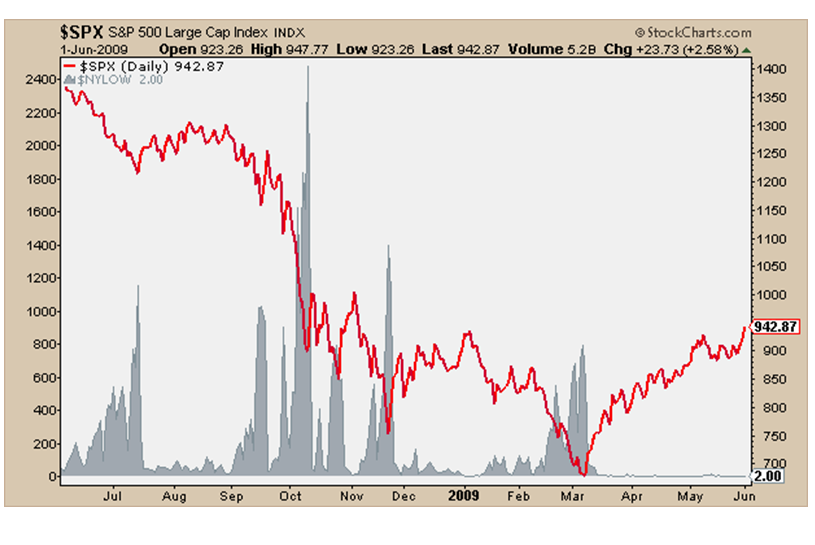
You can see in this chart the red line represents the S&P500 crashing and the gray area chart is the list of new 52-week lows on the NYSE. Do you see the ‘market of stocks’ improving while the headlines kept getting worse and worse on the way down? Awesome right?
You can see a similar bullish divergence in the Consumer Discretionary vs Staples ratio. Look how this very important ratio bottomed out in November, several months before the overall market. Fund managers were already positioning themselves into the more aggressive discretionary space and getting out of the more defensive staples. (please excuse the old charts but they’re well…..old)
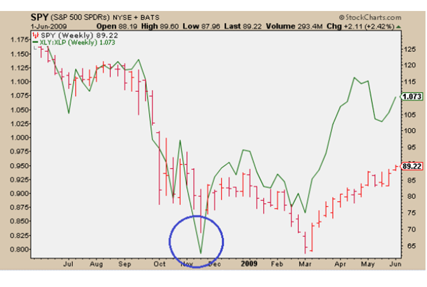
The green line represents the XLY/XLP ratio and S&Ps are in red. You can see the same divergence at the top in 2007. Look at the ratio peaking well before S&Ps:

It should be no surprise that the stocks, sectors, and indexes that bottomed before March 2009 turned out to be the leaders on the way up. Technology is a good example. The XLK bottomed in November of 2008, four months before the rest of the market. These guys led for a while and still seem to be leading the way higher.
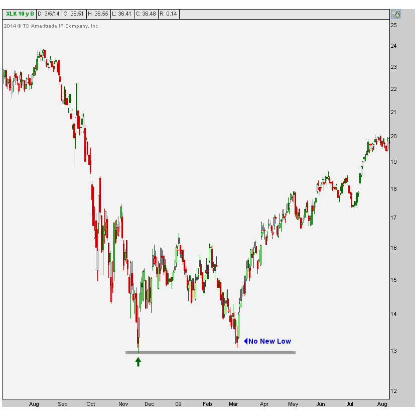
Go back and look at the names that did not make new lows in 2009 and held their Fall ’08 lows. I promise you that those were some of the biggest winners.
From an Elliott wave perspective, we had a text book 5 waves down. This to me is the best example I may have ever seen of the volatility in “wave 3 of 3”. These tend to be the most violent waves in a major move: we’re talking about the 3rd wave down of the 3rd wave on the larger timeframe. This helps because when you identify this 3 of 3 wave you can work your way backwards and count away from the ultra-violent move:
I would say that a big lesson for all of us is probably that trends can last a lot longer than you think. I don’t care how you feel about a company’s fundamentals because the market doesn’t care what you think. All the way down in 2008 these guys were calling bottoms and ignoring the trend. We’ve seen the same thing on the way up, everyone calling tops. And I don’t mean short-term stuff for a trade, I’m talking cyclical bottom and top calls. Lesson learned: trends trend.
What about you? What have you learned during this historic period in time?
Tags: $GE $C $SPY $XLK $XLY $XLP
On Tuesday afternoon I sat down with Jessica Menton over at International Business Times to talk about what we’re seeing so far in 2014. We know that commodities are the big winners for the year (although very quietly) and US stocks are up slightly. But what about going forward? What do we like best and what should we stay away from?
Here is the video in full:
Source:
Which Asset Classes are the Big Winners & Losers So Far in 2014 (IBTimes)
Tags: $EEM $RSX $XLY $XLP $KC_F $JO $PA_F $PALL $SPY
Whenever the word “Coal” comes up in conversation, a reaction of disgust has become the standard. The reasons range from, “It’s dirty” to, “We don’t need it” to, “Obama” (whatever that means)…..But I don’t know anyone who likes this space. Not a single person in fact. I bet I probably grossed some people out with this headline alone.
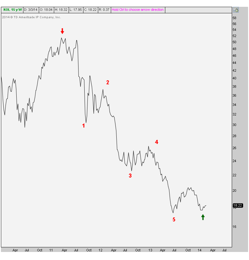
So as we like to do around here, when no one likes them it’s probably time to look a little bit closer. We’ll focus our attention today on shares of the Market Vectors Coal ETF $KOL. The first thing that stands out to me is the beautiful 5-wave pattern from the 2011 highs down to last year’s lows:
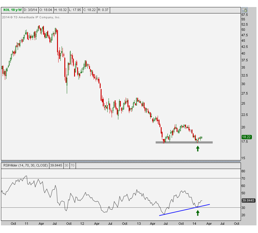
The next thing that sticks out to me is the potential double bottom formation down here near 17.25. This is a weekly candlestick chart. Look how on the second low last month, momentum (measured using a 14-period RSI) was putting in a much higher low. That bullish divergence stands out after a 5-wave decline.
I’m not a hard-core Elliotician. I find it too difficult and too subjective to sit there counting every single wave on every time frame. That doesn’t make much sense to me based on my time horizon and strategy. But I can’t help but notice something when it’s right there starring at me in the face. Trends tend to move in waves of 5. After a beautiful 5-wave downtrend, it would not surprise me one bit to see a nice recovery.
Remember, we don’t need a massive new uptrend. A correction of this 3-year downtrend could be violent. If the coal names just get back to the highs from a year ago, we’re looking at a 50% move. I don’t care who you are, that’s a lot. And what’s the risk? Well if prices make new lows, then we know we’re wrong. That presents us with about a 1:10 risk/reward opportunity. Anything wrong with that?
So why would coal stocks start rallying from here? Simple: who care why. Knowing why doesn’t pay us, never has, never will. And please don’t be that guy that compares it to Natural Gas. I know it sounds good on tv, but the math isn’t there. So please don’t….
I will say this though: look around. Who do you know that’s bullish on the coal names? I talk to a lot of people and I don’t know anyone. Do you?
Tags: $KOL $CNX $JOY $BTU
As bad as the Emerging Market space has been, not all of them are as horrible as they may seem on the surface. Within the EM space, there is some strength on a relative basis, specifically in India. Not so much in Russia.
Here’s what I mean. Take a look at a chart of India relative to the MSCI Emerging Markets Index. You see how last year prices broke down below major support that goes back to 2008 & 2009. That quick reversal back above these levels was the catalyst for India to breakout this year above a multi-year downtrend line:
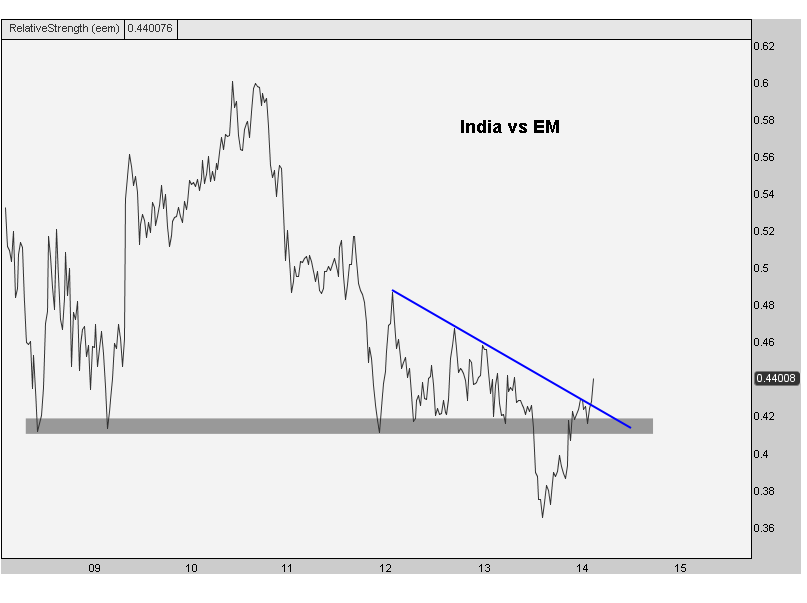
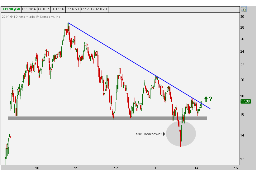
It looks to me like India is the big winner relative to the whole Emerging Markets space. Here is the pure price action showing India bumping up against a major downtrend line from 2010. Just like in the relative chart, I think that false breakdown last year could be the catalyst to really send this one higher:
Now look at Russia making new lows relative to the Emerging Markets as a group:
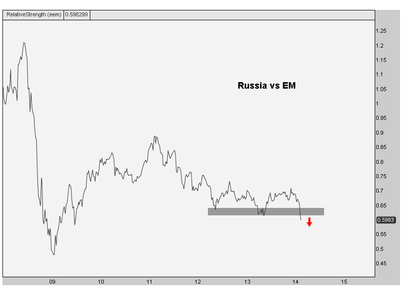
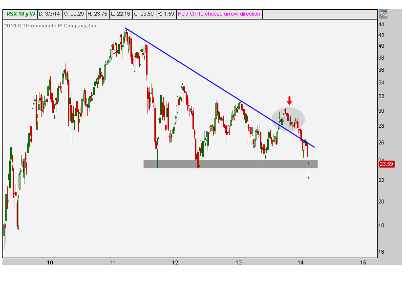
And look at the breakdown in price. How much stronger does India look compared to this chart?
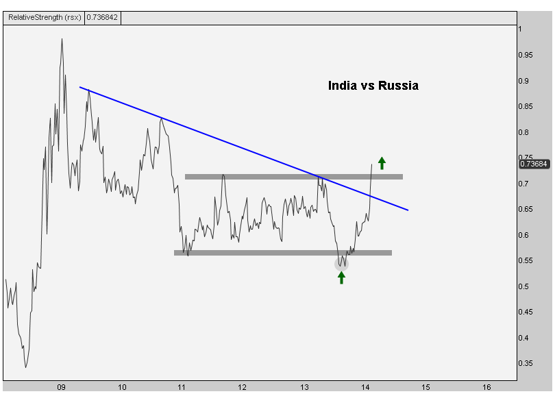
 Finally take a look at India vs Russia. Once again, we can point to the failed breakdown last year and quick reversal. This time, like in the absolute chart of India, just like the relative chart of India vs EEM, we can see here that it became the catalyst to break out India vs Russia:
I think there are opportunities in some of the individual countries relative to the EM space. Remember our denominator in a trade doesn’t always have to be US dollars. You can sell short something else if the price action makes sense. In this case $EEM or $RSX.
Tags: $EEM $RSX $ERUS $EPI $PIN
We’re already in March. That was fast wasn’t it? So how are things going so far? It’s a new year full of new stories. Less Taper, more Ukraine. But who’s leading and who is lagging?
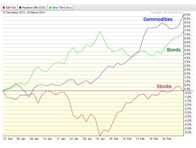
Coming into today Commodities are the big winner so far for 2014. The Equal Weight Continuous Commodity Index is up almost 10%. Treasury bonds have been a big winner as well. With interest rates getting smoked this year, my favorite t-bond benchmark $TLT is up 7.5% year-to-date. Meanwhile the S&P500 coming into Tuesday is basically flat for 2014.
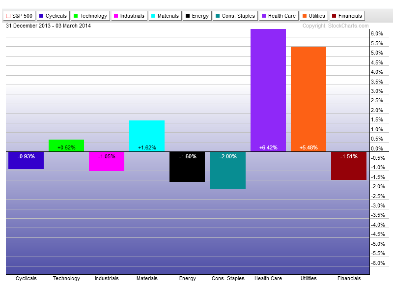
Here are the individual sectors so far this year. The big winners are Healthcare and Utilities, up 6.4% and 5.5% respectively. The rest of the sectors are up or down 2% and not really making much noise yet:
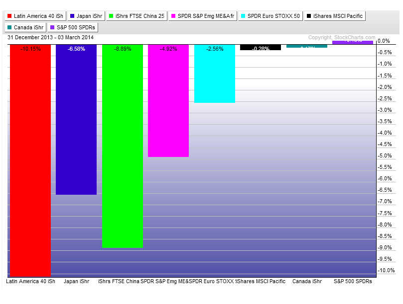
And here are a bunch of stock markets from around the world. Latin America is the big loser so far down over 10% YTD. This should be no surprise as it has been a serial underperformer for years. Japan has been getting hit as well, but not as bad as China (down almost 9%). Things have been much more quiet in North America with both the US and Canada flat in 2014:
We all know Coffee has been a monster so far this year. But most of the other commodities are doing well also. Gold and Silver are up 12% and 10% respectively, Oil and Natural Gas are each up over 6% and one of my favorites: Corn is up 11.5%. I know the energy names usually get all the attention, which is why most commodity indices are heavily weighted with Oil & Gas. But I prefer to use an equal-weighted measure as you can see in the chart above:
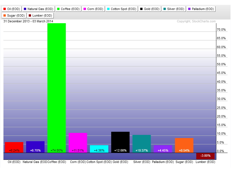
And that’s 2014 so far folks. What do you think? More of this to come? Or will equities finally get going? And not just in the US, but around the world?
Tags: $CL_F $NG_F $KC_F $ZC_F $CT_F $GC_F $SI_F $PA_F $SB_F $LBS_F $USO $UNG $JO $CORN $BAL $GLD $SLV $PALL $SGG $TLT $SPY $SPX $CRB $XLY XLF $XLK $XLE $XLI $XLB $XLU $XLV $XLP $ILF $EWJ $FXI $GAF $FEZ $EWC $EPP
Monday afternoon I dropped by the Fox Business studios to chat with Liz Claman about shares of JC Penney. Here is the full interview:
Also See:
Why JC Penney Has 30% Upside From Here (3-3-14)
Source:
How Much Higher Can JC Penney Stock Move? (FoxBusiness)
Tags: $JCP $BBRY $AAPL
With markets “in turmoil”, if you will, the already hated and beat up names don’t get the attention anymore. When the S&P500 is hitting all-time highs and companies like JC Penney are gapping down to historic lows, there’s no sexier headline. But when geopolitics are supposedly sending stock markets lower around the globe, good ol’ $JCP gets ignored.
![]()
So let’s give $JCP some love and look at what’s happening here across multiple timeframes. The first one is a weekly chart showing a nice bullish divergence and false breakdown:
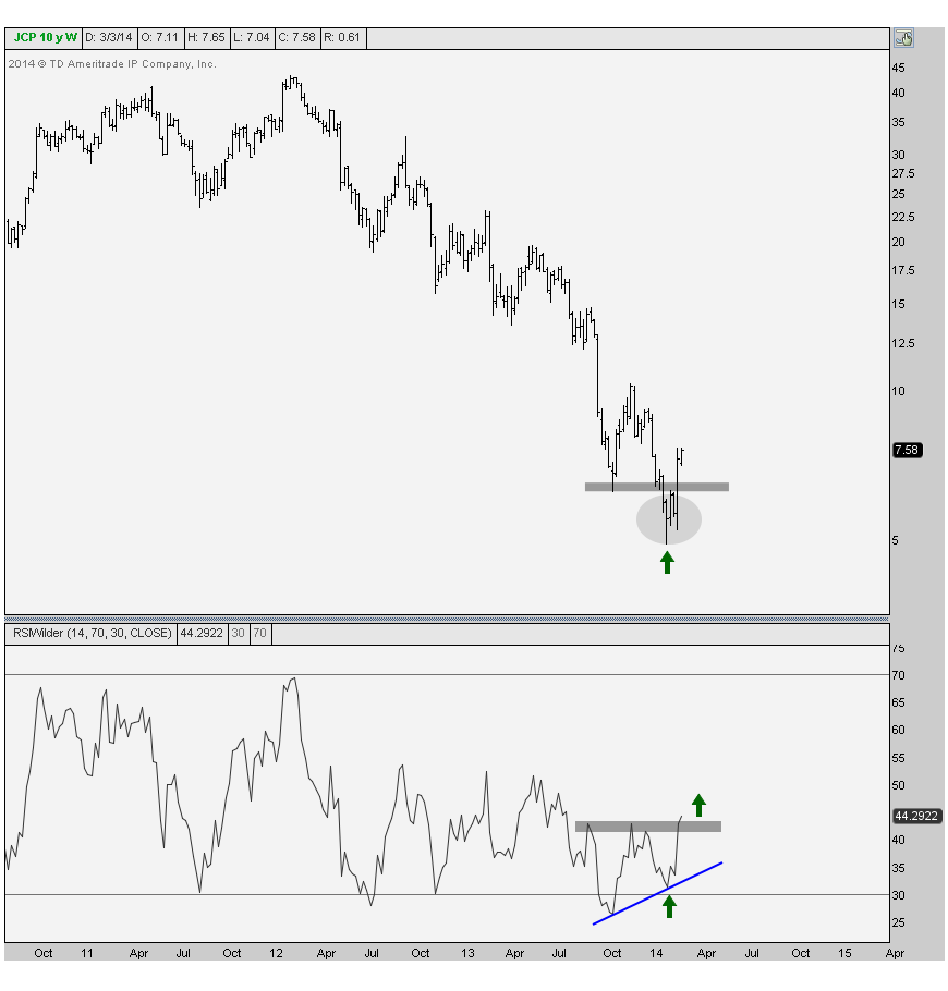
Notice how on the most recent break last month, momentum measured using a 14-period relative strength index put in a higher low. As a technician, when I see a failed breakdown to new lows, a bullish divergence like this is my catalyst to get full out bullish.
As David Asman on Fox so eloquently pointed out to me last week, a stock can go to zero. And he’s right. So when entering a beat up name like $JCP we have to protect our downside. The big question here always is, Where are we wrong?
Here is the daily candlestick chart where I included a 50 & 200 day moving average. We can see here just like in the weekly chart that a nice bullish divergence developed in momentum at the most recent lows. The quick recovery is normally my best friend in this case. But more importantly this one came on a gap higher, which to me is even more bullish. This gap higher brought us back above the October lows as well as back above the 50 day moving average:
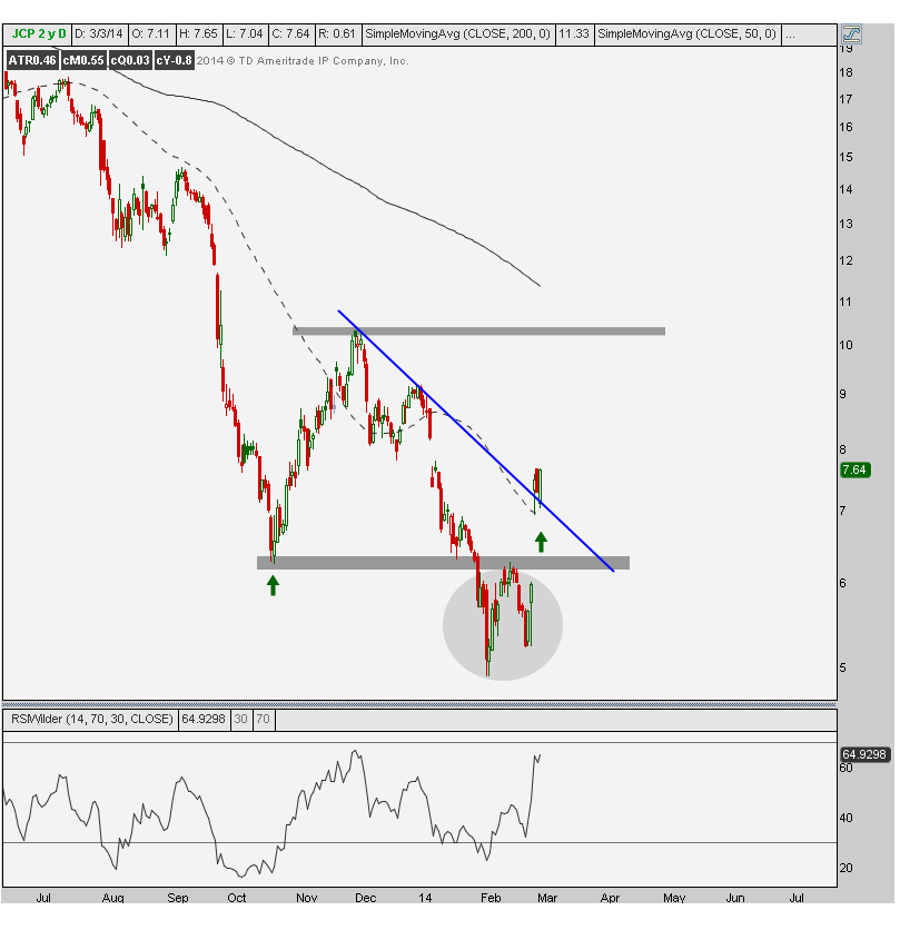
This gives us a clear out in the case that we’re wrong. Last week’s lows & 50 day moving average becomes our line in the sand. If prices break down below these levels, things get messy and we don’t want to be a part of it. That presents a favorable risk/reward opportunity, which is all we can really ask for right? The bulls here want to see more upside follow through soon though. But so far so good.
Target-wise, I don’t see why we can’t get back up to those early December highs. By then, the declining 200 day moving average should be somewhere around there. It looks to me like this would be a good place to take some profits and then reevaluate the entire situation.
Now look how well it’s behaving on a relative basis. We can start by mentioning that with S&Ps and global equities markets getting destroyed to start the week, JC Penney is up over 4% – a standout leader (did I just that about JCP?). Look at it relative to the S&P500 breaking down to new lows and quickly reversing. This is the most beautiful setup for me and it looks like shares of JCP should outperform going forward.
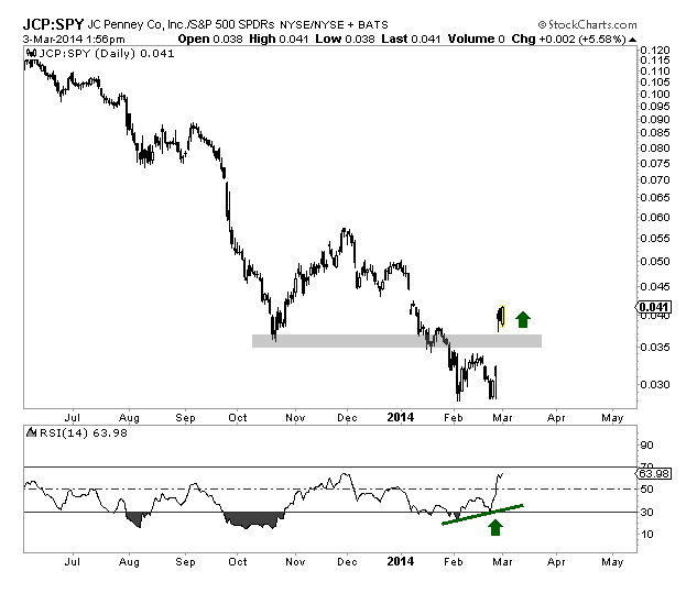
Correlation-wise, this one is on its own. Shares of $JCP have a -0.80 correlation with the S&P500 over the past year. This is mostly due to it crashing while S&Ps have been hitting historic highs. But shorter-term there is a 0.0 correlation over the past quarter, which seems more reliable than such a negative correlation might represent. We love that lack of correlation on a stock market that we are clearly negative on.
So for right now, it’s all systems go into shares of $JCP. We have our out and we want to stay disciplined with that. But with all the hate out there and bullish momentum divergences across multiple time frames (both on an absolute and relative basis), this beat up name is a screaming buy.
We’re putting together a list of readers interested in receiving weekly top/down technical analysis just like this. REGISTER HERE for more information on how to get on this upcoming list.
Tags: $JCP $SPY