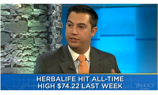
I sat down with Jeff Macke this week to discuss the possibility of a historic short squeeze coming in shares of Herbalife. Click on the video to watch in full:
Source:
Herbalife: Monster Squeeze Coming Soon Says Chartist (Yahoo)
Tags: $HLF
Expert technical analysis of financial markets by JC Parets
I sat down with Jeff Macke this week to discuss the possibility of a historic short squeeze coming in shares of Herbalife. Click on the video to watch in full:
Source:
Herbalife: Monster Squeeze Coming Soon Says Chartist (Yahoo)
Tags: $HLF
There seems to be a lot of commotion these days over this head and shoulders top in one of the most important companies in America. JP Morgan has been putting in what most technicians would consider a pretty text book topping pattern since early May. Now, whether or not $JPM breaks the neckline and confirms is still unknown, but the potential is certainly there.
This is a daily bar chart of JP Morgan Chase & Co going back to the Spring. The left shoulder was put in towards the end of May, the head in July and most recently a really weak right shoulder in September. What stands out to me here is how short lived the most recent rally was. Take note of how much lower the September peak is (right shoulder) when compared to the May highs (left shoulder). This is further evidence that the buyers are just tired:
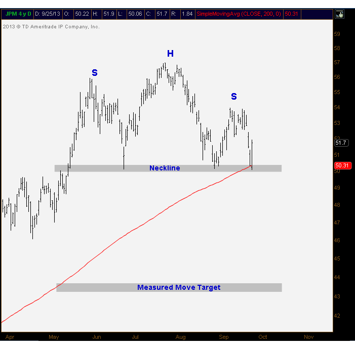
As we can see in this chart, nothing has been confirmed yet. Once the neckline is broken to the downside, we can then look for potential targets. In this case, you’re looking at about a 7 point height from the top of the head down to the neckline. These 7 points should take you down somewhere between 43-44 depending on whether you’re using closing prices or intraday extremes.
There is also a 200 day moving average right here at neckline support. So I’m not sure how easy it will be to break below these key levels. But something else worth noting is the rollover in momentum. With the new highs in $JPM this summer, the relative strength index has been making lower highs – this is seen on multiple timeframes, both daily and weekly charts.
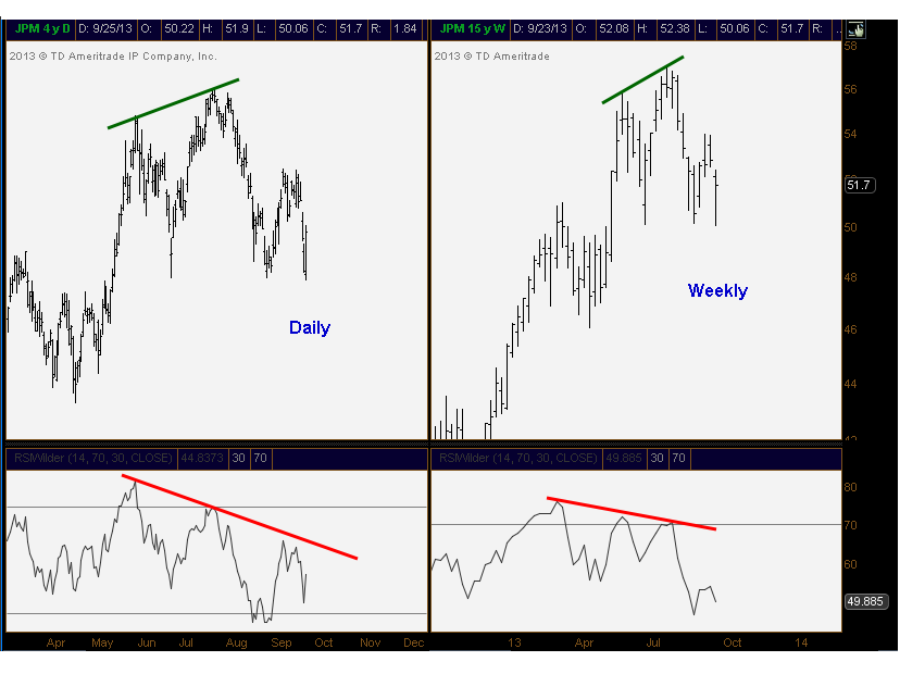
So bottom line, I don’t think $JPM just starts crashing from here. I think it will probably take some time to break this big support. But when we’re looking at a stock that has been underperforming the market for 4 months, momentum has been rolling over on multiple time frames, and a text book topping pattern has been forming, I would be really careful. Also, since the company, and it’s sector, is critical to this market, I think we can look at this one as a bellwether for equities as an asset class.
Stay tuned…
Tags: $JPM $SPY $XLF
I was over at that the Yahoo offices this morning chatting with Jeff Macke about the markets. Stocks have been trading with yields since the FOMC meeting last week. So now what?
Click on the Video to watch in Full:

Source:
Bond Market Rally Is Just Getting Started (Yahoo Finance)
Tags: $TNX $TLT $SPY
You want to talk about following trends? Is there anything worse out there than Japanese Yen?
There is something important to keep in mind here: Consolidations tend to resolve themselves in the direction of the underlying trend. It’s not always the case (what is?), but more often than not, when an asset is trending: triangles, rectangles, flags, pennants, you you name it, these consolidations tend to breakout in the same direction they came from.
Today we’re looking at the Dollar/Yen $USDJPY. After a monster move from last Fall, the currency cross has been consolidating those gains in a text book range since the May highs. With lower highs and higher lows, we can see that the correction has taken the shape of a triangle made up of converging trendlines. Eventually, as prices approach the apex, something’s gotta give. I’m looking at 100.60 as confirmation of a new leg higher:
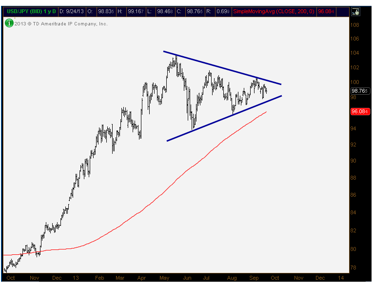
If Yen breaks down (this chart breaks out higher), you’re looking at about a 10 point measured move. This target is achieved by taking the height of the consolidation (May highs to June lows) and adding it to the breakout level mentioned above 100.60. So we’re looking for prices to get above 110.
There is a very strong negative correlation between Japanese stocks and their currency. If you look at $DXJ, the Wisdomtree Japan Hedged Equity Fund, prices have already broken out of a similar looking triangular consolidation. And it looks like it’s heading higher, which is not good for Yen.
I think we could be looking at a new leg lower for Yen. We’ll be keeping a close eye on this chart above.
Tags: $DXJ $FXY $USDJPY $EWJ $NK_F
With the stock market fading off all-time highs last week, I think we discussed some important points on today’s show. Here are some of the clips:
Biotechs & Blackberry:
Apple – Bull/Bear Debate – I still don’t like it Long or Short. It’s a “stay away” as far as I”m concerned, at least for now:
Trade of the Day: Sell Netflix:
Final Trade: Bonds Look Great, especially if 10yr yields break below 2.7%:
Source:
Tags: $AAPL $TLT $TNX $BBRY $GM $F $NFLX $XBI
This is one of my favorite stock market sayings. And there is a very good reason for that. The risk/reward opportunities that are created from it are surely unmatched. Most importantly, if you’re on the right side of the trade, you generally see a fast and violent move in your favor, and all this with limited risk.
The psychology is simple. A market is trending (whether it be a stock, bond, commodity or currency) and goes on to make a fresh new high (or new low in a downtrend). That new high (or low) above (or below) key resistance (or support), quickly reverses leaving those late comers holding the bag. In an example of a new high, the short sellers get stopped out of the positions they initiated against former highs. And new longs come in and buy the euphoric “breakout”. So what happens? The market quickly reverses lower leaving those new longs up there having to sell in order to get out, adding to the selling pressure that was naturally already there. In addition, the short sellers that got stopped, now have to re-short the security, adding even more sellers. This is why from false moves, come fast ones in the opposite direction.
Now that we understand the psychology behind this setup, let’s look at a real live example. My buddy Jonathan Krinsky over at Miller Tabak sent me this chart earlier today. We’re looking at S&P500 daily candlesticks setting up the potential for a false breakout:
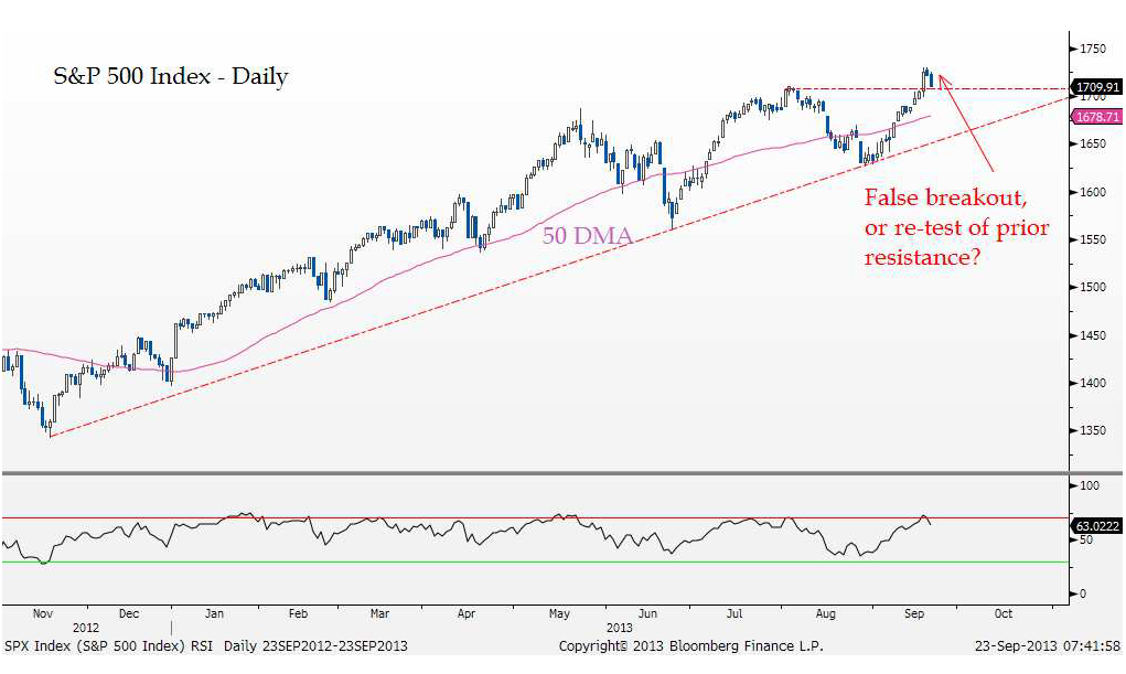
From Failed Moves…
…come fast moves in the opposite direction. That is the saying at least. What that speaks to is when a breakout above resistance, or breakdown below support, is quickly reversed, there is often a very swift move in the opposite direction. One of the reasons for this is as a key level is breached (let’s use the SPX resistance at 1709), many participants add to long positions (or cover shorts) assuming the trend will now continue higher.
When that trend does not materialize, and the market starts heading below that breakout level, all the newly initiated long positions quickly turn into losing positions. This inevitably creates more selling pressure as these positions are unwound, and the other presumable buyers (the shorts) have already covered on the “breakout”. That is the psychology behind the phrase, which could also be called a “bull-trap”.
We mentioned this possibility in our market video over the weekend. And when asked, I said the way to invalidate this potential false move was to put in a nice weekly candle above last week’s closing highs. I don’t even think we need to make new highs this week, just hanging out above last week’s highs and closing on a positive note Friday would be reason enough to get much less bearish.
Follow Jon Krinsky on Twitter: @JKrinskyPGA
Tags: $SPY $SPX $ES_F
This was definitely an important week. After the FOMC decision (or lack there of), stocks and bonds both rallied. The difference is that bonds went out near their highs for the week, while stocks rolled over and got crushed after Wednesday’s initial euphoria. Meanwhile breadth and momentum continue to deteriorate in stocks but there are still some names in uptrends that we can focus on. Readers asked us to look at $DDD and $DXJ so we went into details on the two of those.
I hope you enjoy!
Tags: $DXJ $ZB_F $TLT $TNX $DDD $SPY $SPX $ES_F
With Wednesday’s big move in bonds, I think now is a good time to review the 10-year yield. This 2.7% level has been my line in the sand for months. I still believe that if yields fall below that area, there is probably a lot more downside to go.
The chart is pretty clear. We’re looking at resistance from early July and again in early August. After it broke out, that level became support in late August. Now we’re back here again. But with the most recent highs in rates, momentum was already rolling over. That bearish divergence suggests that a sustainable break below 2.7% is likely:
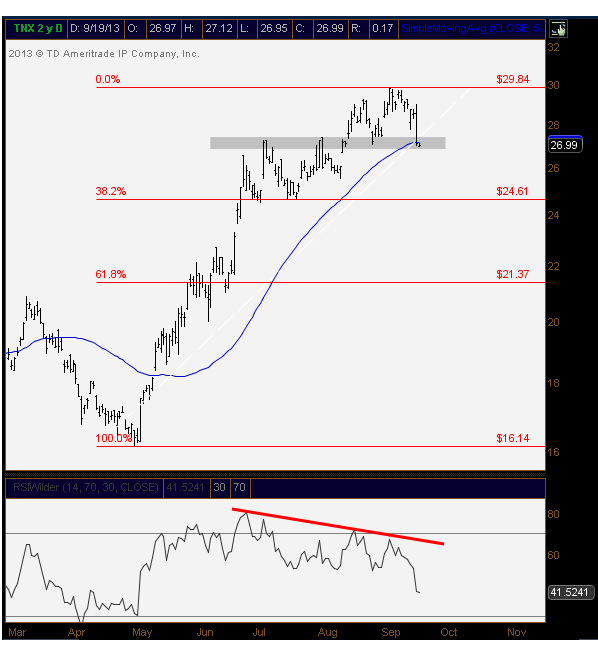 I included some fibonacci retracements for potential support if rates do indeed break down. The 38.2% retracement coincides with the July lows. So 2.46% looks like a decent area for a bounce. And then somewhere around 2.1-2.2% would be a logical area for support as there was some churning in that area in May and June.
All of this would be extremely positive for bond prices, which are putting in a nice bottom themselves. And everybody hates bonds. We haven’t seen this much hatred for the asset class since early 2011, just before a 25% rally in 30-yr futures and 40% rally in the iShares 20+ Year Treasury Bond ETF $TLT. Here is what the Consensus Inc. Bullish % chart looks like. Talk about extremes in pessimism:
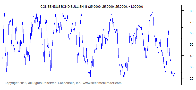
Source:
Consneuss Bond Bullish Percentage (SentimentTrader)
Tags: $ZB_F $ZN_F $TLT $TNX $TBT