Here is the video of our panel at the New York Traders Expo
Source:
Expert technical analysis of financial markets by JC Parets
Here is the video of our panel at the New York Traders Expo
Source:
Over the weekend I was going through all of my favorite charts, making annotations and writing down notes. One of the things I like to do to get a good feel for the US stock market is to rip through all of the S&P sectors and sub-sectors on multiple time frames to get a good read on money flow. Which ones are the strong sectors? Which ones are the weak sectors? Are any of these actionable? What does the sector rotation tell us about the overall stock market and/or interest rates? These are all question that I ask myself along the way.
REGISTER HERE if you’re interested in receiving information about how to access all of these sector by sector charts on a weekly basis.
***
Today I want to focus on the strength that we’re seeing in Utilities and REITs, both on an absolute and relative basis. These guys are known around The Street as income generators, as they pay some of the highest dividend yields of any stock market sector out there.
As it turns out, with the S&P500 down half a percent so far this year, Utilities and REITs are each up over 6%. That’s quite a difference. Now, is it a coincidence that these guys pay the highest dividends and are outperforming by this much so far this year? I doubt it. I don’t believe in coincidences when it comes to Mr. Market.
First, here is a chart of the $XLU – SPDR Utilities Select Index. We’re looking at daily bars putting in a nice symmetrical triangle well-defined by these two converging trendlines. Notice the false breakdown in late-December and early-January that became the catalyst to break this one out to the upside. I love it when that happens:
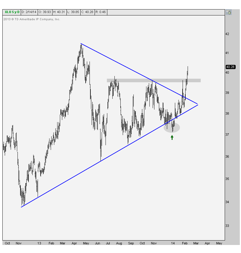
It looks to me like prices are heading up towards last year’s highs, especially if they can hold above the July & November resistance (shaded here).
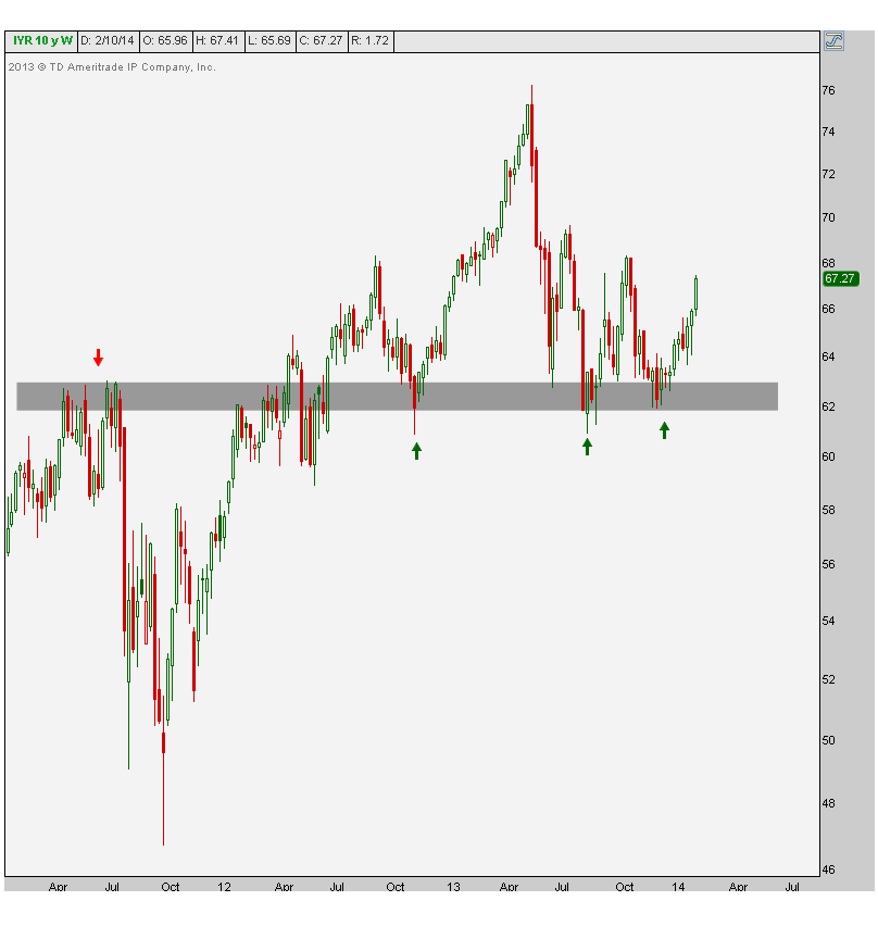
The next chart shows the weekly candlesticks for the iShares US Real Estate ETF $IYR, to get some context. You can see that what was once clear resistance throughout 2011, eventually became support in 2012 and 2013. And now prices are ripping.
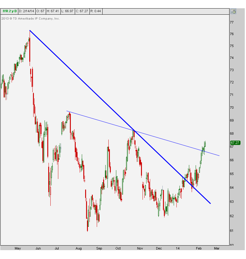
Here’s a closer look at the recent action in REITs. We can see clean breakouts above both downtrend lines from last year. A thing of beauty no?
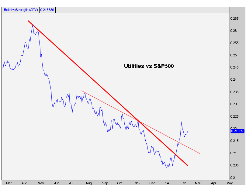
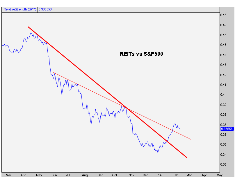
Now more importantly look at the relative strength charts for Utilities and REITs. These represent each sector compared to the S&P500. The first one shows Utilities breaking downtrend lines across the board:
And the next one shows REITs doing the exact same thing:
So why do we think there is so much strength, relative and otherwise, into these dividend paying sectors? Could it possibly be that it’s because money managers are looking for places to get yield? Why would they need to do that? Why would they increase their risk for just a little bit more yield when they can get a guaranteed return from the Government not too far from what these guys pay? Could it be that it’s because they think rates are going lower?
You guys know how I feel. I’ve been calling for lower rates for two months. We’re now started to see the stock market react to what I think we’re seeing. Are the big fund managers also now positioning themselves for a lower rate environment?
I’m just presenting the facts. You guys draw your own conclusions. You know how I feel. But what do you think?
REGISTER HERE if you’re interested in gaining access to these as well as the rest of the S&P sector charts on a weekly basis.
Tags: $IYR $XLU $SPY $TLT $TNX
Come hang out with us Monday at the New York Traders Expo.
Here are the details from Yahoo Finance:
On Monday Feb 17th, Yahoo Finance Interactive Editor Phil Pearlman will moderate a panel discussing technical analysis and social media at the International Traders Expo.
A growing number of market participants are using social tools to exchange trading and investment ideas and knowing how to do so effectively can help you improve your skills and performance.
Pearlman will be joined by an all star cast including:
All of these guys are expert technicians and superb communicators.
You will learn something valuable about how to use social media as tools to gain valuable information about markets and have a chance to ask questions too.
This event will take place Monday February 17th at 10:30AM at the Marriott Marquis Hotel in Times Square. Admission is free, the market is closed and (supposedly) it will have stopped snowing by then. So come by for sure.
Here are the details from MoneyShow.com
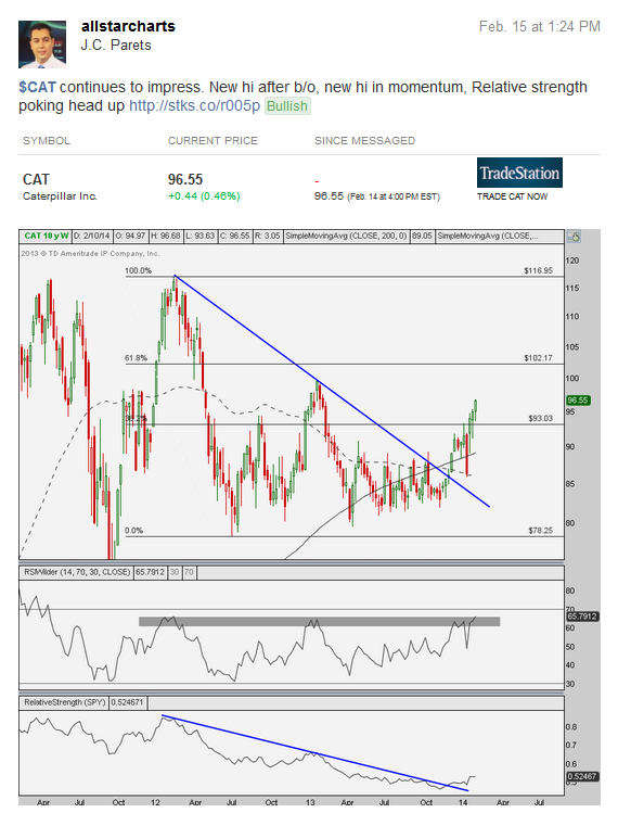
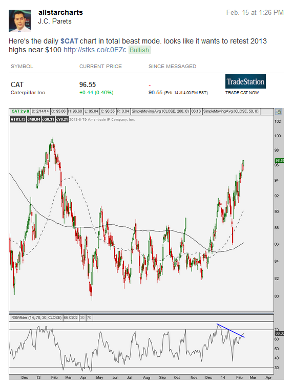
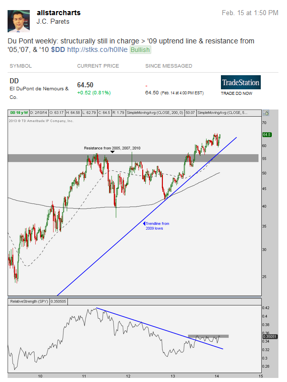
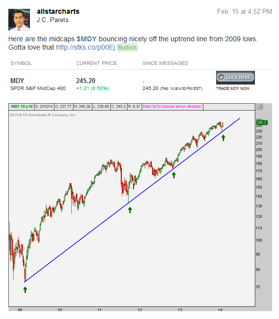
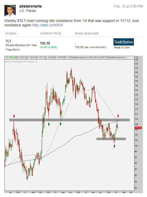
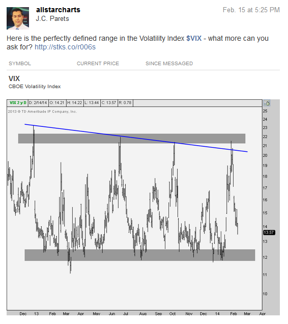
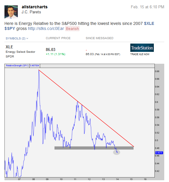
It was an ugly snowy Saturday in New York City so it was the perfect occasion for a long charting session. I really enjoy a nice weekend afternoon of coffee, classic rock and candlesticks. It’s the little things in life you know…
While I rip through all of my charts, I make my annotations and save everything to a hard drive so I can always reference them in the future. This way I can see what I got right, what I got wrong, and more importantly why. I’ve been doing this my entire career as a technician. Anyway, along the way I shared what I thought were some of the more interesting charts on Stocktwits. Here is a copy of my stream.
***
REGISTER HERE if you’re interested in receiving information about how to access all of these charts and many more on a weekly basis.

***
REGISTER HERE if you’re interested in receiving information about how to access all of these charts and many more on a weekly basis.
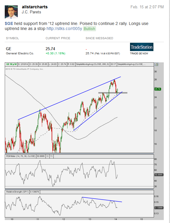
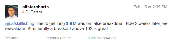
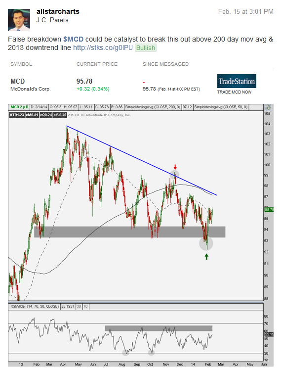
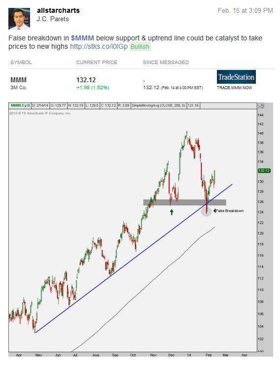
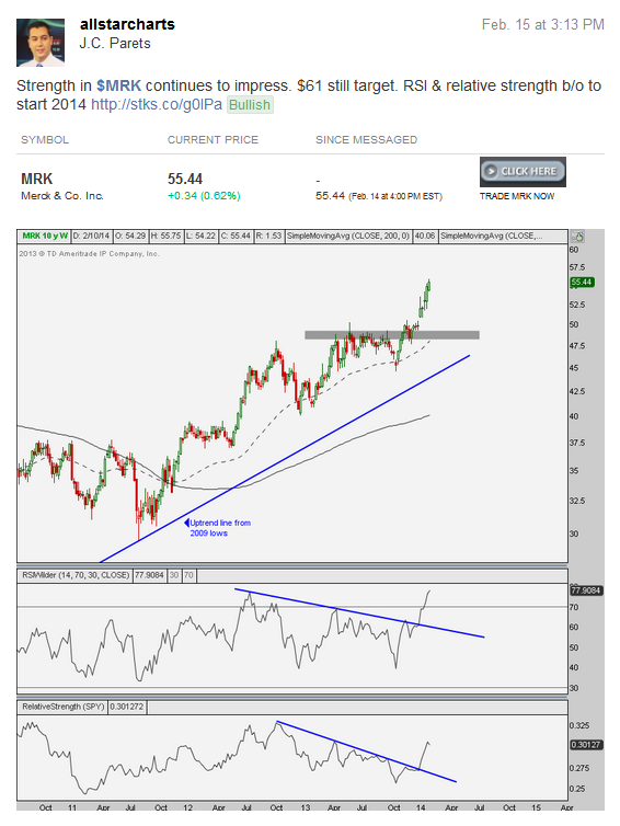
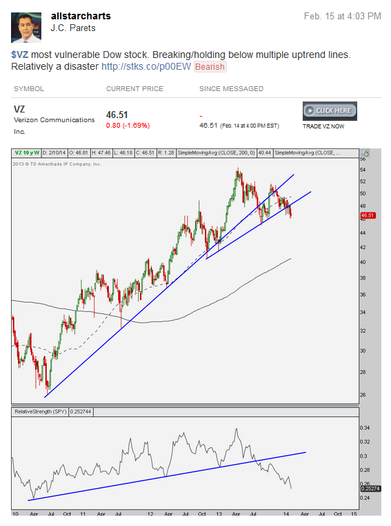
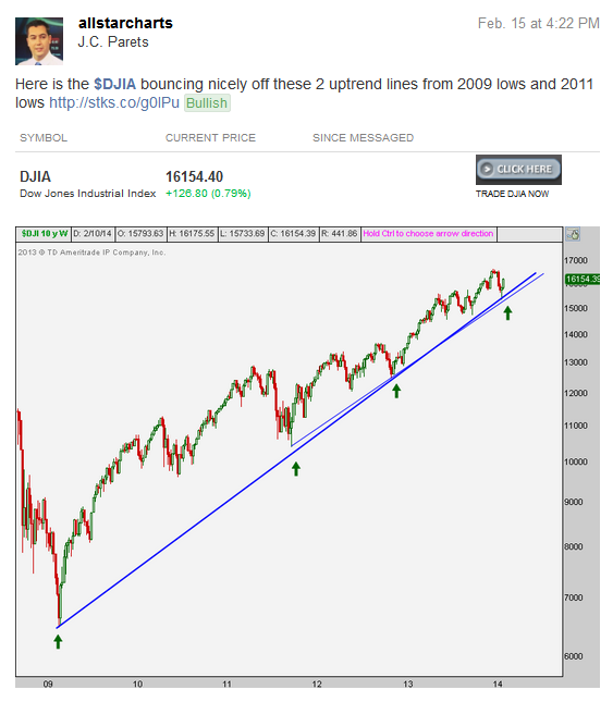
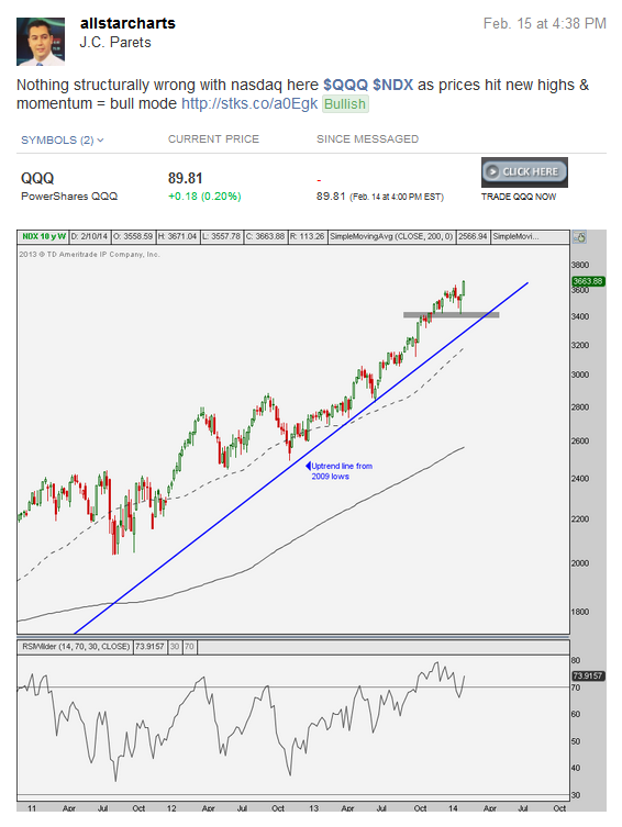
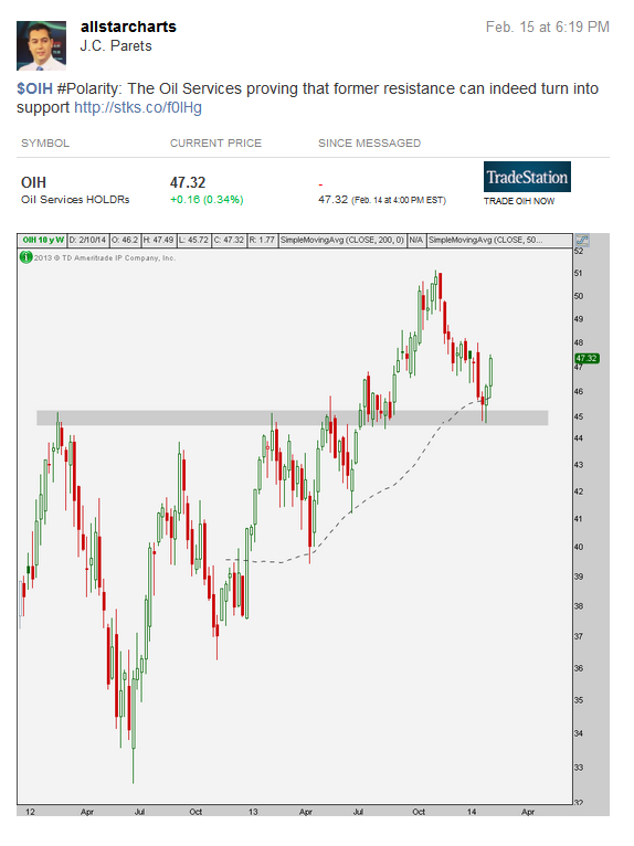
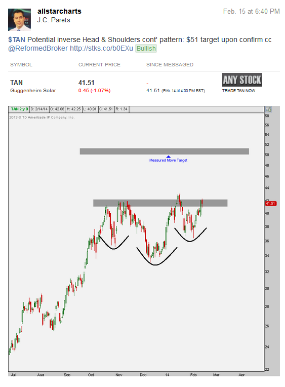
Tags: $CAT $DJIA $DIA $DD $GS $GE $VIX $MDY $QQQ $NDX $IBM $MCD $MMM $MRK $UTX $VZ $XLE $SPY $OIH $TAN
You guys remember Silver??? It was that shiny metal that everyone loved back in 2011. You know, the one that was going to rally forever, but then didn’t?
And now everyone hates it. How do you not love market sentiment? Supply and Demand is a beautiful thing and if you don’t learn to appreciate it and find the humor in the whole thing, you’re not having any fun.
So let’s amuse ourselves for a hot minute and talk about Silver. Quietly this guy’s been putting in a serious 3-month base. And this base isn’t just coming at some random level. This sell-off has stalled right at those 2009-2010 resistance levels that also turned into support last Summer. Check out this weekly chart. Don’t tell me Polarity doesn’t exist and this is just a giant coincidence: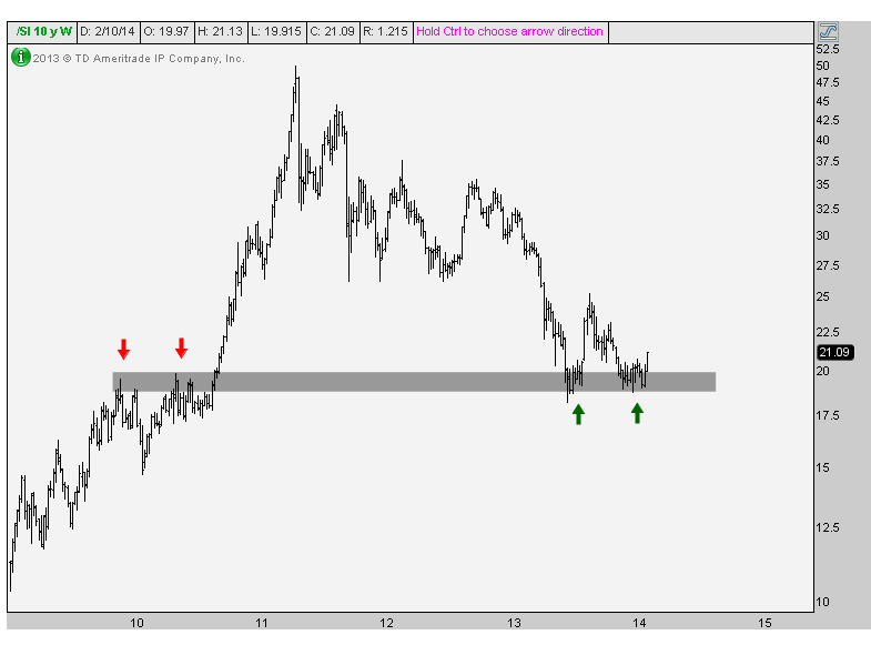
Here’s a closer look at Silver futures breaking this downtrend line from over a year ago. This is a line chart to keep things clean and simple:
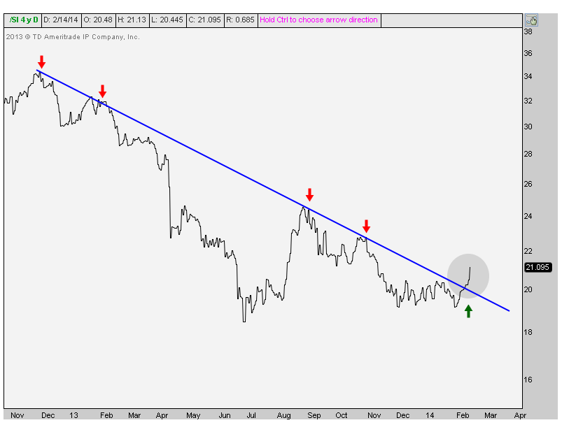
Now look at this base on the daily candlestick chart. Nice breakout huh?
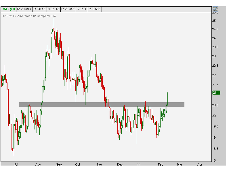
It looks to me that as long as Silver prices stay above 20.40 these guys are going a lot higher. The hatred in this space lately has been epic. The sarcastic tweets about the returns in precious metals last year (even by my close friends) has been overly obnoxious. That’s the sort of sentiment unwind that really gets me going in the morning.
So we get to buy silver again. How cool is that?
REGISTER HERE if you’re interested in receiving information on how to access this research on a weekly basis.
Tags: $SI_F $SLV $AGQ $ZSL
So where would you rather be? In the stock market or the bond market?
Here is a weekly line chart comparing the iShares 20+ yr Treasury Bond ETF ($TLT) and the SPDR S&P500 ETF ($SPY). These are two widely followed proxies for Treasury Bonds and US Stocks. We’re taking this one back 10 years to get a long-term perspective of where we are today:
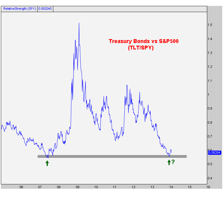
It’s pretty clear to me that we are at the exact levels where this particular ratio bottomed out in 2007. It should be no surprise that the bond market was well ahead of the curve and started to outperform in advance of the upcoming stock market crash of 2008.
The way I learned it, when a market gets back to a historic support (or resistance) level for the first time, there is market memory there and a reaction typically occurs. In this case, we’re talking about a historic support level where the market reaction would be a bounce higher.
Now, does this have to happen? Of course not. Stocks can continue to rally to all time highs and bonds roll over to new lows. But that seems to be the consensus as I keep hearing on tv and reading on the internets that we’re in a “rising rate environment”. If that’s the case, and consensus is right, then this support should be irrelevant.
But I came into the year very bullish bonds and I continue to believe that bonds trade higher and we are NOT in a rising rate environment. I think rates continue to fall and this chart bounces nicely.
Either way, the risk/reward here seems to be in favor of the bond bulls (stock market bears) by a long shot. And at the end of the day isn’t that all that matters? Finding the best risk/reward opportunities?
What do you think? Should we ignore our supply & demand principles here? Or pay attention?
REGISTER HERE if you’re interested in receiving information on how to access this research on a weekly basis.
Tags: $SPY $TLT $ZB_F $TNX $ZN_F $SPX $ES_F
Financials are an area where we want to see leadership. When banks are leading the way, markets are generally trending higher and signal that higher prices are coming for the major averages. Today we’re taking a look at Regional banks, which is something that concerns me. If you like this multi-variable, multi-timeframe sector analysis, REGISTER HERE for more information on the rest of the S&P sectors.
***
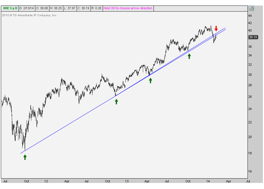
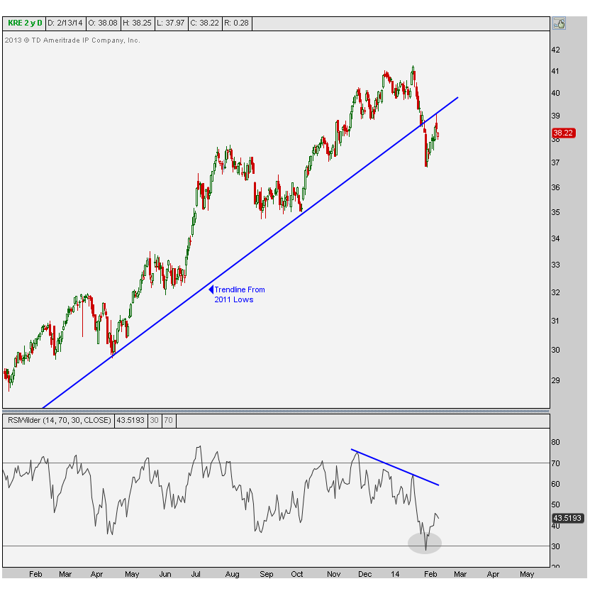
The first chart is shows daily bars for the S&P Regional Banking ETF dating back to the 2011 lows. This trendline has been very consistent in putting an end to short-term corrections. But not this time. Look at the break and subsequent retest and failure at the uptrend line:
Here is a closer look at the same chart but this time with candlesticks. You can see the breakdown in January and this week’s failure. Also notice momentum rolling over at recent highs. This bearish divergence came ahead of the breakdown and now the Relative Strength Index is hitting oversold conditions. That’s not a good thing as this now changes the dynamics of this chart. Oversold conditions are a characteristic of a bear market, not a bull market. Remember, in order get oversold readings, there needs to be an overwhelming amount of sellers. Again, generally a bearish characteristic.
So what does this mean? Well the correlation between regional banks and the overall market is pretty high at +0.95 over the last year and +0.80 over the past month and quarter. So as regional banks go, the S&P500 tends to follow.
In terms of regional banks specifically, this is an underperformer. That can’t be denied. This is a chart of the regional bank index relative to the S&P500. Look how the recent highs were not confirmed by momentum. And now more importantly, on sell-offs we’re seeing oversold readings. Once again, bearish characteristics, not bullish.
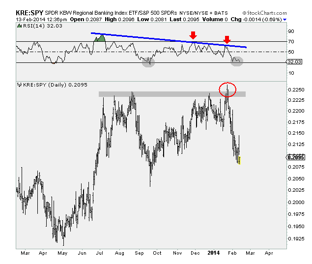
Based on all of the above charts I think for now, the path of least resistance in regional banks is still lower. As always we want to take note of what might change our stance. Personally, I would want to see prices hang on to those early February lows and consolidate through time, building a nice base to launch prices higher. Another positive development would be for prices to recover back above this broken trendline and 50-day moving average. In that case I would be much less inclined to be/stay short KRE.
We’re seeing bearish momentum divergences on the daily chart, we’re seeing bearish momentum divergences on the weekly chart, we’re seeing broken trendlines from 2011 lows as well as from the Spring 2013 lows. In terms of relative strength, again seeing bearish momentum divergences and false breakouts on multiple time frames – both the daily and weekly charts.
So do I want to be long regional banks here? Not a chance. I think for now you can still be selling any strength.
***
REGISTER HERE for information on how to subscribe to Technical Analysis for the rest of the S&P sectors.
Tags: $KRE $SPY
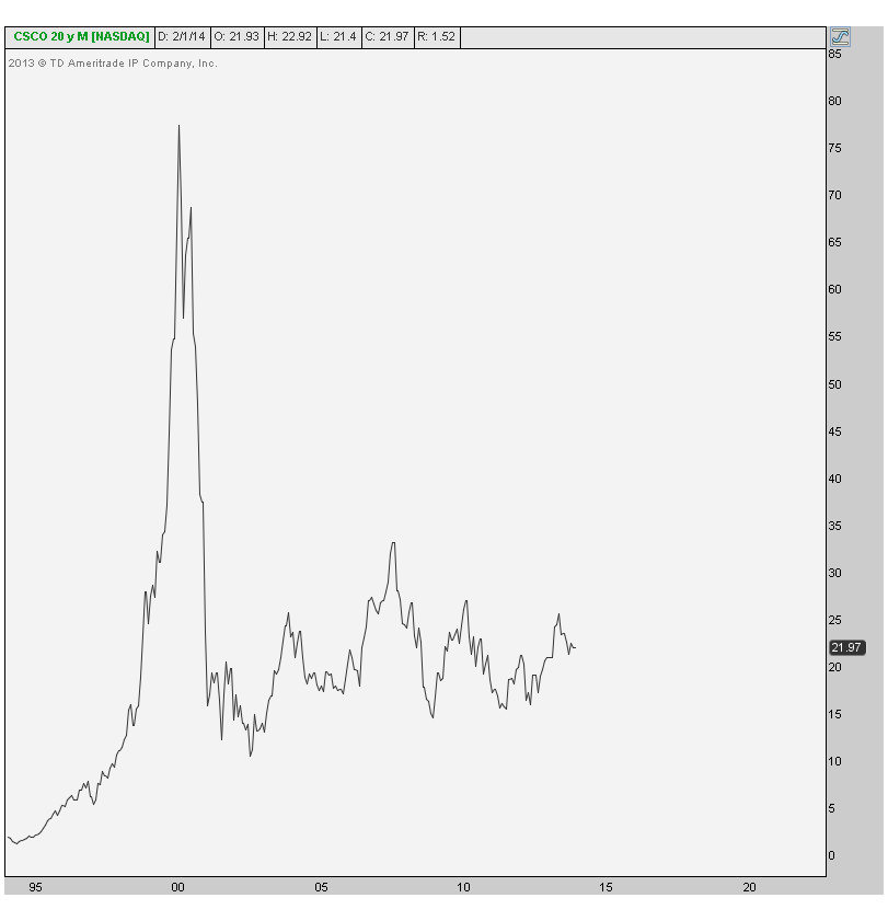
Every earnings season when Cisco reports, we always hear about how it’s a bellwether and a leading indicator for the market’s health and anything else to get people to watch the tv or click on links. But truthfully, the stock is a joke. Has been and continues to be. It’s not a bellwether for anything and doesn’t lead anyone anywhere. But you know, you can’t let the truth get in the way of a good story.
I particularly like the headline, “Cisco Disappoints”. As opposed to what? When haven’t they disappointed?
To start, let’s just put things in perspective. Here is a 20 year monthly chart of Cisco Systems showing the rise and collapse after 2000. Since then, this stock has just been trading around levels from the late 90s and not really doing much relative to what it once was.
The next chart shows the relative strength in Cisco since 2009. After underperforming the S&P500 throughout 2010 & 2011, it has continued to struggle as it hangs out near 13-year lows in relative strength. I can’t help but laugh when they call this one a leading indicator.

Now here is a weekly bar chart showing the downtrend line from the 2007 highs finally being taken out last summer. I like how prices came back and successfully retested this trendline in December. As long as prices stay above $20, I think structurally there is little to be concerned about (other than that epic underperformance mentioned earlier). 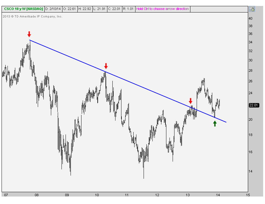
Finally we’re looking short-term at the mess that is Cisco Systems. Look at this disaster. Is this the stock you want to own? I’m no rocket scientist, but I see a chart going from the upper left to the lower right, while most of the stock charts I look at are doing the exact opposite.
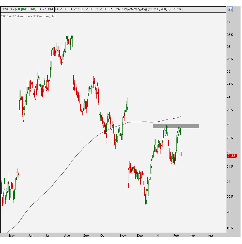
I would need to see prices take out December highs and hold above this rising 200 day moving average in order for me to get excited about this one. Aside from that I see no reason to be involved on the long side. If prices manage to break below the December lows, I think this one is in big big trouble. It would suggest getting aggressively short, both absolute and relative to the S&P500 as the relative chart breaks down below 13-year lows.
Register here if you’re interested in similar analysis for the rest of the Dow 30 components.
Tags: $CSCO $SPY $DJIA