I went down to the floor of the New York Mercantile Exchange this week to look at some commodities charts. In this video we focus on a potential end to this secular bull market in Bonds, a breakout in Cocoa and the downtrend in precious metals.
Check it out:
Tags: $ZB_F $TLT $TNX $CC_F $NIB $GLD $GC_F $SLV $SI_F
That Looks Like a Big Breakdown in India
Today I want to talk about the big underperformance out of India. This region has been getting killed all year down over 22% YTD. But now this week it’s taken took out all of the lows for the year and is sitting at the lowest levels since the Spring of 2009. This is according to the WisdomTree India Earnings Index, which is comprised of companies in India that are profitable and eligible to be purchased by foreign investors.
Here is a daily bar chart of the ETF that tracks this particular index – $EPI. Notice the big breakdown below, and not just this year’s lows, but all of the pivot lows for the last few years:
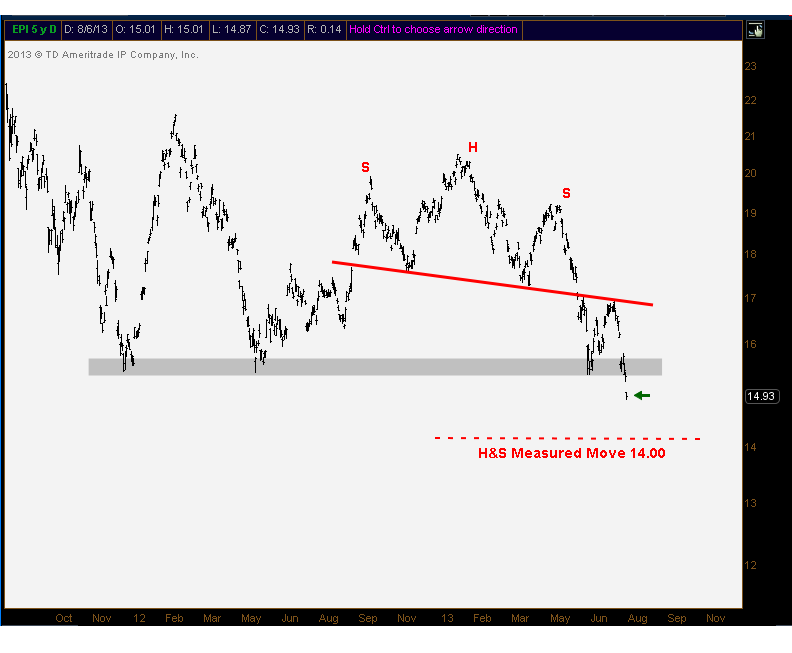
From a measured move perspective, we can see a pretty clear head and shoulders pattern that takes us down to about $14.00. This target is based on the 3.25 difference between the top of the head and the neckline. After that we have a 161.8% fibonacci extension down near $12.00.
As long as prices in India remain below these broken levels, I see no reason to own it. On the short side, the risk management here is to stay in it below the freshly broken support. That’s how I see this one…
Tags: $EPI $PIN $INDY
And You Thought August Was Boring
We’re now heading into the last few weeks of summer. Rumor has it that this might be the best time to take a family vacation or a fishing trip with the boys. The volume throughout markets slows down and the second stringers are usually manning the trading desks right? So is this true? Should we not expect much out of the market in August?
My pal Greg Guenthner put together the charts of the S&P500 in August for the past 4 years. As it turns out, this month isn’t boring at all. And if the last few years are any indication, then we should actually expect plenty of movement:
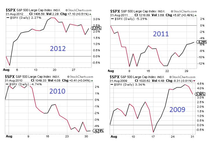
In 2011 for example, S&Ps were down over 12% in the first week and half before ultimately recovering to close the month down just 5%. And in 2009 we saw a 5% rally in the second half of the month alone. So don’t discount August just yet. There is still plenty of opportunity for markets to move around.
Make sure to follow Greg on Stocktwits and Twitter @GregGuenthner
Tags: $SPY $ES_F $SPX
Weekly Market Video With Phil & JC
Dr. Phil and I ripped through a few charts on Friday afternoon.
This week’s discussion revolved around the S&P500 short-term, Russell2000 Long-term, BlackBerry, Peruvian Mines, and the Europe/China pair trade that we’ve looked at before.
Check it out:
Tags: $BVN $SPY $IWM $FEZ $FXI $BBRY
July: The Month That Was
The first month of the 3rd quarter and 2nd half of the year is now in the books. So what happened?
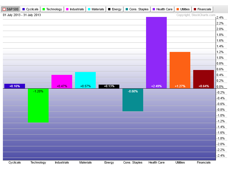
Well, the S&P500 rallied over 5%, Treasury Bonds lost some more ground with the long end down 2.5%, commodities did well with Gold up 7.4% and Crude Oil up 9.3%, but emerging markets lagged once again up just 1.3% for the month. Here in the United States, defense led the way once again as the did in the first quarter.
Here is a chart of the S&P Sectors relative to the S&P500. Look how well healthcare did this month, with Utilities right behind them and Technology lagging the group:
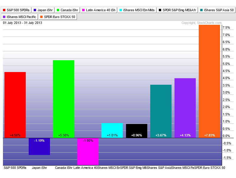
Looking around the globe, it was Europe who led the way this month up 7.8%. Canada finally bounced back nicely with commodities doing well in July. Out in the Pacific, pretty much everything outside of Japan bounced back nicely. And Latin America once again had a down month:
So what’s in store for August? What sectors are going to lead the way? Which ones will struggle? Which asset classes will money flow into as we finish up the summer and get ready for the big leagues in Septemeber?
These are the questions that I think about constantly. What are you guys thinking about?
Tags: $EWC $FEZ $XLV $XLK $SPY $EPP $EWJ $GAF $ILF $EEM $GC_F $CL_F
A Look At Bonds on FOMC Day
Today is FOMC day. You gotta love it.
And I’m not trying to put on any huge bond positions going into this volatility event. But they do look terrible. Yields look like they are consolidating nicely and heading higher. So let’s get right into it.
This is a daily bar chart of the iShares 20+ year Treasury Bond ETF. This just doesn’t look like a bottom to me. I think this thing has another leg lower coming. I currently don’t have a position but probably will before the end of the day/week. A breakdown below this trendline could prove costly for US Treasury Bonds. But I would say that anything above 108.30 is a short-term positive for bonds and reason enough to stay away, at least on the short side:
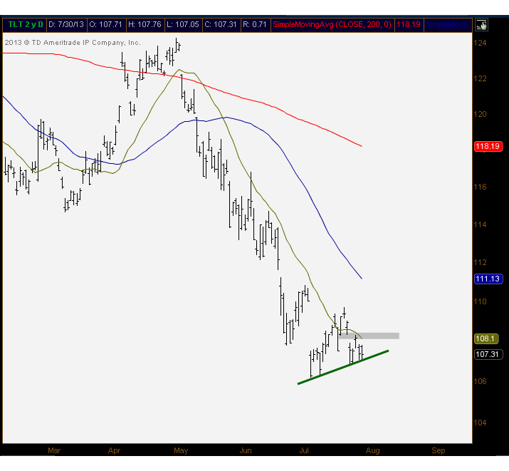
Here are 10-year yields. As we know, yields trade inversely to bond prices. And just like Treasury Bond prices don’t look like a bottom, yields don’t like like a top. They just don’t. Here are 3 sets of higher lows within this month-long consolidation. I would say anything below 2.54% would be short-term negative for yields. But again, this just doesn’t look like a top to me:
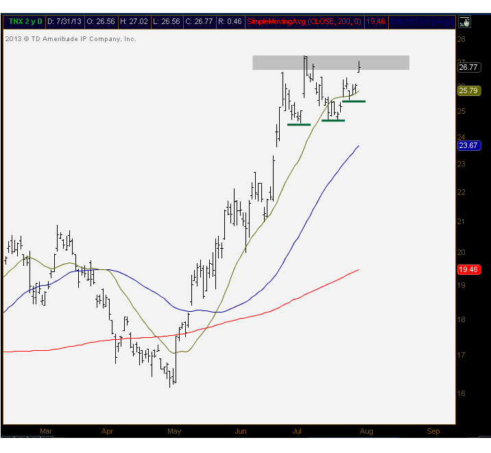
In both charts I included the 20 (yellow), 50 (blue) and 200 (red) day moving averages. The fact that bond prices are below them all and yields are above them all is, of course, negative for bond prices. But what’s even more convincing is the actual slope of these moving averages: rising in yields, declining for prices. This to me is the most important thing: the direction of the averages.
So what would another sell-off in yields do to stocks? That’s a big question that affects us all. Let’s remember last time bonds got hit, stocks with yields: Utilities, REITs, Telecoms, etc all got sold the hardest. Not saying we’re due for a round 2, but something we have to keep in mind.
I’m leaning towards entering the bond market on the short side. But keeping an open mind. I believe that this open-minded mentality should always be encouraged, but especially so in an economic data driven week like this.
Good look out there. Go get em!
Tags: $TLT $TNX $SPY $XLU $IYZ $IYR
Chart of the Day: 13-Year Dow Cycles
As you guys know, I take a look at a lot of charts every day. I mean, I literally look at thousands of charts daily. But this one from Chris Kimble takes the cake as the best chart I’ve seen all week. And by best I mean the most interesting, not necessarily the most bullish.
The first thing you notice is the 13 year cycle of major tops and bottoms that have been put in for the Dow Jones Industrial Average going back to 1974. Currently we’re in the 13th year after a major top was put in during the year 2000. So cyclically, the market is vulnerable according to this chart:
Click chart to embiggen
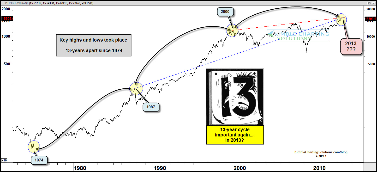
But the two trendlines that go back to the 1987 and 2000 tops are just fascinating.
Make what you will of this chart. Call it a coincidence if you want. But tell me this isn’t the chart of the day?
h/t Chris Kimble
Source:
Tags: $DIA $DJIA $YM_F
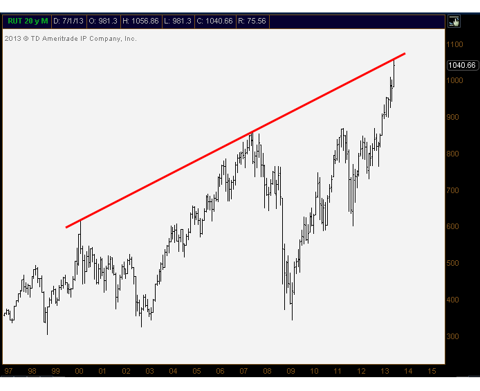
My Colleagues Are Pointing To SmallCaps
Over the last 24 hours, two technicians that I respect very much have come out pointing to the current vulnerability in small-caps. I first brought up some potential resistance two Fridays ago on July 19th. As far as I was concerned, it wasn’t so much the momentum or any breaks in price, but more so the targets that were being achieved. The measured move and key fibonacci extensions were both right here. And as expected, price has stalled. But, to their credit, they haven’t given back any gains either.
Carter Worth of Oppenheimer is pointing to the resistance from the upper trendline connecting peaks throughout recent history. This takes us right to where we are currently in the Russell2000. Every time we’ve reached these levels, prices in small-caps have seen major corrections. Here are the monthly bars in $RUT going back to the 90s:
And then this morning, my pal Jonathan Krinsky over at Miller Tabak wrote about the waning momentum in the Russell2000. He sees a combination of a negative crossover on MACD and a daily RSI that has now turned back below 70:
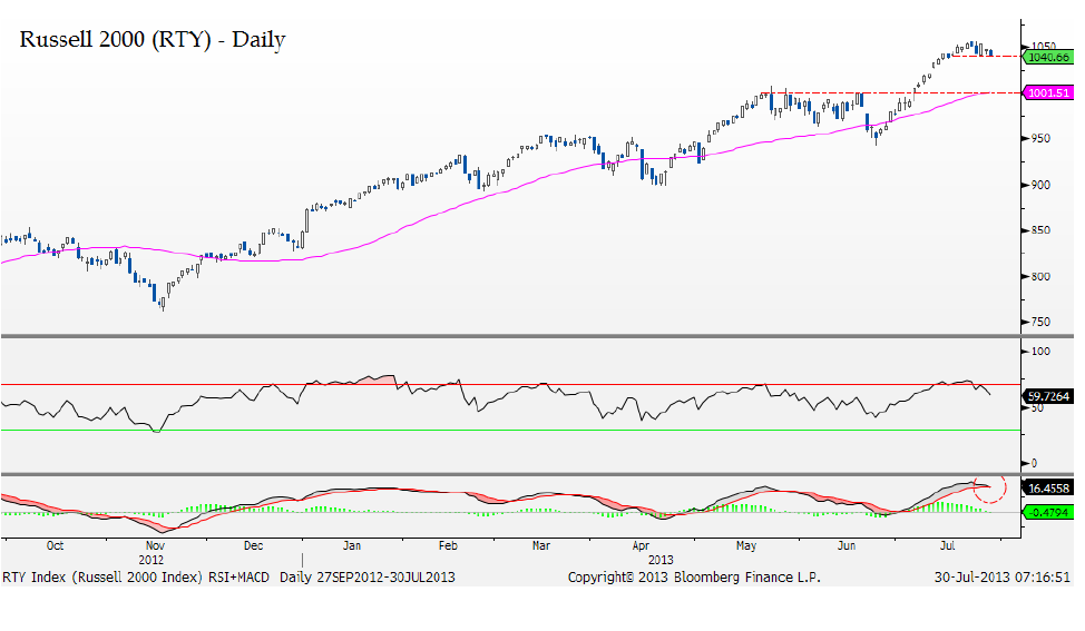
He mentions that none of the support levels of consequence have been breached, but that given this loss of upside momentum, a close below 1035 opens up the door for a retracement down to the breakout level near 1000.
Again, from a pure price perspective, things are still fine. This is a big week of economic data so who knows where we’re sitting on Friday afternoon. But I think it’s important to note that these two guys, whose work I respect very much, are pointing to some red flags in small-caps.
Source:
Downside Risk In Stocks (CNBC)
Morning Technical Perceptive – Jonathan Krinsky (MillerTabak)
Tags: $IWM $RUT $TF_F
- « Previous Page
- 1
- …
- 361
- 362
- 363
- 364
- 365
- …
- 472
- Next Page »