At this year’s New York City Money Show I had the chance to sit down with Rob Booker to talk about process.
Here is the short video:
)
Also see:
MoneyShow Video: Technical Analysis Myths
Source:
Expert technical analysis of financial markets by JC Parets
At this year’s New York City Money Show I had the chance to sit down with Rob Booker to talk about process.
Here is the short video:
)
Also see:
MoneyShow Video: Technical Analysis Myths
Source:
After getting the year started right, Gold miners are digesting their gains in a very healthy way. Coming into the week, the Market Vectors Gold Miners ETF $GDX is up 23% for 2014. The Junior Gold Miners ETF $GDXJ is up 36% this year. We’re talking about just a couple of months here folks. Meanwhile, the S&P500 is up a percent or so for the year. Can you say Alpha?
It’s funny because coming into 2014 I was reading blog post after blog post hating on the performance of Gold. It’s sentiment like this that sparks rallies with these kinds of returns. Remember that.
So going forward, can the gold miners continue this move? I think so. The majority of this year’s gains came over the first 5-6 weeks of 2014. Since then, they’ve been consolidating those gains in a very healthy pattern. Some might call this a flag, some call it a pennant, triangle, etc. Truthfully it doesn’t matter what you call it, it’s the implications that really matter.
Here is a daily candlestick chart of $GDX. Look how well prices are consolidating:
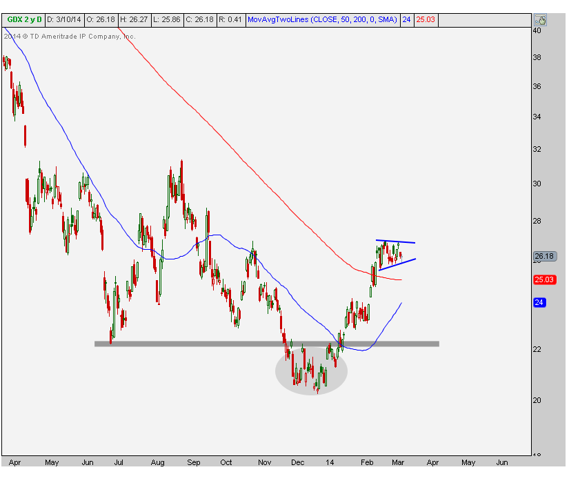
This has allowed the 200 day moving average to flatten out and allowed the 50-day to catch up as well.
Take a look at the weekly chart. Look at the nice bullish divergence in momentum. When prices made new lows in December, the relative strength index was already putting in a higher low and failed to reach any oversold conditions. This was a very positive development.
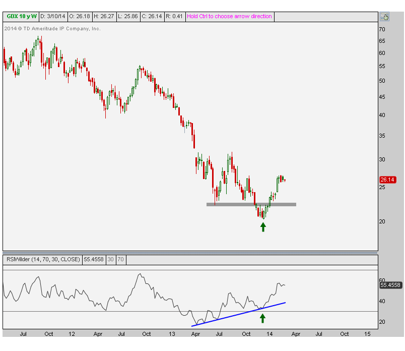
Bullish divergences like this combined with that extreme bearish sentiment mentioned before create violent moves like the one we just saw. After the initial run and healthy consolidation, I expect this uptrend to continue.
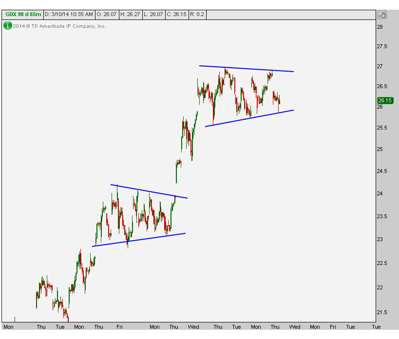
Here is a closer look at this consolidation where we can take a breakout above the upper end of the range as a signal that the uptrend has resumed. The Junior miners look the same, just with higher beta. Here are the 65-minute timeframes:
So far so good in the Gold Miners space. A breakout from this bull flag would be extremely positive. A gap higher out of this pattern would be even more bullish.
Tags: $GDX $GDXJ $GC_F $GLD
Not all commodities are created equal my friends. As great as this space has been all year and as bulled up as I am, Copper is simply not one of them. Down over 10% so far for 2014, what the heck is up with Copper?
The charts actually look a lot like emerging markets. Which isn’t good. The numbers agree as well – the 3 and 4 year correlations are 0.73 and 0.79 between Emerging Markets and Copper (EEM/JJC). That’s pretty high and the charts tell that story well.
Here is a weekly bar chart going back to the lows put in at the end of 2008. After a monster rally, prices started to peak in early 2011, right around the same time that the MSCI Emerging Markets Index made its highs:

We can see a pretty clean descending triangle that has all the makings of a massive break down. We would need to see prices back above the December highs in order to invalidate any bearish thesis. I’m not saying it’s impossible, but from where we sit today, this is the low probability outcome. With this series of lower highs and a flat bottom, a breakdown here seems imminent.
When looking at a daily chart, it’s easy to see why this recent breakdown has been so violent. As the old saying goes, from failed moves come fast ones in the opposite direction. And December’s failed breakout through 2013 resistance was the catalyst necessary to break Copper down below the uptrend line from June.
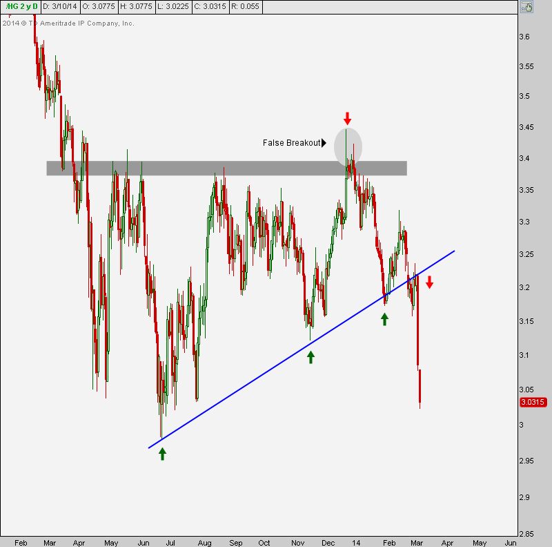
It looks to me, based on both the daily and weekly charts, that multi-year lows are coming in Copper very soon.
Tags: $HG_F $JJC $EEM
On Monday morning we will be emailing everyone who has expressed interest in our weekly technical analysis product. You will get a list of some of my favorite charts from around the world. The charts will be annotated and will include comments on multiple time frames. They will range from US stock market averages (i.e. SPX), to S&P sectors (i.e. XLF), International Market Averages (i.e. FXI), trending names (i.e. JCP), individual Dow components (i.e. CAT), Currency crosses (i.e. GBP/USD) and Commodities (i.e. Gold).
If you’ve already registered look for this email to arrive on Monday morning. If you have yet to register, feel free to do so now.
I will follow up shortly with more details on how to receive this research on a weekly basis going forward. Thanks again for all of the interest you guys have already expressed. More details coming soon, I promise:

My Friend Ari Wald of Wolfe Research brought this one to my attention:
Investopedia.com on Technical Analysis:
In a shopping mall, a fundamental analyst would go to each store, study the product that was being sold, and then decide whether to buy it or not.
By contrast, a technical analyst would sit on a bench in the mall and watch people go into the stores. Disregarding the intrinsic value of the products in the store, the technical analyst’s decision would be based on the patterns or activity of people going into each store.
I like it
Source:
At this year’s New York City Money Show I sat down to chat with Rob Booker about Technical Analysis and some of the myths out there about what we do as technicians.
Here is the short video:
Source:
Happy 5-Year Anniversary U.S. Bull Market
S&P 666 to 1873 in just 5 years
Do you guys remember those days? 2008-2009? The big joke going around the desks the week that the stock market bottomed was that, “Citigroup’s share price was less than their ATM fees”. That’s one that will always stick with me. Shares dropped below a dollar that week before rallying 400% over the next six months. Ironically enough, the stock is actually flat since August of 2009.
Another one that will always stick with me is the key reversal day that we saw in shares of General Electric. This is THE example of a key reversal that I always point to when people ask me. Look at the market participants just puking out of this one the week S&Ps put in their historic bottom.
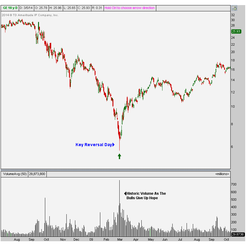
Huge volume on a key reversal day that closed up over 16% off the lows. This is how bottoms are born folks. General Electric closed out 2013 up about 390% from that day’s lows.
There are a lot of stories like this and we can be here forever going over them. But I think what’s probably more valuable is going over some of the leading indicators that pointed to that bottom. Remember the market is forward looking, so it clearly wasn’t the fundamentals. We can start with Sentiment. Everyone KNEW the market was going lower. This wasn’t a secret. We were in trouble. Since then, you’ve just witnessed the power of those extreme sentiment unwinds. Talk about a beauty.
We should also point to the fact that 2009 was the mother of all false breakdowns. Literally, the greatest I’ve ever seen. Look at this weekly candlestick chart of the S&P500 showing the late February break of the 2002 lows. You see this is when all the superlatives come out in the media;
“lowest prices since 1996”, “Worst Decline since…..”. And that’s how bottoms are born:
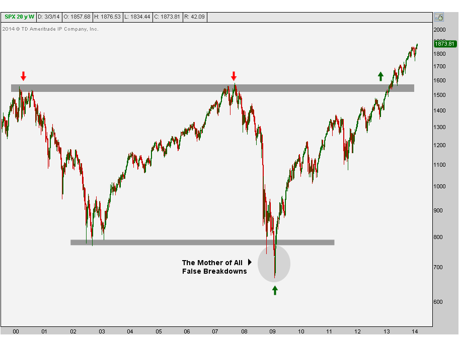
From false moves come fast moves in the opposite direction. In this case, the mother of all false breakdowns caused the fastest move in the opposite direction that we’ve ever seen. The initial rally off the lows broke records. Five years later, we’re still making new historic highs. You want to talk about epic squeezes?
Another favorite chart of mine is the list of NYSE 52-week lows as we approached that bottom. As it turns out, the actual low in terms of individual stocks hitting new lows was back in October. Then at the November lows we saw even fewer NYSE lows. And by the time S&Ps made their historic bottom in March, most of the stocks on the NYSE had already bottomed and begun their epic rally:
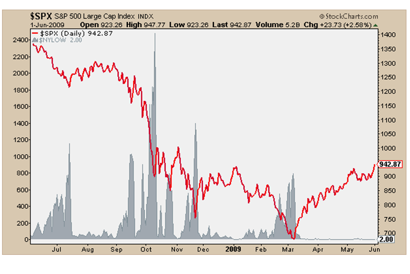
You can see in this chart the red line represents the S&P500 crashing and the gray area chart is the list of new 52-week lows on the NYSE. Do you see the ‘market of stocks’ improving while the headlines kept getting worse and worse on the way down? Awesome right?
You can see a similar bullish divergence in the Consumer Discretionary vs Staples ratio. Look how this very important ratio bottomed out in November, several months before the overall market. Fund managers were already positioning themselves into the more aggressive discretionary space and getting out of the more defensive staples. (please excuse the old charts but they’re well…..old)
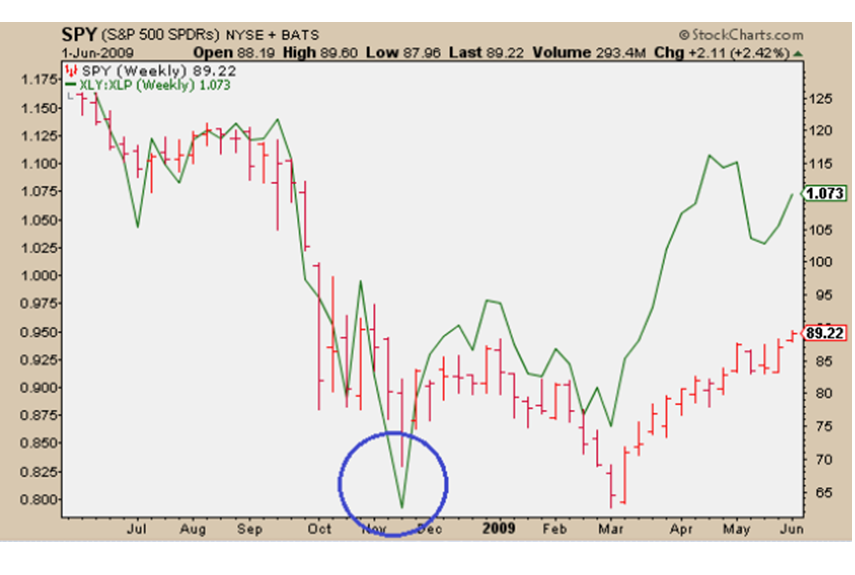
The green line represents the XLY/XLP ratio and S&Ps are in red. You can see the same divergence at the top in 2007. Look at the ratio peaking well before S&Ps:

It should be no surprise that the stocks, sectors, and indexes that bottomed before March 2009 turned out to be the leaders on the way up. Technology is a good example. The XLK bottomed in November of 2008, four months before the rest of the market. These guys led for a while and still seem to be leading the way higher.
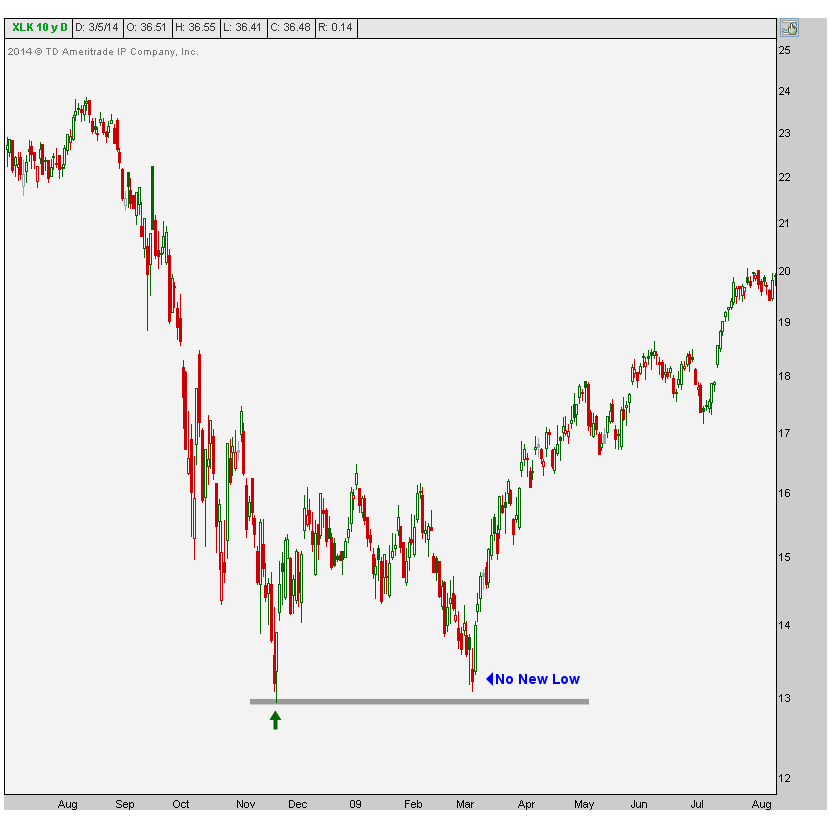
Go back and look at the names that did not make new lows in 2009 and held their Fall ’08 lows. I promise you that those were some of the biggest winners.
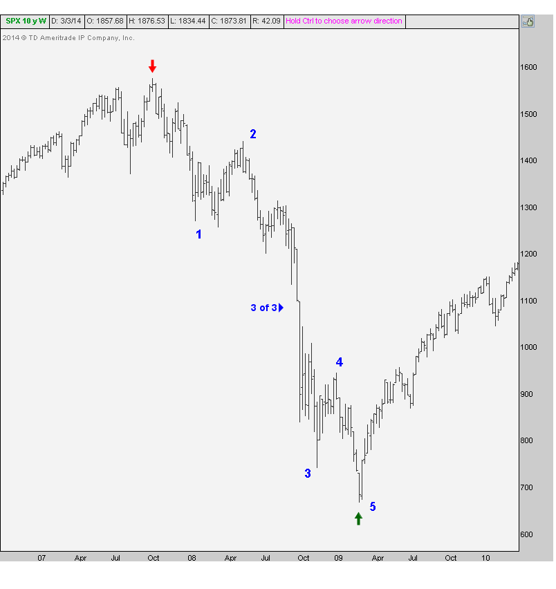
From an Elliott wave perspective, we had a text book 5 waves down. This to me is the best example I may have ever seen of the volatility in “wave 3 of 3”. These tend to be the most violent waves in a major move: we’re talking about the 3rd wave down of the 3rd wave on the larger timeframe. This helps because when you identify this 3 of 3 wave you can work your way backwards and count away from the ultra-violent move:
I would say that a big lesson for all of us is probably that trends can last a lot longer than you think. I don’t care how you feel about a company’s fundamentals because the market doesn’t care what you think. All the way down in 2008 these guys were calling bottoms and ignoring the trend. We’ve seen the same thing on the way up, everyone calling tops. And I don’t mean short-term stuff for a trade, I’m talking cyclical bottom and top calls. Lesson learned: trends trend.
What about you? What have you learned during this historic period in time?
Tags: $GE $C $SPY $XLK $XLY $XLP
On Tuesday afternoon I sat down with Jessica Menton over at International Business Times to talk about what we’re seeing so far in 2014. We know that commodities are the big winners for the year (although very quietly) and US stocks are up slightly. But what about going forward? What do we like best and what should we stay away from?
Here is the video in full:
Source:
Which Asset Classes are the Big Winners & Losers So Far in 2014 (IBTimes)
Tags: $EEM $RSX $XLY $XLP $KC_F $JO $PA_F $PALL $SPY