From the desk of Steve Strazza @Sstrazza
Our Top 10 Charts Report was just published.
In this weekly note, we highlight 10 of the most important charts or themes we’re currently seeing in asset classes around the world.
High Yield Holds The Line
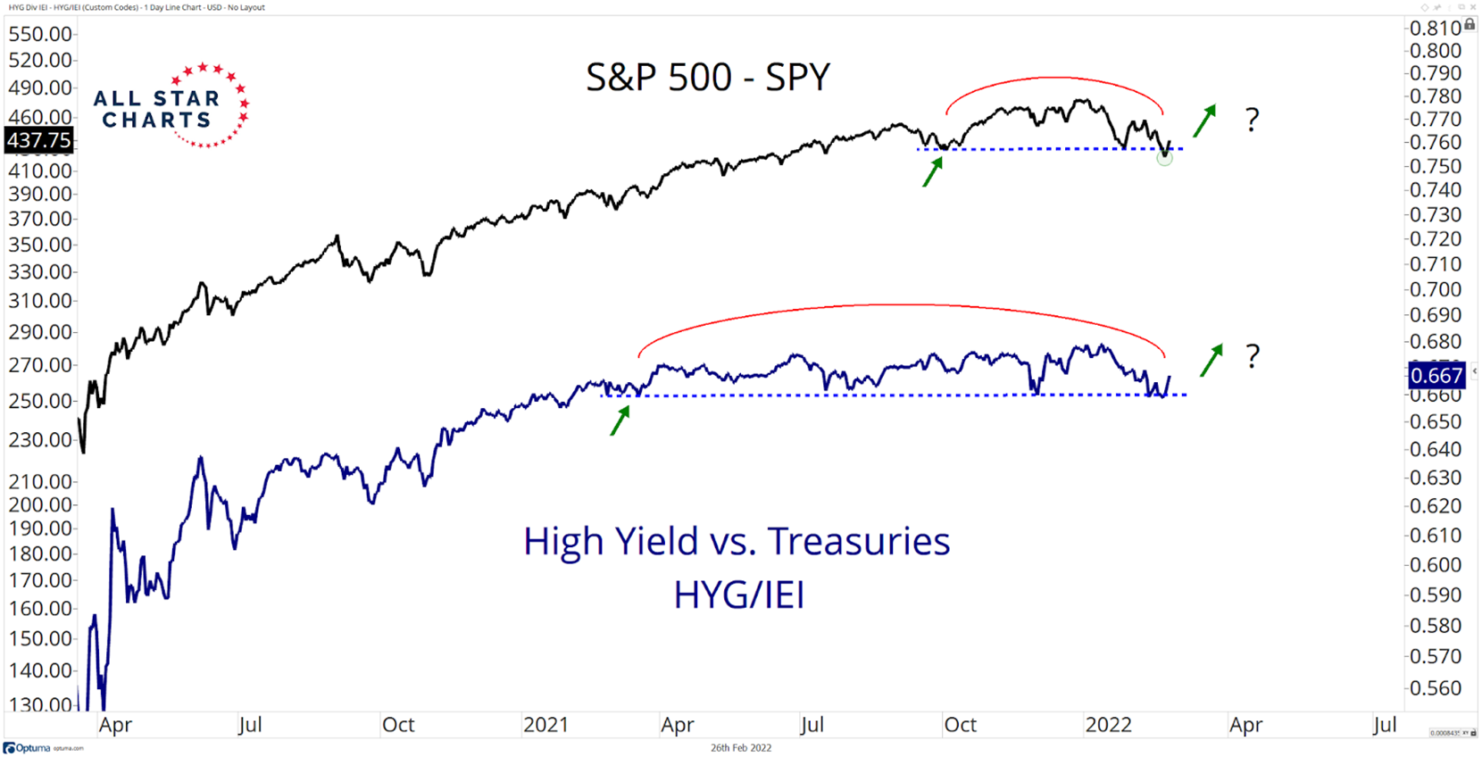
Below is a chart of the S&P 500 overlaid with the High-Yield Bonds versus Treasuries ratio. HYG/IEI is one of our favorite ways to analyze risk appetite. As you can see, the ratio has been building a topping formation since last year and has threatened to violate the lower bounds on many occasions. Last week was no exception as we saw more selling pressure, but ultimately, buyers regained control and successfully defended this level. Seeing this relative trend hold is solid evidence that this is a tradable low for US equities. Falling prices for the HYG/IEI ratio tends to coincide with volatility for risk assets while a rising ratio is normal during bull market environments. Since last year, this ratio hasn’t given us much information as it has been trending sideways in a range. But with so many risk assets resolving lower recently, the fact that it continues to hold its range is one for the bulls and suggests this bout of selling pressure could be coming to an end.
To read the rest of this report, you must be a member of All Star Charts PLUS. Please login below or start your risk-free 30 day trial today.
Lost Password?