When it comes to putting money to work in the market, there is a process behind my decision making that I think is worth discussing. Remember, the market is an always evolving puzzle that we as investors are trying to put together with the many moving pieces that come along the way. Everyone has an opinion, but the market is the ultimate arbiter. Here is how I approach the marketplace.
The first thing that I want to keep in mind is that I have no idea what is going to happen tomorrow, or next week or next year. The good news is that no one else does either. So step one is recognizing the fact that since we can’t predict the future in any given security, taking the weight-of-the-evidence will lead to a higher success rate than simply using single data points or looking at securities on their own without considering what other securities are doing. Therefore, in order to “weigh the evidence”, we need to literally gather all of the data, organize it in a digestible format, and then attempt to come up with a conclusion.
To me, the Top/Down Approach starts with analyzing the Top. In other words, first taking a bird’s eye view of the world. Then we work our way down to individual countries, then sectors and then stocks. Along the way, we want to incorporate the behavior of the commodities markets, like energy, metals and agriculture, to supplement the price action in stocks. After also including the currencies and interest rate markets into this equation, we can then formulate a big picture thesis. Once the thesis has been laid out, then we find the best way to execute and find the appropriate vehicle that fits our specific time frame, risk parameters and overall market goals.
The best way I know to visualize changes in equilibrium between supply and demand is in chart form. This is the reason why I look at so many charts. How else can we analyze those supply and demand dynamics? Multiple timeframes is also a huge advantage in my opinion. We look at weekly timeframes to get a more structural perspective and then work our way down to daily charts for tactical execution purposes.
A Trader should have opinions about different time frames in the same market. When timeframes line up it is time to trade, otherwise watch
– Peter L. Brandt
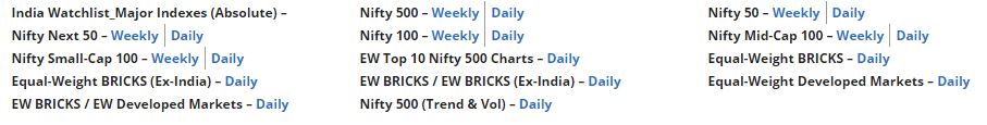
The first group of charts we want to analyze are India’s major indexes. Every time I go through this entire process, which is about once a week, I want to do it in a different order. Sometimes I start with the stocks and then finish with the Indexes. Other times I start with the indexes and work my way down. For purposes of this explanation, we will start with the Indexes and work our way down. I encourage you to change your habits constantly so you can always see things from different perspectives. It makes it a lot harder to miss something important.
Here is my list of Indian Indexes and where our market analysis will begin today:
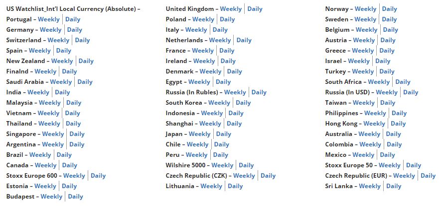
Once we have an idea of the direction of the trends, both long-term and short-term, in India, we want to move on to my list of International Indexes:
At this point, we have a good idea of the long-term direction of both Indian. and Global stock market indexes as well as the shorter-term direction of markets. By going over each of these one by one, we also get a sense of which parts of the world are showing relative strength. We want to ask questions like: Developed or Emerging Markets? Asia, Europe, South America or North America? Where in Europe is the leadership – Germany and France or Italy/Spain/Greece? etc…
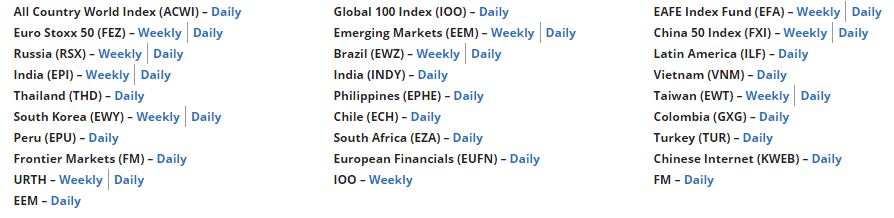
To help supplement the global analysis, I also use a list of US-based ETFs that either incorporate groups of countries or provide data for countries that may not have an ideal index to observe. Here is my list of Global ETFs:
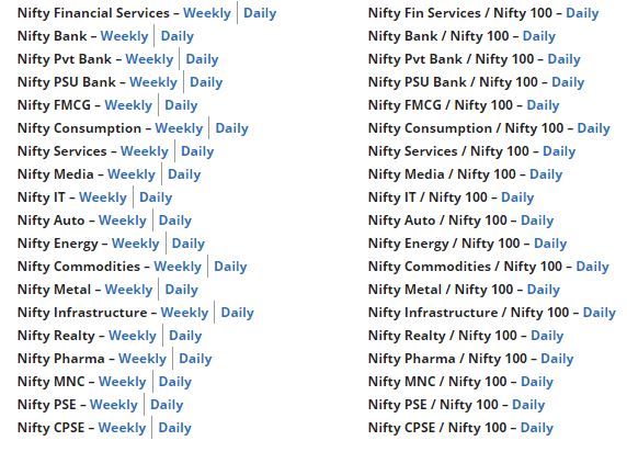
Now that we have a good perspective globally, we want to break things down to the individual sector level. These all of the Nifty Sector & Thematic Indexes. Even if they’re not tradeable vehicles, the information they provide is invaluable to our process. To get a clear picture of where the money is flowing, we look at these indexes on an absolute basis, and relative to the broader market. Here is my list:
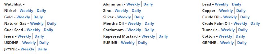
Now that we have the stock market squared away, both in India and abroad we turn to commodities and currencies. This includes energy, metals and Agricultural. Again, we approach all of them using both weekly and daily timeframes:
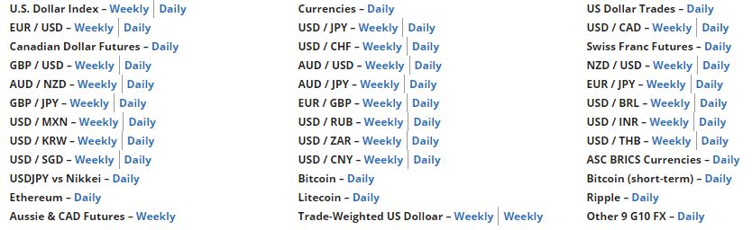
Currencies are what moves markets. The more you’re in this business the faster you learn that. Emerging market stocks tend to move with their countries’ currencies, the U.S. Dollar is very powerful considering how many assets are denominated in USD, and from an intermarket perspective, seeing that money flow is very beneficial. As a result, in addition to the Rupee pairs covered in the section above, we often leverage the work we’re doing for subscribers to our US research to understand what’s happening with the most important currencies all around the world. Here is our list:
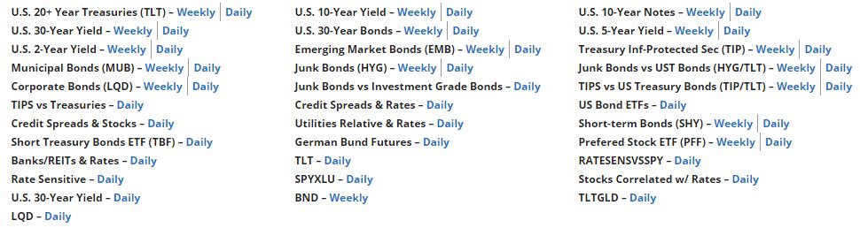
Finally, how do bonds and interest rates fit into this developing thesis of ours? Is the direction of interest rates a headwind or a tailwind for our conclusion? For this section, we leverage the work we’re doing for subscribers to our US research to understand what’s happening with US Treasury Bonds, which are the ultimate safe-haven asset and help set interest rates all around the globe. Here is our list:
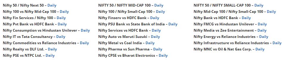
With respect to money flow, intermarket ratios really tell the story. When money leaves one asset, it doesn’t just disappear, it goes somewhere else. These intermarket relationships really help supplement my absolute price analysis:
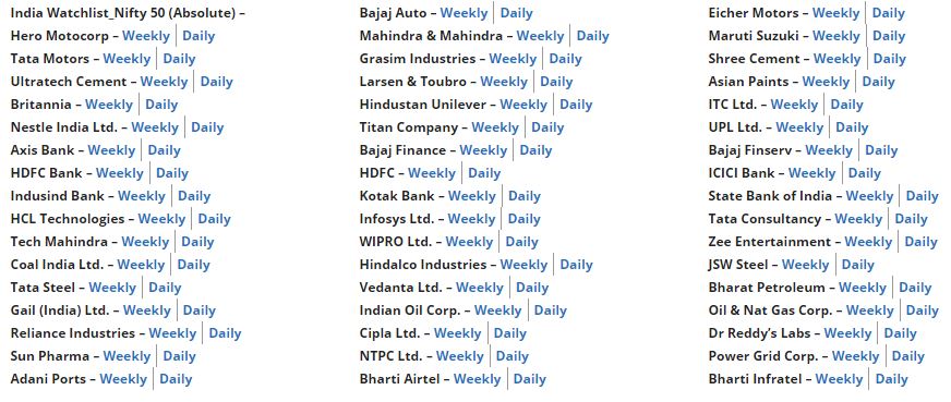
And finally, after all of that, I like to look at a list of individual stocks. Many times, I will start with the stocks and then work my way in the opposite direction as we did here today, move to sectors and finish with the Indexes. It’s always good to mix up the order. For stocks, I like to start with the 50 components of the Nifty and then include an additional list of stocks that I think are important to my top/down approach. By analyzing the 50 components of the Nifty, we can get a feel for which sectors are performing well and which aren’t. And given these are the large-cap stocks that are driving the broader market’s trends we ought to pay close attention.
I do this professionally, so I like to supplement all of this work with a run through the entire list of Nifty 500 stocks (see: Diary of a Charting Session Part 1). The process is simple. I go sector by sector, one at a time, until I’ve analyzed every stock in the Nifty 500 index on both daily and weekly timeframes. That’s over 1000 charts and I do this every week. It serves multiple purposes. First of all, it gives me a deep dive look into each sector. It allows me to look at the sector collectively as a group, but it also gives me the opportunity to see where the relative strength and weakness lies within each sector. So for example, Financials could look great, but looking deeper I might notice that it’s the Non-Bank Financials stocks leading it higher while the Private and PSU Banks struggle. So it’s not just about the sector, it’s about where in the sector do we want to be.
Going through all 500 stocks gives me a huge advantage over those who just look at the index blindly and treat it like it is 1 thing. It’s not, it’s over 500 things. The sooner you recognize this concept, the better of you’ll be. This is a “Market of Stocks”, and not just a “Stock Market”. The Top/Down approach gives us the unique ability to incorporate all markets into our final conclusion. The Nifty 500 does not move up and down based on what is happening in India. The Nifty 500 is driven by forces all over the world. To think otherwise would be naive. Therefore, we need to start by looking around the world until eventually breaking it down to the individual stock level.
Stocks selection is very important. Having the wind behind our backs is an advantage and increases the probability of success. To quote my friend Joe Fahmy:
If you trade the averages you’ll get average returns
Gain Full Access Now