Let’s talk about different types of charts. There are 3 types that I use: Bars, Candlesticks, and Line charts. They each serve a specific purpose and the idea is not to use one kind exclusively but to use them all for what they each bring to the table. You can’t have a football team made up of all fat offensive linemen. You need the skinny fast guys to run and catch the ball while the big guys block for them. Each position helps the team win at the end. It’s the same with different types of charts. Don’t get married to one. Use them together.
Types of Charts
Bar charts are the most common type of chart used in Technical Analysis. Each period is represented by a vertical bar, which as it turns out, is why we call them “Bar Charts” and not because technicians drink too much. If we are looking at weekly charts, each bar represents one week’s price change. The daily chart represents a single day’s price movements. Bars can be used for even longer timeframes like months or even quarters and can be used intraday to represent 30-minute timeframes, 10-minute timeframes, and even 1-minute bars
Bar Charts
Bar Charts (O,H,L,C)
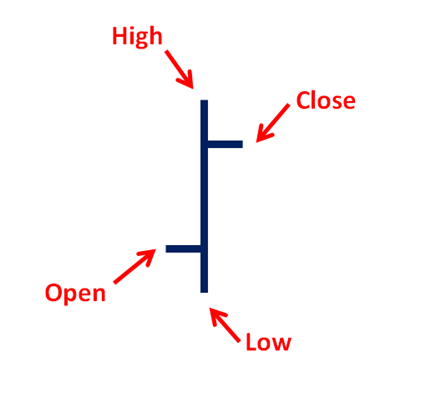
Each bar shows the opening price, the high price for the period, the lowest price and the closing print. Here is what each bar will look like. The opening print is represented by a horizontal line on the left side of the vertical bar. The closing print is represented by a similar line on the right side of the vertical bar. The height of the bar is determined by the movement within the given period. The larger the price change, the longer the vertical bar will appear.
Every week I go through about 3000 charts without any moving averages, without any momentum indicators, and just look at bars. This allows me to analyze just the supply and demand dynamics driving price. It’s amazing what you can see when you get everything else the heck out of the way.
Japanese Candlesticks
These are Japanese candlesticks. They are some of the most beautiful creations seen in nature. Once you understand how to read them, you’ll find them showing up in classic ways at the most important turning points in American history. Here’s a quick explanation:
Japanese Candlesticks
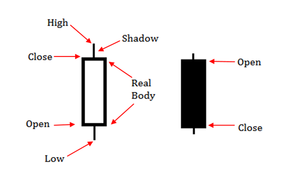
Japanese Candlesticks show the same open, low, high, close just like the bar charts. The difference is in the real bodies, instead of just a vertical bar. The real bodies represent the prices between the open and the close. If the candlestick is hollow, it means that the period closed above the opening print. If the candlestick is filled, like the one on the right, it means that the closing price was below the open price. It looks like a melted candle if you will because it started fresh at the top and melted all day to close at or near the lows.
The vertical lines that stick out above and below the rectangular real bodies are called wicks (or shadows). On daily candlestick charts, these are the intraday highs and lows that were outside of the open and closing prices. The longer the wicks, the bigger and more dramatic the intraday reversal. You’ll often find the longest wicks at or near important turning points in the market.
Depending on your charting platform, you’ll often be able to adjust the color setting for your candlesticks. The difference between green or red (or black or red) should be determined solely by the closing prices, not whether it is filled or hollow. While the filling of a candlestick is based on where the closing price is relative to the open, green candles are when the close is above the previous day’s close and red candles appear when the close is below the previous day’s close.
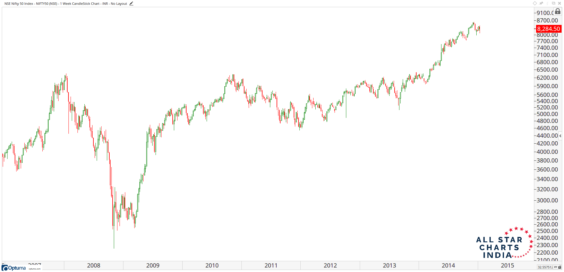
Here is what they look like plotted on a price chart:
Japanese Candlestick Chart Nifty 50 Index
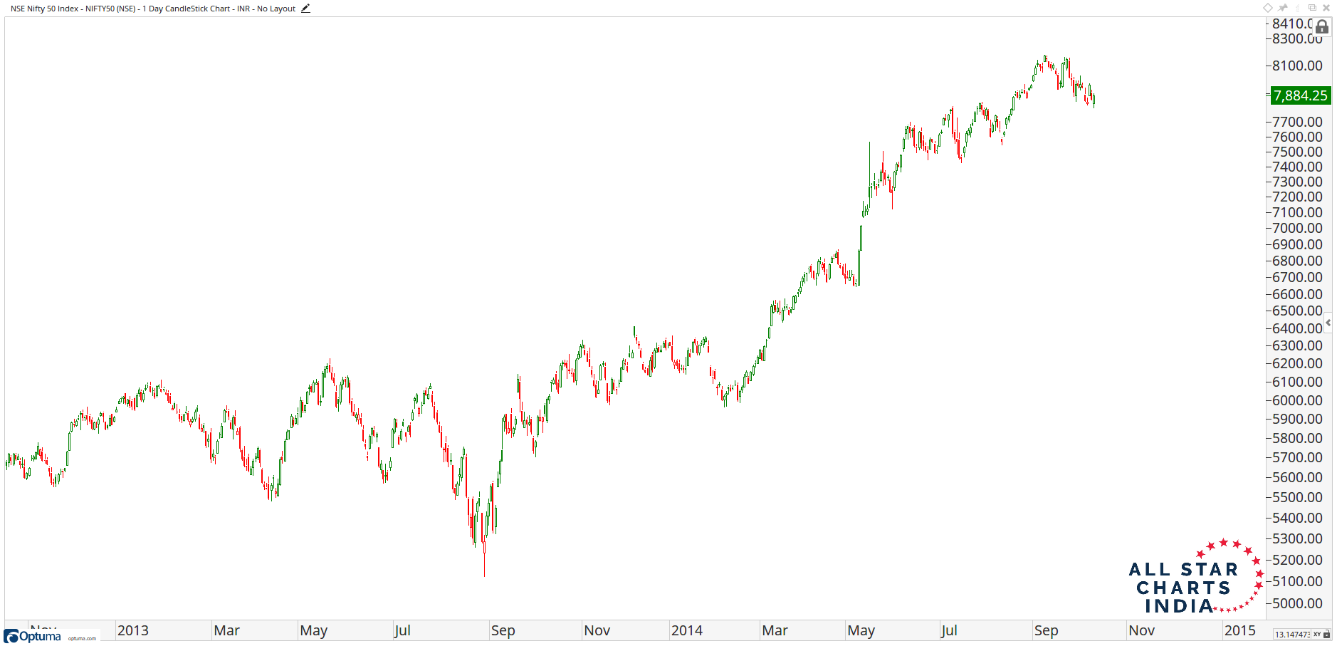
To get a closer look, here is a more zoomed-in look at candlesticks. You can see red filled ones and red hollow ones. You’ll find filled green ones and hollow green ones. You’ll find really long wicks (or shadows) as well as really short ones.
Japanese Candlestick Chart Nifty 50 Index
For more information on Japanese Candlesticks, click here to skip to Module 4.
Line Charts
You’ll notice sometimes you will see gaps between adjacent candlesticks. This is due to the fact that price either opened well enough below the previous low that the gap appears obvious or because prices opened above the prior period’s highs. These gaps appear more often in ETFs and volatile stocks than they do in Futures or Indexes. When you see gaps in either Futures or Indexes, it’s a much bigger deal, especially if they come on weekly charts. Line charts connect only the closing prices for each period so it eliminates this additional noise when you need it to.
Line Chart Nifty 50 Index
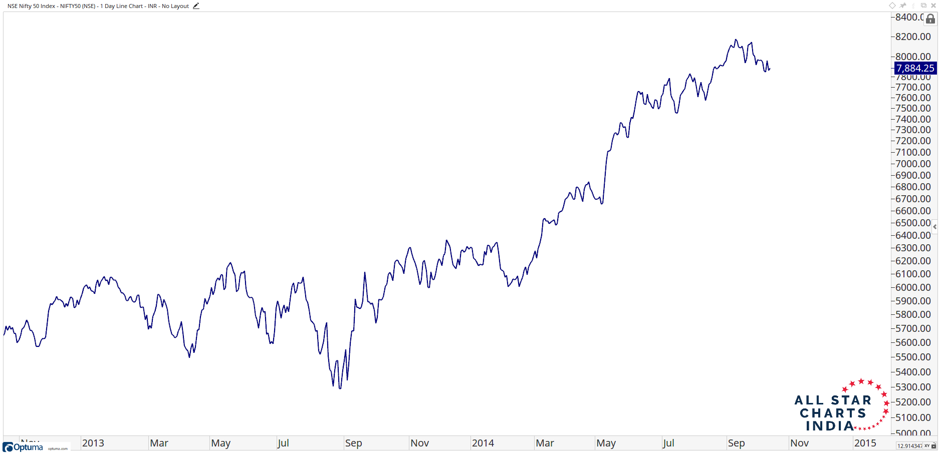
Line charts represent the most important price for each period: the closing price. Let me say that again: THE CLOSING PRICE IS THE MOST IMPORTANT PRICE FOR ANY PERIOD.
Did you catch that?
THE CLOSING PRICE IS WHAT WE ARE MOST CONCERNED WITH!!!!
Charles Dow wrote his tenets down in the Wall Street Journal back in the late 1800s. Dow Theory doesn’t care about the extreme highs and lows within a given day. Dow Theory cares even less about what happens pre-market or in after-hours trading. This is just noise, and those who get paid to make noise, pay the most attention to this stuff. It’s their job to blatantly make up reasons for why something is up or down during the prior few hours, even though they truly have no what the reason may be. For those of us looking to make money in the market, outside of the 0.0001% of the market who are day-traders, recognizing that closing prices are what matters the most is extremely important.
By the time the market closes, 3:30 PM IST (or 4:00 PM IST for the closing session), in the case of Indian stocks, the collective marketplaces around the world have agreed on a final closing price. This is, therefore, the price that we want to pay attention to the most. Line charts represent these most important price changes from period to period, whether we are looking at daily or weekly charts. The larger the timeframe, the more important the close. By 1PM PT in California on a Friday, the entire world’s stock markets have closed for the week. This is my favorite time to do my analysis. All fresh data!
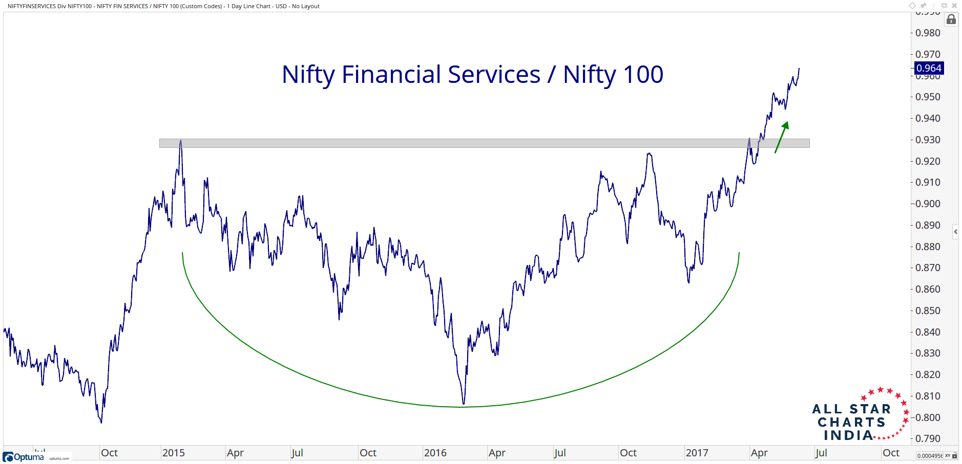
Line charts are also preferred for ratio analysis. Whenever we’re comparing two different assets, we want to use line charts connecting the closing prices for each period. So for example, if we want to see the relative strength in Financials vs the rest of the market’s large-cap stocks, say the Nifty 100, it would look like this. You can see a ratio of one vs the other. When the ratio is rising, it means the numerator, in this case Financials, are outperforming the denominator, which in this case is the Nifty 100. From early 2015 to early 2016 when this ratio was falling, it shows us that the Financial sector was underperforming the rest of the market.
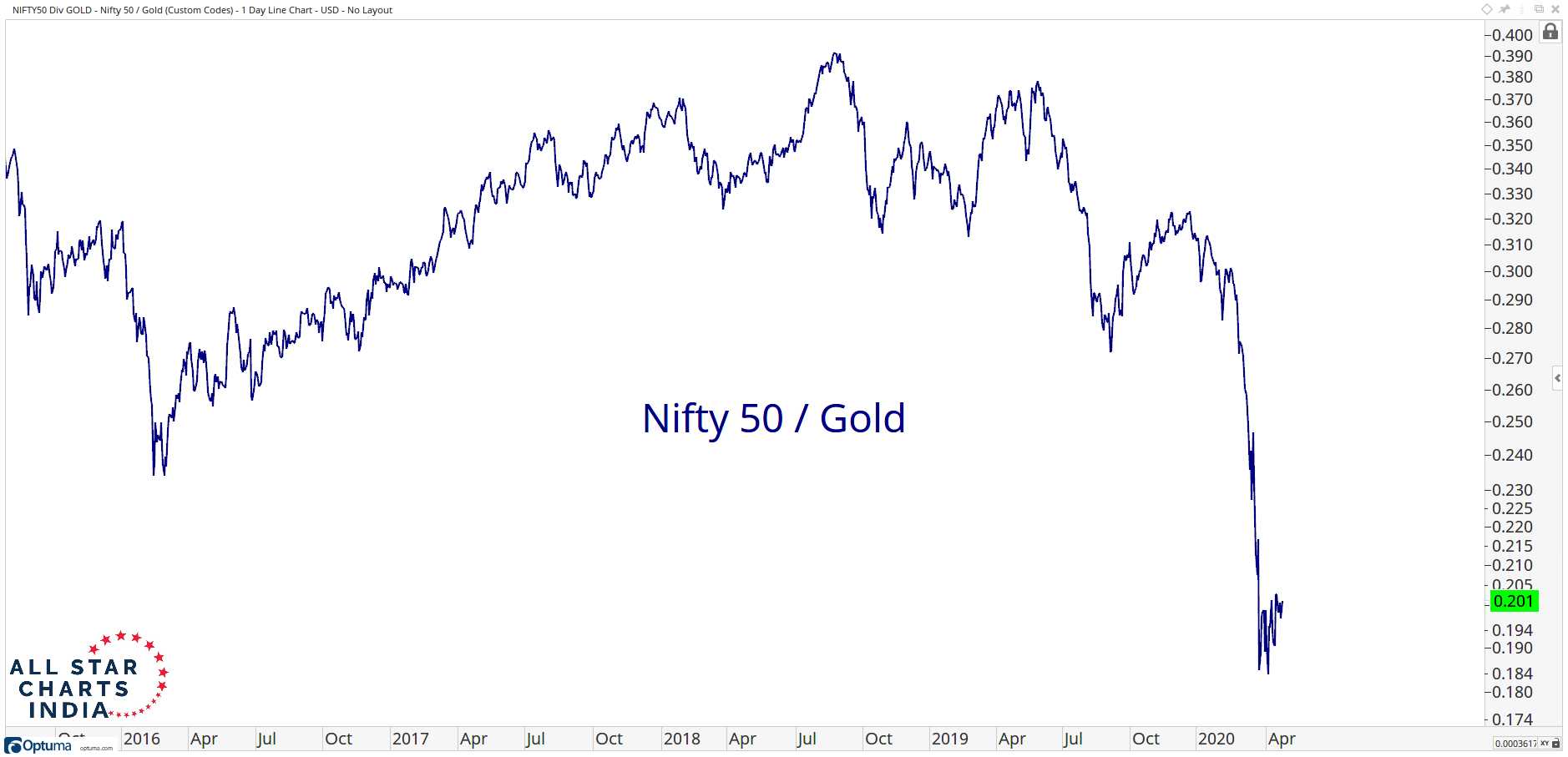
You can use this approach comparing other assets like Indian Equities vs Gold. The point is to quickly be able to identify the trend. In this case, the trend is Equities underperforming Gold since late 2018.
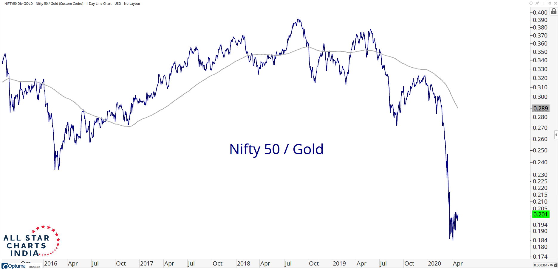
To help identify these trends, I like to use a moving average. This is a smoothing mechanism that supplements price to clear out a lot of the noise. Notice how during the largest extent of the 2019-2020 decline, prices were below a downward-sloping 200 day moving average. The one thing we know based on all of this is that it is not an uptrend.
Moving Averages
Moving averages are just a smoothing mechanism. I prefer to use a 200-period simple moving average. When I say “period”, I mean that when we are looking a chart with daily timeframes, I use a 200-day moving average and when I look at weekly timeframes, I’m using a 200-week moving average. The formula is very easy. You’re adding up the closing prices for the previous 200 periods and then dividing that total by 200. Every time a new period ends, you take the new data point, add it to the equation, and eliminate the data from 200 periods ago. As time goes on, the smoothing mechanism “moves”, which I suppose is why they call it a moving average.
Moving Averages are not for Support and Resistance purposes. Almost consider it an invisible line. We only use it as a supplement price when identifying price trends.
We go into more detail about Moving Averages in Module 4.
Indicator Windows
I’ll use additional windows in my charts primarily for 4 reasons: Relative Strength Analysis, Momentum Readings, Correlations and Breadth Analysis. If you have some kind of custom indicator that you’ve built, this is where it would likely be plotted. With improvements in technology I’m seeing more and more indicators plotted directly on the price scale itself. I’m personally not a fan of all that clutter. I would prefer a single indicator below and if I need to see something else then I’ll just create another chart. Don’t be lazy!
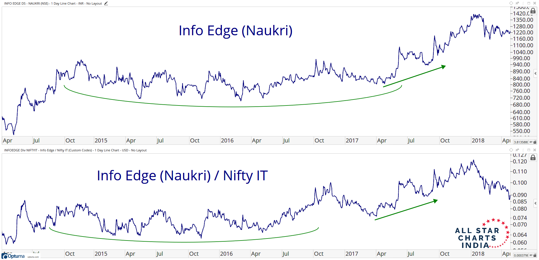
Relative Strength
Here you can see a chart of Info Edge (Naukri) breaking out in mid-2017. Plotted in the window below the price window is the relative strength of Info Edge (Naukri) vs the Nifty IT Index also breaking out. We get powerful signals when both happen simultaneously.
Momentum
Here you can see the Nifty 50 in late 2011 with momentum plotted in the window below. This is another window that you’ll often find in my charts. In this case, we’re looking at momentum putting in a bullish divergence in at the late 2011 lows. This was a warning of a change in trend, and sure enough, a few months later the Nifty 50 saw an epic rally into the first few months of 2012.
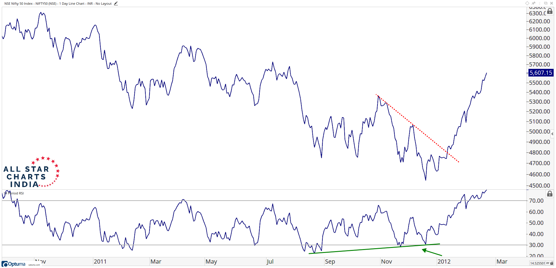
For momentum I use a Relative Strength Index, it’s an RSI. I prefer 14-periods. When I say Relative Strength Index, I don’t mean Relative Strength which is one security relative to another. In the case of the RSI, we’re referring to a momentum oscillator. In reference to Periods, we use 14 weeks for weekly charts and 14 days for daily charts. The RSI moves from 0 to 100, which means that it is an oscillator.
We go into more detail about momentum in Module 4.
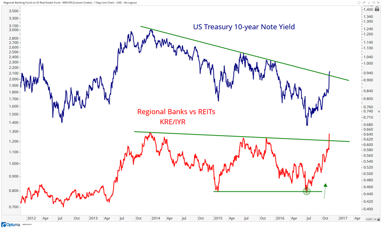
Correlation Analysis
The 3rd way that I use an additional window is for correlation analysis. When certain assets move together with others, you’ll often see one move before the other. This intermarket analysis really helps to understand how money is flowing. I use it consistently throughout my entire process. Here we’re looking at a chart of US Interest Rates at the top and then at the bottom is a ratio of US Regional Banks vs Real Estate Investment Trusts. As you can see, the two move very closely together. Regional Banks benefit from higher rates while REITs become a nice alternative to bonds if rates are falling. So the ratio between the two is a good indication of where the market thinks rates are going. You can see them breaking out simultaneously in early November of 2016
Breadth
Finally, breadth is another important aspect of the weight-of-the-evidence approach. With new highs in the indexes, we want to see an expansion of stocks participating to the upside making new highs as well. When fewer stocks are participating to the upside while the indexes make new highs, this divergence suggests the market breadth is thinning and fewer stocks are leading to the upside. This is the beginning of the end for market trends. Here is an example of a positive breadth divergence in the Nifty 500 in early 2016.
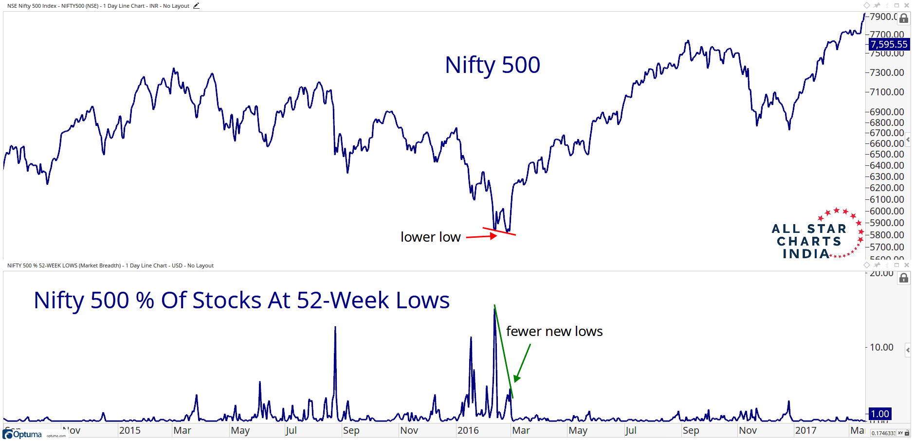
Prices made new lows in late February 2016, but far fewer stocks were participating to the downside than just a few weeks earlier. Once prices reversed and got back above the initial price low from early February, we received confirmation that a potential trend change was underway and that our risk was well-defined on the long side.
I also like to compare momentum of breadth. In other words, when prices make new lows and fewer stocks participate with downside momentum characteristics, that is a positive catalyst. Here is the Nifty 500 during the same 2016 period.
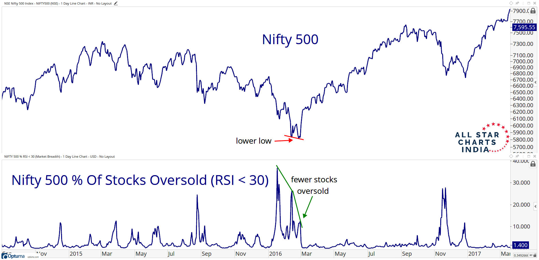
You can see that the real low was made in early February. This was the bottom in the “market of stocks” when the most amount of stocks hit oversold conditions. The point is that we can use these charts to help visualize the changes in supply and demand dynamics.
Volume
So far we’ve paid the most attention to price. By now you may have noticed that I don’t use any volume on my charts. In some circles, this might be considered blasphemy. To that, I’ll say this: I think we can all agree that price is what pays. In fact, it is the only thing that pays. Therefore, by definition, volume is only a supplement to price itself. Again, we can all agree that there are many other supplements to price, like momentum, pattern recognition, sentiment, intermarket analysis, etc. But we don’t necessarily have to agree in which particular order of relevance these indicators should be put in, only that they are all a far second to price behavior itself.
I only use volume to check for liquidity. In my case, I deal with the most liquid markets in the world, stocks, ETFs, futures, and options, so I really only need to worry in some ETFs and in some options contracts. But for the most part, I’m good with respect to volume. I’m not managing $100 Billion dollars yet. I look forward to having that problem when I get there.
Also, on that note, I also think that volume can be seen elsewhere, not just in the stock. We often see huge trades going off in the options market that represents exponentially more in exposure, leverage, and risk. This isn’t seen in stocks. So when Charles Dow wrote his tenets down in the Wall Street Journal in the 1880s, they didn’t have options contracts. The futures markets also weren’t what they are today, where you can leverage a fortune in S&P futures and hedge your portfolio, or leverage it in one direction.
In India and other developing countries where the Financial System isn’t as robust, the case for volume is stronger given that all trades are still made through the exchange and not “off-market” in dark pools and other vehicles. And while derivatives are very prominent in India, there aren’t as many to track and measure, so it’s more manageable than somewhere like the US where there are tens of thousands of products available for trading.
Clean Charts
Finally, I want to be clear that we want to have our charts nice and clean. Have some respect for yourself and your work. My friend Howard Lindzon calls what we do “Chart Art”. We’ve created a visual representation of supply and demand. Let’s keep the focus on what we’re trying to accomplish here and not include extra distractions like too many moving average or indicators.
This would be appropriate, for example:
Or something like this where we’re comparing a couple of assets:
This is NOT the look we’re going for:
Or even something like this is way too much:

We’re looking for something like this. Much more reasonable:
Take pride in your work. Keep your charts clean!
For my charting software, over the years I’ve used Stockcharts.com, Bloomberg, Tradestation, and Thinkorswim. I have to say that Optuma is my favorite charting software by a long shot. Nothing even competes.
How Many Monitors Do You Really Need?
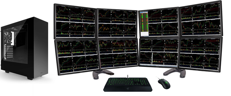
Respect your workstation and more importantly, respect yourself. Having more monitors doesn’t necessarily make you a better trader. Having more monitors does not make you look cool. There are laws of diminishing returns in monitor collections. Not only does having too many monitors not help you, but there comes a point where it actually hurts you. Understand that your thought process has limitations. Focus on one chart at a time. Even two charts, a weekly and a daily for example, could work. But is this really necessary?
Do you need this many monitors to get the information you are looking for from the market?
Are you trying to launch a rocket ship into space?
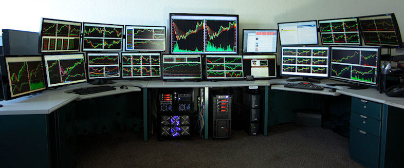
Less is more. Keep it simple stupid. We want to focus on one thing that is in front of us. If we need to do that thousands of times a week (I do), that’s fine. But is it necessary to have to look at 50 charts at the same time, at all times??
This is more of what we’re going for:

Or some kind of standup desk. I love these.

Even something like this works well if you need a 3rd monitor:
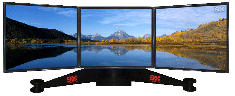
I’m a 2 monitor guy. Have been for a long time. I’ve tried to avoid that 3rd monitor as long as I can remember. I’ve thought about it and purposely found ways to work around it. I’m a firm believer that we want fewer distractions.
We want to keep our charts clean and simple so that they’re easy to understand. Our workspaces should be no different. Less is more. We want to be eliminating noise, not adding to it.
Gain Full Access Now