Carl Richards over at BehaviorGap creates a weekly napkin sketch that, as he says, “Make complex financial concepts Sharpie-simple”. I hope this gives you some food for thought going into the weekend:

Sources:
Expert technical analysis of financial markets by JC Parets
Carl Richards over at BehaviorGap creates a weekly napkin sketch that, as he says, “Make complex financial concepts Sharpie-simple”. I hope this gives you some food for thought going into the weekend:
Sources:
Jordan Roy-Byrne, CMT on Downside Targets for Silver (PragCap)
More than One Outcome from a Divergence (DerekHernquist)
Taking Shelter, Markets are Primed for Large Bull-Trap (Market Anthropology)
Move the Senior Index and the Rest will Follow (DynamicHedge)
May Begins the “Worst 6 Months” for the Dow and S&P (StockTradersAlmanac)
Chris Kimble on the Fallign Channel in Bond Yields (dShort)
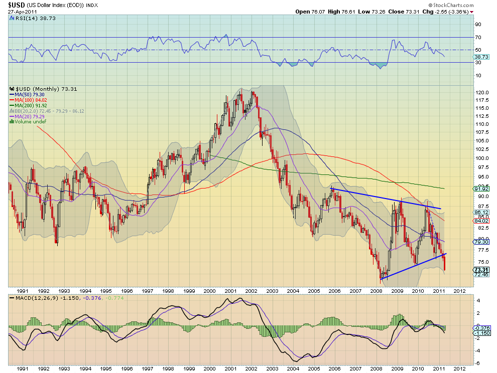
The US Dollar looks Ominous from a Technical Perspective (ChartsandCoffee)
Doug Short – The S&P500 closed the day up 0.36% to yet another new interim high. The index is 101.1% above the March 9 2009 closing low — a full doubling of the price at the bottom. It is 13.1% below the nominal all-time high of October 2007.

Related Posts:
Alright guys. Enough is enough already. The question that we need to be asking ourselves is NOT whether we think Gold is going higher in Dollar terms. It is a worthless academic exercise to keep coming up with ridiculous price targets for Gold. Do I hear $2,000? $3,000? I heard yesterday, someone say $5,000. What is the point? Might as well make it a Million.
In case you didn’t get the memo, the value of the US Dollar has been going down for a decade. Gold is priced in US Dollars, $1530 US Dollars per ounce last I checked. But if the denominator (in this case the Dollar) keeps losing value, then of course the numerator in the ratio will continue to accelerate higher (Gold in this case). Same thing with Stocks, valued in US Dollars. Sure the Dow Industrial Average is making new highs, but relative to what? The Dollar? Oh terrific.
What I think is more important, and more relevant, is to use Gold here as the Denominator. Ben Bernanke cannot create Gold Bars. He can’t just pull the lever (See TRB) and create more Gold. So let’s look at Real Prices here – Stocks vs Gold. We’ll use the Dow Jones Industrial average to keep our usual ‘Keep it Simple’ Mantra.
In 1980, One share of the Dow Jones Industrial Average bought you One ounce of Gold, about $800. This was a 1:1 Dow:Gold Ratio. What too many people are forgetting is that over the next 20 years, this is the ratio that exploded. By the turn of the century, 20 years later, One share of the Dow bought you 44 Ounces of Gold. The 1:1 ratio in 1980 got to 44:1 by 1999. THAT is the bubble that popped at the turn of the century that you don’t hear people talking about. Why not? I have no idea. Peter Schiff has been all over this for a while.

Right now this ratio is sitting around 8:1. In other words, One share of the Dow only buys you 8 ounces of Gold. This is much lower than the 44:1 in 1999. The trend here is clear. Stocks are buying less and less Gold as time is going on. Historically speaking, trends in this ratio don’t last for weeks or months or even years, they last for decades. And based on just price action alone, there is zero evidence of this trend completely reversing and begin heading higher. In fact, all signs are pointing towards getting closer to that 1:1 ratio. We don’t want to make ridiculous predictions here, like our Gold to $5,000 buddies. But it is important to recognize that this is a big and powerful trend that currently in place. It cannot be denied. Ignore it if you want. But I think you’re doing yourself a huge disservice by dismissing it.

This is a closer look at this ratio. RSI still bearish. No signs of a reversal. That declining 200 week moving average is like having Ray Lewis sitting there waiting to crush you the minute you cross that line of scrimmage (See Here in case you don’t know). Yes watch the Stock Market. But just remember that if you price stocks in something that keeps losing value because of Government intervention, you’re ignoring a critical factor. Watch the Dow/Gold ratio. It’s an important one and it’s trending lower until further notice.
Related Posts:
https://allstarcharts.com/media-breakout-on-yahoo-finance/
https://allstarcharts.com/gold-prices-inflation-adjusted/
Historic Dow/Gold Chart courtesy of www.thechartstore.com
I really had a great time this morning being a guest on my favorite new show.
Breakout on Yahoo! Finance.
Here’s the segment on US Equities and Sector Rotation:
Source:
Y! Finance – Breakout April 26, 2011
http://finance.yahoo.com/blogs/breakout/bull-market-fight-left-chartist-184215769.html#more-1761
Also See:
This morning I had the pleasure to be a guest on my favorite new show:
Breakout on Yahoo Finance
Source:
Y! Finance – Breakout April 26, 2011
http://finance.yahoo.com/blogs/breakout/don-t-sell-silver-yet-uptrend-intact-chartist-150216010.html#more-id
With Lumber prices getting destroyed, one thing comes to mind: Homebuilders. If there’s demand for new homes, you’re going to need some lumber. If there is less demand for new home construction, you are going to need less lumber. Plain and simple. We also use Lumber Prices as a heads up for moves in Treasury Bond Prices (but that’s for another day). Let’s take a look at $XHB:

Lumber prices are down 30% per board feet in just one month. This comes at a time when the S&P Homebuilders Index ETF closed at the highest levels in almost a year. $XHB closed at $18.82 both Wednesday and Thursday. We’re going to watch this closely for any false moves because both these new highs came on disappointing intraday action and non-existent volume. RSI has held in Bullish mode, for now, so that’s one positive.

The problem lies in the components. With the ETF making new highs, none of the usual suspects are participating. Toll Brothers ($TOL), Lennar Corp ($LEN), KB Homes ($KBH), Pulte Group ($PHM), and MDC Corp ($MDC) are all well below their Year-to-date highs. What seems to be the problem? Are Lumber prices warning us that something is wrong with this group? Is the lack of participation from the Homebuilding stocks confirming the lumber warning? A 30% hit in a month gives us reason to watch closely. The mixed signals and lack of component confirmation makes me worried.


Once or twice a week I put together a linkfest with some of the best charting and technical analysis being done throughout the main stream and social media. We are literally….
“ Spanning the globe to bring you the constant variety of Charts… the thrill of victory… and the agony of defeat… the human drama of Capital Market Competition… This is Wide World of Charts! ”
This week marks the 50th anniversary of ABC’s Wide World of Sports. The precursor to ESPN. Believe it or not, the show was the first to air coverage of Wimbledon, The Indianapolis 500, NCAA Men’s Basketball Championship, the Daytona 500, Little League World Series, Triple Crown, the US Open Championship, and many more sporting events that had not reached the living room. Announcers that were featured ranged from Howard Cosell and Al Michaels to Mickey Mantle and Reggie Jackson. They really were ahead of their time.
No matter how hard I try, I don’t think that I’ll ever be able to make the impact on the charting community that Wide World of Sports was able to make on sports fans. But at least I have something to strive for.