The market has been messy for a while and we’ve been reiterating that point for some time now. There are no new signals in terms of a direction, but we thought this is a good time to look at our risk metrics.
When we go through the metrics, we are essentially trying to put them in three buckets. Positive, Negative, and Neutral. Going by the weight of the evidence, we decide which way to go. Leave it all to the charts, they’re your map for this treasure hunt.
There are several different metrics that we track on a global and a local level. The goal is to identify whether we are risk-on, risk-off, or waiting. This translates to how liquid one’s portfolio could be at a given point.
Index view:
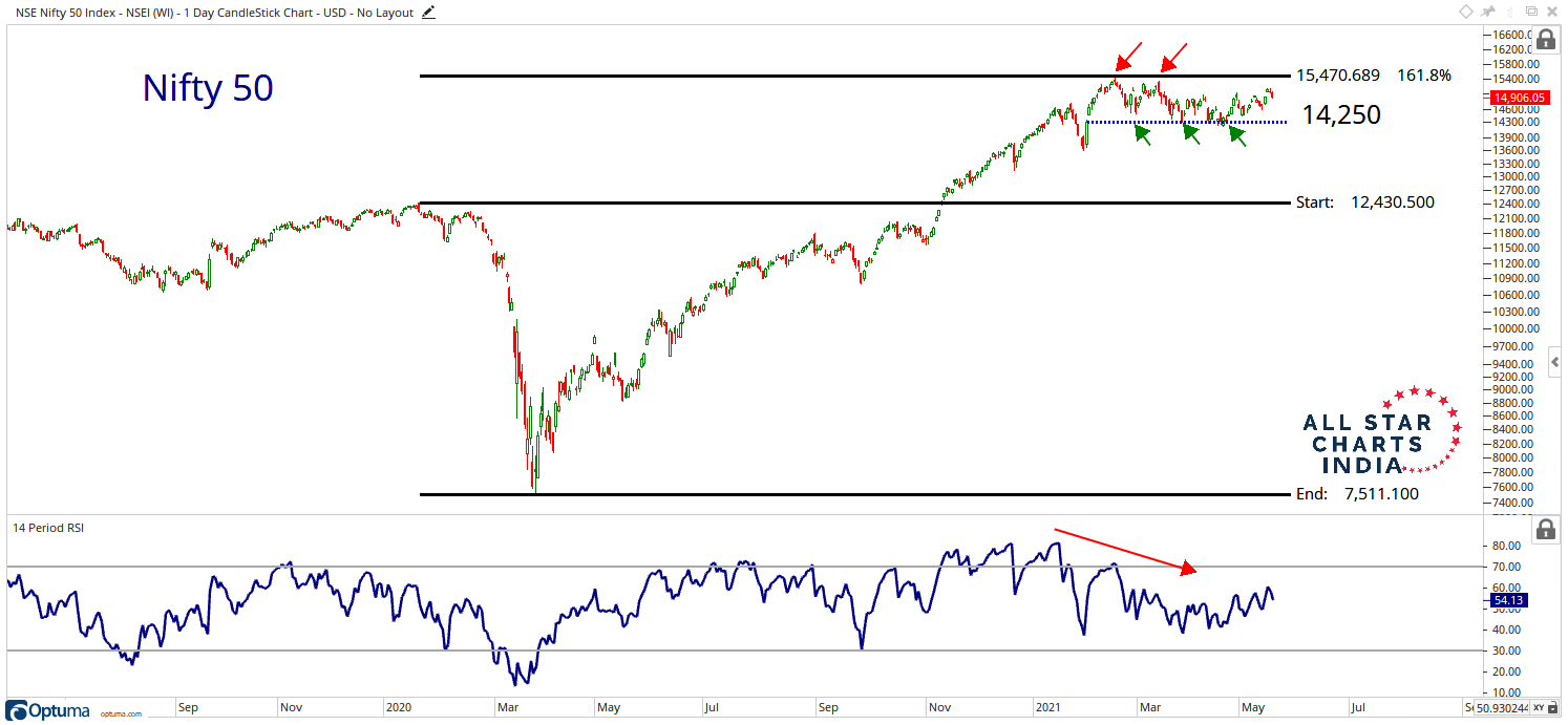
First up, let’s take a look at what Nifty 50 is up to. We can see that since February this year, the market has been consolidating. This move has been limited between 15,470 and 14,250. What we also noticed early on was the divergence in the indicator. Momentum was losing steam despite price making new highs. That acts as an early signal of a possible change in momentum. Keep in mind, it is not the sole signal to track.
The levels that we’re tracking now are pretty straightforward. We’re looking for a breakout above 15,470 for a resumption in the ongoing trend. On the downside, we’re keenly watching 14,250 to see if this level holds as the price movement continues to play out. So far, it’s done a good job. Will that continue? We’ll just have to wait and watch.
Click on chart to enlarge view.
Global Indicators:
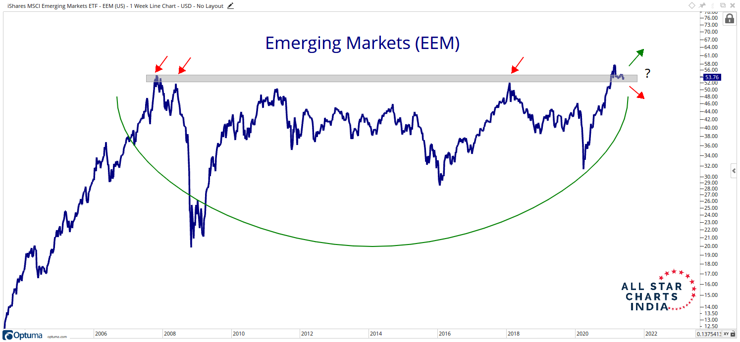
The first metric that we will look at is the Emerging Markets ETF (EEM). This gives us a general direction of the emerging markets, of which India is a part. The long-term base breakout that we had observed in February this year seems to be giving away. The price is witnessing a minor correction. What we want to observe is whether this a short-term phenomenon or a failed breakout.
From a tactical perspective, this could just be a pause in the trend. But one thing is for sure, if the market is to resume higher, this chart must too. We are keeping a close watch on this one. If this does rollover, then we’re in for a market correction.
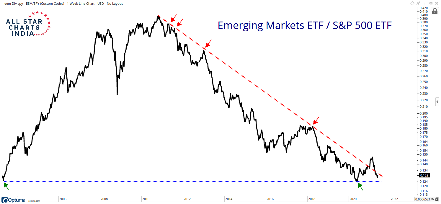
Next up, we take a look at EEM relative to S&P 500. When the market recovered from the brutal correction in March 2020, we saw signs of a recovery in this ratio as well. Notice how the ratio bounced from the same level as that in 2003. Post that, emerging markets witnessed a monster rally! Since 2010 however, the sentiment has been negative, to say the least.
We saw a breakout of the downward sloping trendline in December 2020 as markets across the globe participated in the rally with gusto. But the ratio is now back below the downward sloping trendline and that does not bode too well for the economies in question.
If this ratio manages to display signs of recovery, we may see a robust rally in the weeks and months ahead. If not, the messy environment could continue to play out with a correction on the cards.
The EEM chart we looked at was a big base breakout. We tracked such breakouts in important economies as well. These breakouts and a continuation of those trends add strength to an existing rally. But what happens when the contrary unfolds?
Let’s take a look at a couple of charts.
To access our team’s Technical Analysis, you must be a premium member of All Star Charts India. Please login below or start your risk-free 30 day trial today.
Lost Password?