I had the opportunity to hang out on the CNBC Fast Money desk for the full hour on Thursday. Here are some of the clips from the show:
Source:
Tags: $AAPL $SPY $TLT $TNX $NEM $GDX
Expert technical analysis of financial markets by JC Parets
I had the opportunity to hang out on the CNBC Fast Money desk for the full hour on Thursday. Here are some of the clips from the show:
Source:
Tags: $AAPL $SPY $TLT $TNX $NEM $GDX
A technician has many many tools. But what a lot of people fail to realize is that all of these are just a supplement to the most important thing we have, which is price. Over the past few months I’ve received a bunch of emails and comments questioning the significance of Fibonacci numbers and people asking me to explain how I use it as a tool.
So let’s start with how the Fibonacci Sequence was first discovered. Liber Abacci, first published in the year 1202, was a book on arithmetic written by Leonardo of Pisa. We know him today as Leonardo Fibonacci. In the book, a problem is posed that first gave rise to this sequence of numbers: 1,1, 2,3,5,8,13,21,34,55,89,144, and so on to infinity. The problem was this:
How many pairs of rabbits placed in an enclosed area can be produced in a single year from one pair of rabbits if each pair gives birth to a new pair each month starting with the second month.
From Elliott Wave Principle:
“In arriving at the solution, we find that each pair, including the first pair, needs a month’s time to mature. But one in production, begets a new pair each month. The number of pairs is the same at the beginning of each of the first two months, so the sequence is 1, 1. This first pair finally doubles its number during the second month, so that there are two pairs at the beginning of the third month. Of these, the older pair begets a third pair the following month so that at the beginning of the fourth month, the sequence expands 1,1,2,3. Of these three, the two older pairs reproduce, but not the youngest pair, so the number of rabbit pairs expands to five. The next month, three pairs reproduce so the sequence expands to five. The next month, three pairs reproduce so the sequence expands to 1,1,2,3,5,8 and so forth.”
So basically the sum of any two adjacent numbers in the sequence forms the next higher number in the sequence: 1 plus 1 equals 2, 1 plus 2 equals 3, 2 plus 3 equals 5, 3 plus 5 equals 8, and so on to infinity.
Why is this important? Well after the first several numbers in the sequence, the ratio of any number to the next one higher is approximately .618 to 1 and to the next lower number approximately 1.1618 to 1. The further along the sequence, the closer the ratio approaches 0.618 (or 61.8%). Between alternate numbers in the sequence, the ratio is approximately .382, whose inverse is 2.618.
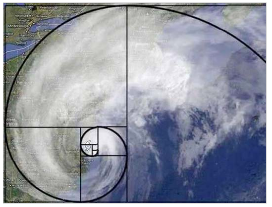
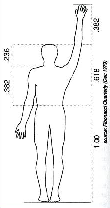 How do we use these numbers to our advantage? Well, we find them all around us everyday in nature. From the sizes of our arms relative to our torso, to the construction of Hurricanes, to Rams horns and even in our DNA. The more you dig into it, the more amazing this phenomenon becomes. But regardless of all that, the market cares. So we care. Go back to the market lows after the crash of 1987 and see where the 2009 bottom was after correcting from the 2007 top. Amazing stuff.
When markets are trending and a correction comes, and I mean any market: stocks, bonds, commodities and currencies, they tend to stop at certain levels before resuming the underlying trend. These levels are 38.2% and 61.8% of the previous move higher (or lower in a downtrend). We see this time and time again. But we’re not just buying because we’re at a Fibonacci level, it’s when these levels coincide with former support and resistance areas that it really becomes valuable. As I mentioned in paragraph 1, sentence 2 of this post, Fibonacci is just a supplement to price like everything else. If price says you have a good risk/reward AND you’re at a key Fibonacci level, I pay more attention, and will probably put on bigger size. Throw in a momentum divergence and maybe some sentiment extremes and you could have a home run trade.
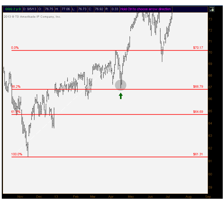
Here is a good example of the Nasdaq100 finding support in April near 38.2% of the rally that started in November, before resuming its uptrend:
Fibonacci also comes into play when we’re at levels never seen before by a market. We’ve had this dilemma throughout the year as S&Ps were breaking out to all-time highs and we’ve had nothing to refer to in the past because we had never been up there. What I like to do then is take the most recent correction in the market, and once we breakout to new highs, figure out what the 1.618% and 2.618% extensions of that prior move would be to come up with an area of potential supply. You can use that level to take profits or even put on a short, if that’s what you’re into.
Here’s a good example:
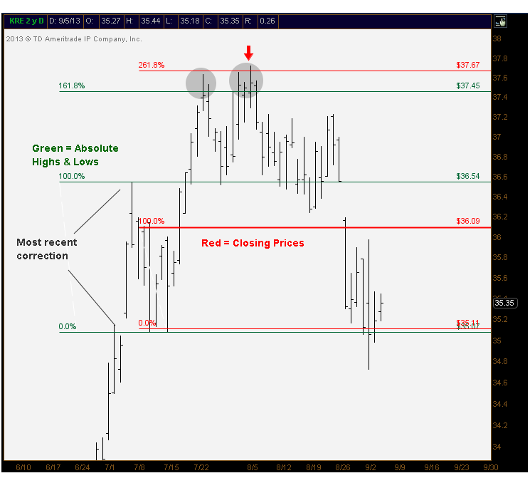
And these are the 2 biggest ways that I use Fibonacci. But that’s just me personally. I also get asked a lot whether I prefer to use absolute highs and lows or closing prices. The answer is I use both. You can see in the example above that Regional Banks ($KRE) could barely hang on to the 161.8% level and was barely able to exceed it to run into the 2.618% extension of closing prices. I thought that cluster of extensions was interesting.
Time is a big factor as well. I know some smart guys that use the Fibonacci sequence in their cycle work and has helped them spot key turning points in the market. Like anything else in life, I can’t use every tool and indicator that we have at our disposal. But feel free to dig deep and see how Fibonacci can help you. Everyone is different. But I thought I would share how it helps me.
Here’s to our boy Leo Fibonacci, one of the great mathematicians in history.
Sources:
Here is the video in full:
Source:
Business Day: Technical Tuesdays (BNN)
Tags: $CRB $DX_F $SPY $SPX $UUP $GC_F $GLD $TLT $TNX $ZB_F
The worst performing month of 2013 is now in the books. Funny enough, the S&P500 only lost 3%. But the internals and breadth in this market have been deteriorating for some time. We’ve pointed to several examples of this over the past 4-5 weeks, so today we reviewed some of that. Also bonds this week confirmed everything we discussed in last week’s video. They look great and everyone still hates them. And finally since it’s the end of the month, we took a look at the Dow Jones Industrial Average going back 20 years. And it looks like we’re up in the nosebleed section.
I hope you enjoy the video:
Tags: $DJI $DJIA $DIA $SPX $SPY $ES_F $TLT $TNX $ZB_F $CRB $DJP
Sometimes we allow our preconceived notions get in the way of objective analysis. I see this time and time again. A trader might be bearish on the stock market so that prevents him from buying a non-correlated stock in a beautiful uptrend. I’m guilty of this myself. We’re human right? Sometimes, when I rip through a series of charts, I don’t even look at the symbols. I just keep going until I find one that I love (or hate), and then see what it is. The best part about this process is when you like a particular chart, and look up at the symbol only to realize that you already own it. That’s when you smile, and move on.
So I’ve been posting charts on occasion without any labels or detailed time frames. Just a bar chart and our imagination. This week’s mystery chart sparked some nice conversations over the social interwebs. As usual, there were some great ideas and risk management procedures shared by readers and twitter followers.
The mysterious bar chart this week was Coffee Futures using 30-minute time frames. Here is the actual chart with dates and prices:
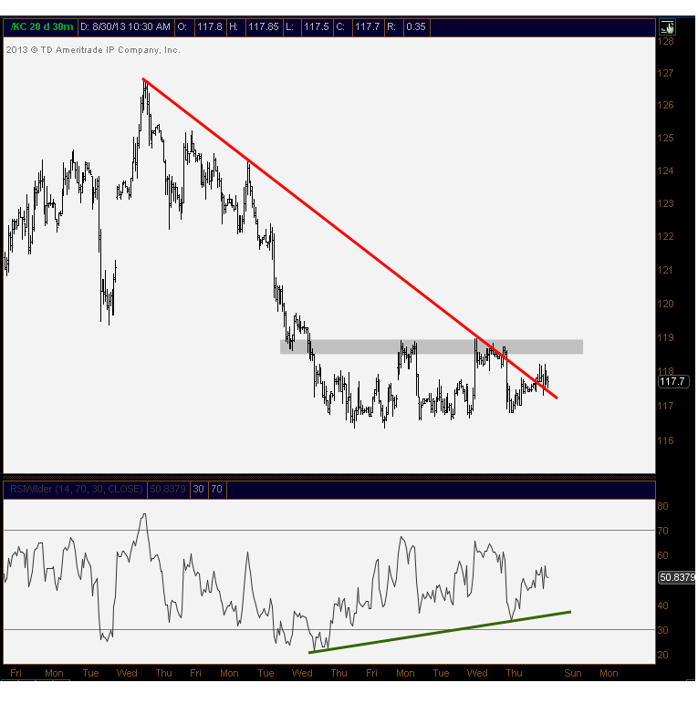
I agree with a lot of the feedback that this could be an excellent long above this overhead resistance. Momentum has turned up while prices have consolidated the last couple of weeks. With the downtrend line now broken, we’re just waiting for the overhead supply to dry up. And I have a feeling this should come soon. We’ll see….A breakdown below this consolidation could lead to another big leg lower. So we’re waiting for a breakout.
Click here to see the original post
Tags: $KC_F $JO
To quote the legendary Staten Island based philosophers, “Dolla Dolla Bill Y’all” indeed. This statement could not be more relevant than right now. Want to know where commodities are headed, and therefore emerging markets, and probably stocks as an asset class? Look no further than the US Dollar bill.
Here’s what I see. Commodities and US Dollars have some of the most consistent and reliable negative correlations in the intermarket world. The chart below shows how strong this trend has been for a while, during both bull and bear markets for stocks. The correlations between the US Dollar Index and CRB Index have been extremely negative, there’s no denying it:
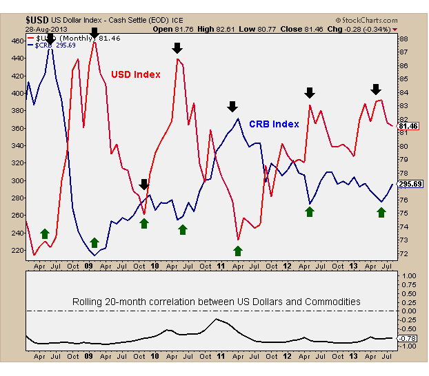
So where are commodities headed? Well if August marked the bottom for dollars, I would say commodities are heading much lower. And if that’s the case, I would imagine that Emerging markets follow. Go run the numbers and you’ll find very high positive correlations between both assets. And if EM continues to get crushed, will US stocks be able to ignore that? Doubt it.
I think Dollars are the key here guys. This is a weekly chart of the US Dollar Index going back a few years. We’re right back down to this key uptrend line. I would say that a break below that trendline support (80.60-ish) and all bets are off on this dollar. That change of events would be bullish for commodities and emerging markets. And I have to believe US Stocks would benefit from that.
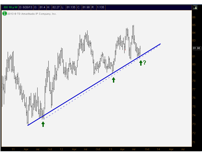
But the trend right now is pointing towards higher US Dollar prices. So that’s the direction in which we’re leaning.
Tags: $DX_F $UUP $USDX $CRB $DJP
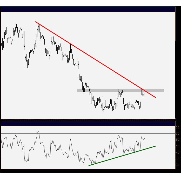
Alright guys. No labels, no time frames. Bars and Momentum via 14-period RSI
Talk to me….
Recent Mystery Charts:
Now that Syria is taking over the news, interest rates and bonds have taken a back seat in the financial media. But for us market participants, this is still front and center. If you watched this weekend’s market video that I did with Phil, or follow me on Stocktwits or Twitter, you know that I’ve been really vocal lately about the potential bottom in bond prices. But today I want to focus on rates.
This is a chart of the 10yr Treasury Note Yield Index. We’re looking at candlesticks that show yields are retesting what was formerly key resistance throughout the summer:
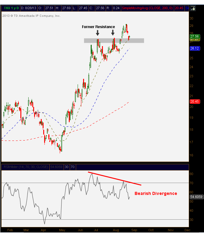
The problems I see are 1) the quick reversal lower after the new highs last week and 2) the momentum divergence that developed on those new highs. As yields took out resistance, the relative strength index made lower highs. That worries me.
In addition, we see crazy bearish sentiment in Treasury Bond prices. These are the kinds of numbers that we’ve seen consistently at peaks in yields; most recently in early 2011 and mid 2009.
For confirmation, we want to see a weekly close in 10yr yields below 2.7%. With rising 20, 50 & 200 day moving averages, there is no doubt that yields are and have been in a bull market. But so were stocks just a few weeks ago right?
Stay tuned…
Tags: $TNX $TLT $ZB_F $ZN_F $TBT