As you guys know very well, we have wanted to be short the majority of the U.S. Sectors and Sub-sectors coming into the new year. While we still have much lower downside targets from a structural perspective, tactically speaking, many of our targets were hit this week. This is where we wanted to be covering short positions and, for the most part, looking to reinitiate short positions if and when we get a corrective rally. I have just updated all of the U.S. Sectors and Sub-sectors and they can be seen in the ChartBook.
[Chart Of The Week] Consumer Discretionary vs Consumer Staples
Ratio analysis is one of the most valuable tools that we have as market participants. It’s important to recognize where money is flowing out of, and where it is going into. This is the case when it comes to stocks, bonds, commodities and currency markets. A lot of these ratios tell us what the institutional money is doing, which is what drives markets. Think about the long-only mutual fund managers as a giant cruise ship. It takes a long time for a cruise ship to turn completely around and go in a different direction. With the amount of money being controlled by mutual fund managers, it’s a similar situation. We can spot a cruise ship turning around very easily, because it takes so long. It’s not much different in the stock market.
Today we are looking at a ratio of the Consumer Discretionary Sector vs Consumer Staples. The reason this is important is because of the high correlation between [Read more…]
BNN Appearance: Agribusiness Stocks & US Dollars
Wednesday morning I was down at the Nasdaq chatting with Frances Horodelski from Business News Network. The mean reversion trade in Energy worked out nicely since last time I was on BNN in March. But at this point I think the easy money has been made there and money appears to be rotating into the Agribusiness sector. We discuss how to take advantage of this as well as the US Stock Market as a group and the weakening US Dollar.
Here is the full interview:
Click Here for more information on our Premium Technical Research Packages

Source:
Agribusiness Stocks Ready To Explode (BNN)
Tags: $SPY $MOO $TSN $AGU $6C_F $USDCAD $UUP $DX_F $XLK $XLP
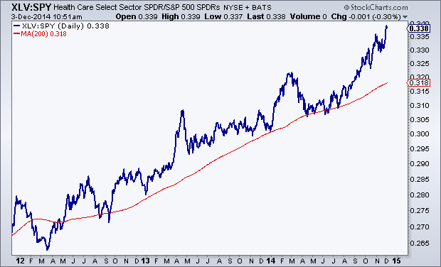
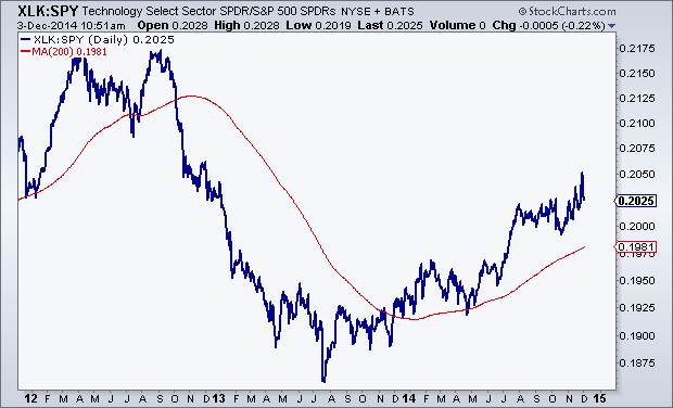
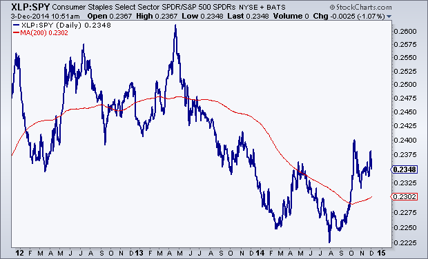
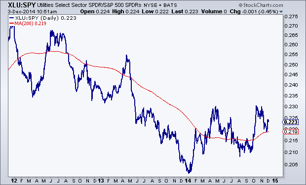
What Are The Best Sectors In America?
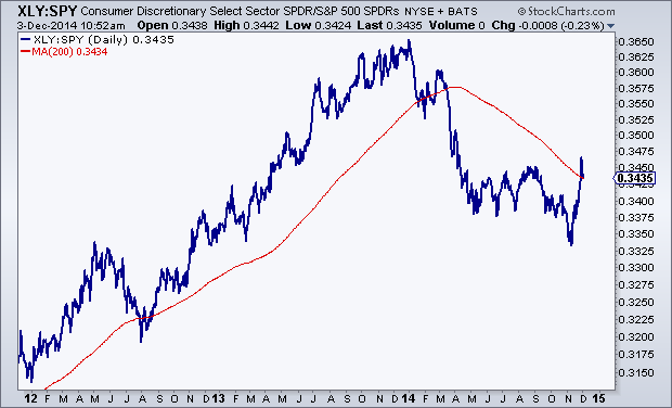
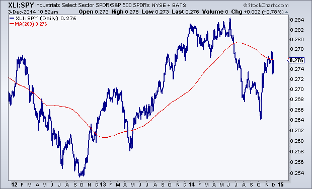
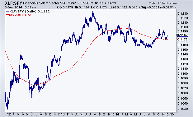
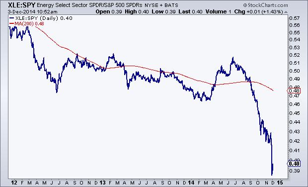
One of the exercises that I find really valuable is comparing the relative performance of each of the S&P sectors to each other. Today we are breaking down 3-year daily line charts of each sector vs the S&P500. I also include a 200-day simple moving average to not only help define the trend, but also to see where prices are compared to the long-term smoothing mechanism.
We’ll start with the best looking charts: Healthcare and Technology which have both been nicely above rising 200 day moving averages for some time now.
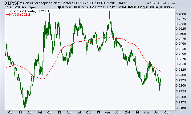
The next two: Staples and Utilities look like bearish to bullish reversals. These were previously in downtrends relative to the S&P500 but now appear to be turning up and trading above upward-sloping 200 days:
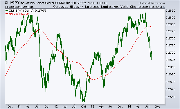
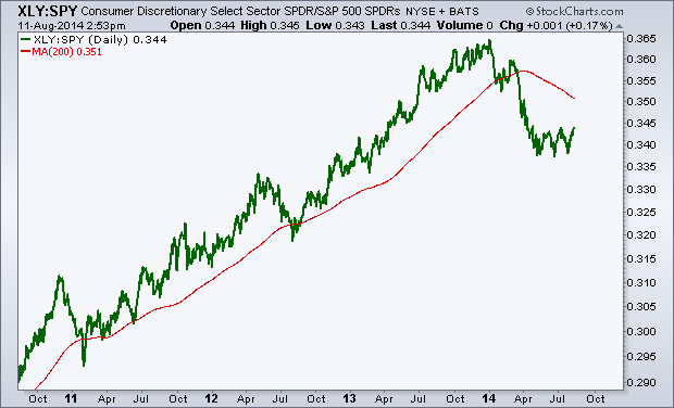
Consumer Discretionaries and Industrials have rallied back to their mean, but with a downward sloping 200 day, a neutral stance from a relative standpoint is likely best here:
Financials are just kind of there. The lack of trend tells us that they are trading with the market and are right near the mean. So not much to do here, although I would argue that they look better than the previous two above.
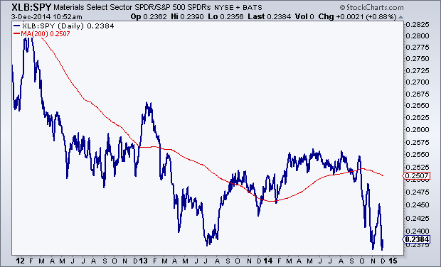
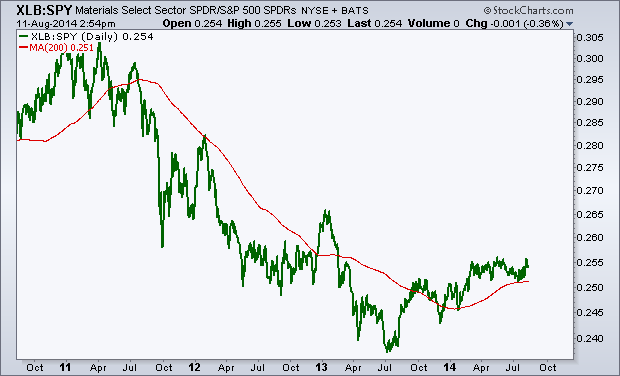
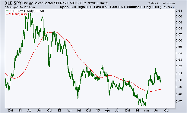
The last three are easily the worst of the bunch: Energy, Materials and Telecom. Each of them on a relative basis are well below downward sloping 200 day moving averages and other than perhaps a brief mean reversion, the trends here are still down. I would not trust these at this point to maintain a sustainable rally relative to the S&P500:

I like to do this periodically to get a good perspective on where money is flowing. I don’t really care what the sell side thinks in terms of over-weighting and under-weighting sectors. To me, price is what pays and the trends here (or lack there of) can be seen very clearly in the charts above. That’s enough as far as I’m concerned.
Members of Eagle Bay Solutions receive weekly updates on each of these charts along with the absolute price action itself. We have 5 different products from Commodities, to US Sectors, Dow Components, Global Equities and the Major US Averages. Click here to see which package is best for you.

Tags: $XLY $XLF $XLI $XLE $XLB $XLV $XLP $XLU $XLK $IYZ $SPY
Fox Business: US Stocks Are Heading Lower
On Wednesday I was over at the Fox Business studios chatting with David Asman and Liz Claman about the US Stock Market. As you guys know I’ve been pretty bearish since the summer. The brief new highs in the S&P500 and Dow Jones Industrial Average last month didn’t tell the whole story. Very few stocks made new highs and most of the averages had already been rolling over. In this segment we went over a few of the indicators that had made us bearish and what’s happened since then to make me think stocks are heading even lower.
Here’s the video in full:
Click here for more information on Managed Assets
Click here for more information on our Premium Technical Research Packages
Tags: $SPY $IWM $IWC $MDY $HYG $TLT $XLY $XLP
Discretionary vs Staples Ratio Breaks 2009 Uptrend Line
Of all of the bearish developments lately in the US Stock Market, there is one important ratio that seems to be getting ignored. The spread between Consumer Discretionary stocks and Consumer Staples tells us a lot about how money managers view the market from a risk-appetite perspective. Today we are going to look at the recent breakdown in the XLY vs XLP ratio.
Members of Eagle Bay Solutions receive weekly updates on both of these sectors looking at them on multiple timeframes, with momentum analysis, relative strength, support/resistance, pattern recognition and risk management procedures. Click Here to register.
***
If you’re a long only money manager, which many large managers are, they can’t go to cash and they can’t get short. Their only goal is to outperform the S&P500, because that’s their job, whether it makes sense to us or not. If the S&P500 goes down 50% and they only lose you 40%, they get a raise. Crazy I know, but that’s the way it works. Fortunately we can be short and go to cash whenever we want. But I digress. My point is that if managers are bullish and want to outperform, they are going to allocate assets towards the Discretionary names (retail, housing, auto, etc) at a faster rate than they would towards Staples (soda, cigarettes, toothpaste, etc). If managers are fearful, the opposite would be the case.
Here is a weekly line chart of the Consumer Discretionary ETF $XLY vs the Consumer Staples ETF $XLP. There are two things that bother me here. The first is the failed breakout above the previous highs 10 years ago. Look how scary that looks. From failed moves come really fast ones in the opposite direction. And I think we’re currently seeing that decline:
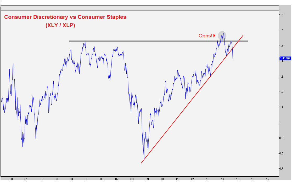
The second thing that bothers me is that we are now breaking the uptrend line from the late 2008 lows. This is a big break because this particular ratio led the market at the top in 2007 as well as the bottom in 2009. Notice how this ratio was already crashing in the summer of 2007, well before the S&P500 peaked in October of that year. Also, this ratio bottomed out in November of 2008, several months before the S&P bottomed in March of the following year.
This is one of the most important ratios that we look at and it’s telling us to be careful. We want to see this ratio making new highs along with the market, not making new 52-week lows like it’s currently doing. I think this is one that not many are talking about but should be.
***
Click here for more information on Managed Assets
Click here for more information on our Premium Technical Research Packages
Tags: $XLY $XLP $SPY
Which is the Best S&P Sector to be Overweight?
With the S&P500 stuck right in the middle between important support and resistance levels, I think right now is probably best to remain neutral towards US equities from a tactical perspective. One of the ways we take advantage of what I think is going to be a lack of trend over the next 6-8 weeks is to put on pair trades that can add to the bottom line while maintaining a neutral stance in the asset class.
I figured now would be as good of a time as any to go over the relative strength for each of the S&P sectors. Here are the SPDR ETFs using 4-year line charts and a 200 day moving average to help define the trends. I kept them very clean and simple so we can really focus on just price and trends.
The first three charts: Materials, Energy and Technology appear to be going through bearish to bullish reversals. Materials look to be just breaking out while Tech is already more mature in this reversing process. Energy is somewhere in the middle. But on a relative basis, these 3 looks great. Materials are my favorite.
Materials vs S&P500:
Energy vs S&P500
Technology vs S&P500:
Financials have been underperforming the S&P500 consistently for over a year. This isn’t a good thing for the overall stock market as Financials are one of the more important sectors where we look for leadership. The fact that they’ve been lagging is, in my opinion, an unsustainable divergence. Something’s gotta give, either S&Ps come down and correct, or financials pick up the pace. Unfortunately there is zero evidence of financials starting to outperform, at least not yet.
Financials vs S&P500:
Consumer Staples are another problem child of this market as they have also been underperforming for over a year. This isn’t somewhere we want to be overweight. I would wait for a bottoming process (maybe similar to materials) before getting more optimistic about this space.
Staples vs S&P500:
The next two are former leadership groups that have gotten hit hard on a relative basis. Both Industrials and Consumer Discretionaries were darlings of the 2013 rally. But recently they’ve struggled; breaking trends and now allowing their 200 day moving averages to roll over. Structurally we prefer to stay more neutral in both of these areas, at least for now. I’m not sure they will keep declining, but I find it hard to believe they will emerge as new leaders any time soon.
Industrials vs S&P500:
Discretionaries vs S&P500:
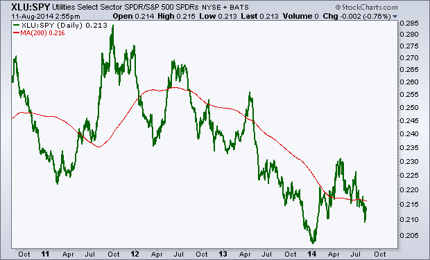
Utilities are still a disaster relative to the S&P500 and I think more time is necessary if this is part of a bottoming process. I’m going to need to see more out of these guys before getting aggressively overweight this space. I’d stay away and just wait.
Utilities vs S&P500:
And finally healthcare. This one is still in a strong uptrend and there is little evidence that the bull run has ended. I would look for a break in this uptrend line and/or break of the 200 day moving average as warning signals for this group. But so far we haven’t seen that.
Healthcare vs S&P500:
I try to review each sector on a consistent basis looking at both the price charts and the relative strength. This helps us, not only keep a neutral positiion towards stocks, but also helps with idea generation and what stocks and sectors to focus my attention on. Right now, it’s the materials that stand out to me the most.
***
REGISTER HERE for more information on how to access these relative sector charts with commentary and annotations on a weekly basis
Tags: $SPY $XLF $XLY $XLK $XLE $XLB $XLI $XLP $XLU $XLV
BNN Appearance: US Dollar Rally and Sector Rotation
I was down at the Nasdaq this week chatting with Frances Horodelski on Canada’s Business News Network. We touched on the recent strength out of the US Dollar, the bearish sector rotation in US Stocks and the ongoing breakout in Canadian Equities.
Here is the interview in full:
Source:
Technical Tuesdays: What Tale Are The Charts Telling (BNN)
Tags: $SPY $DJIA $IWM $QQQ $XLE $XLU $XLP $XLY $XLF $DX_F $UUP $USDX $TLT $TYX $TNX $EWC $USDCAD
- « Previous Page
- 1
- 2
- 3
- 4
- …
- 10
- Next Page »