This is the video recording of the June 9th Weekly Town Hall w/ Willie Delwiche.
06/09/22 2:00 PM ET [Read more…]
Expert technical analysis of financial markets by JC Parets
This is the video recording of the June 9th Weekly Town Hall w/ Willie Delwiche.
06/09/22 2:00 PM ET [Read more…]
From the desk of Willie Delwiche.
In Milwaukee, early June days when the temperature struggles to even get into the 60’s happen almost every year.
I’ve lived here long enough at this point (more than half my life) that it’s not really a surprise anymore. For the first few years I lived here, I believed friends and family when they reassured me that it was “unseasonably cold.” But I caught on soon enough.
In fact, it was 55 degrees and overcast here just yesterday. It had been raining off and on all day.
I have no problem with any of those conditions – I’m not writing this note to complain about the weather. While I don’t think of it as Summer and it’s not what I was looking forward to, I can adjust.
From the desk of Steve Strazza @Sstrazza
Welcome to the 2 to 100 Club.
As many of you know, something we’ve been working on internally is using various bottom-up tools and scans to complement our top-down approach. It’s really been working for us!
One way we’re doing this is by identifying the strongest growth stocks as they climb the market-cap ladder from small- to mid- to large- and, ultimately, to mega-cap status (over $200B).
Once they graduate from small-cap to mid-cap status (over $2B), they come on our radar. Likewise, when they surpass the roughly $30B mark, they roll off our list.
But the scan doesn’t just end there.
We only want to look at the strongest growth industries in the market, as that is typically where these potential 50-baggers come from.
Some of the best performers in recent decades – stocks like Priceline, Amazon, Netflix, Salesforce, and myriad others – would have been on this list at some point during their journey to becoming the market behemoths they are today.
When you look at the stocks in our table, you’ll notice we’re only focused on Technology and Growth industry groups such as Software, Semiconductors, Online Retail, Solar, etc.
Then, like any good technician, we filter the list down to those closest to new highs.
This allows the cream of these strong groups to rise to the top and helps streamline our mission to identify technical breakouts in the top-performing stocks.
From the desk of Willie Delwiche.
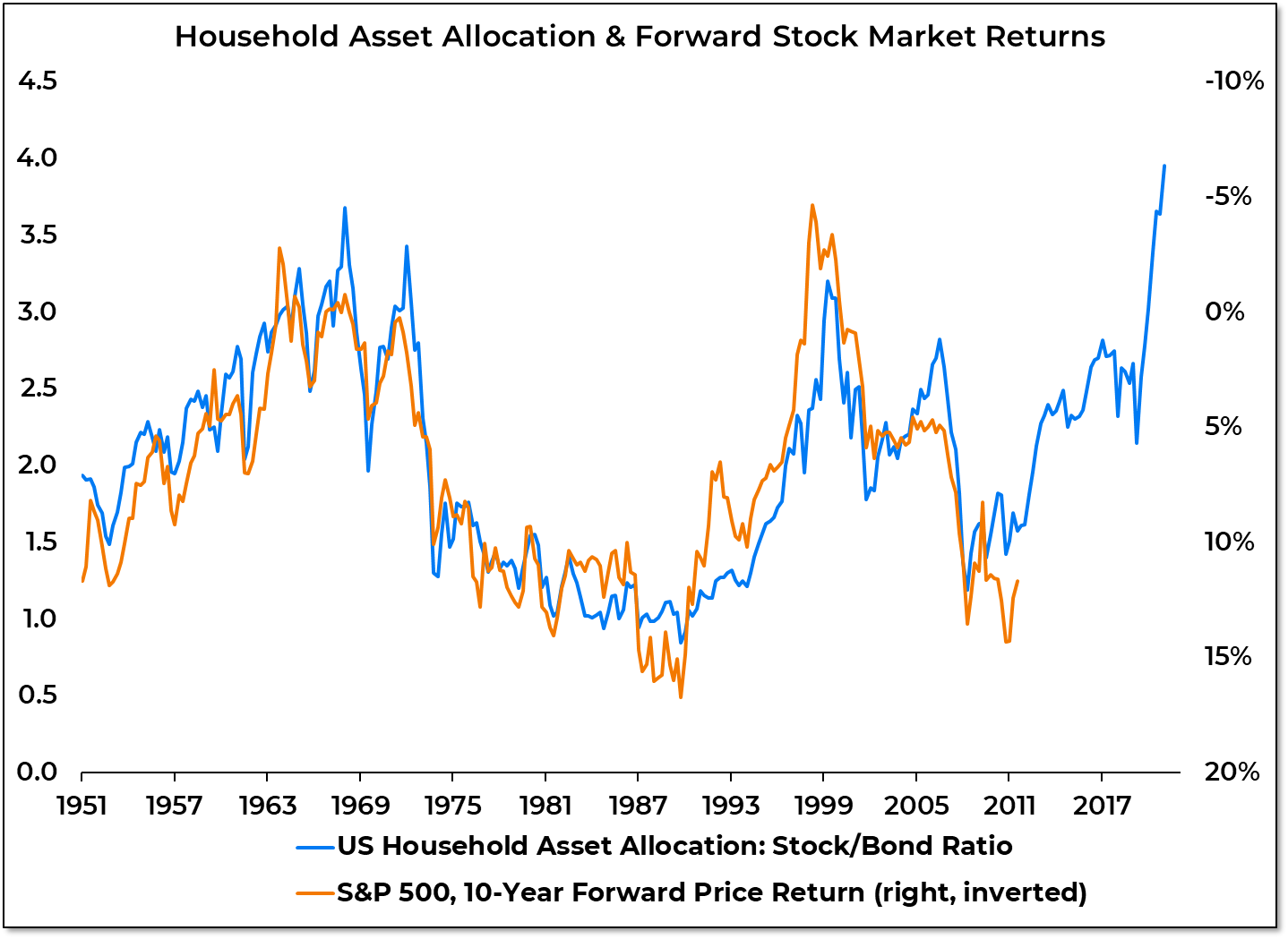
Key Takeaway: There is plenty of talk about investors turning fearful. This is reflected in more bears than bulls on the various sentiment surveys and high demand for puts relative to calls (though this is being distorted by the collapse in call option activity). But from a longer-term perspective, risks to the equity market remain elevated. Stocks are still historically expensive and overowned. Updated data from the Fed this week will clarify how (if at all) the household asset allocation mix shifted in Q1 after finishing 2021 with the highest exposure to stocks versus bonds in history. While the cyclical rise in pessimism may provide enough fuel for bounce attempts and counter-trend rallies, it will be difficult to suggest that a major reset has occurred until stocks are inexpensive and underowned in addition to being unloved.
Sentiment Report Chart of the Week: Equity Exposure Charts A Challenging Path
The Federal Reserve report from which we get the data behind US household asset allocation comes out quarterly, and with a lag. We will finally get Q1 2022 data this week. While quarter-to-quarter shifts are interesting, this data is more about identifying the longer-term environment for equities than anything else. The data shows that historically there has been a strong inverse correlation between exposure to stocks (relative to bonds) and forward returns for the S&P 500. In the past, when households have had heavy exposure to stocks (like they did in 1968 and 2000), the following decade has produced little by way of returns. Periods of relatively light exposure to stocks (like 1991 and 2009) were followed by some of the best 10-year returns in the stock market’s history. When we look back 10 years ago from today, the stock/bond ratio was still low in Q1 2012 (48% stocks, 28% bonds) but beginning to rise. It reached its highest level ever in Q4 of last year (62% stocks, 16% bonds). If the historical pattern holds, S&P 500 returns over the coming decade could fall quite a bit short of what has been experienced over the past decade.
It’s been a minute since we’ve put some delta-neutral credit spreads on. And while VIX is off its highest levels of the year, there is still plenty of elevated premium in pockets.
The team here at All Star Charts has been monitoring the elevated options premiums in the Consumer Discretionary space. The $XLY ETF has been persistently hanging around the top of our implied volatility lists for the last couple of months. We talked about it yesterday during the @allstarcharts live twitter spaces chat.
And I like having a few delta-neutral trades on to provide some portfolio balance against my bullish and bearish directional bets in individual stock names. So $XLY is providing us a good opportunity to collect some income.
[Read more…]
From the desk of Steven Strazza @Sstrazza and Ian Culley @IanCulley
The Japanese yen continues to slide.
In early April, we highlighted the multi-year base in the USD/JPY cross. We were anticipating a significant breakout based on the broad weakness in the yen.
Even gold, one of the worst performing assets, looked strong denominated in yen.
We went so far as to title the post Anything in Yen.
Funny or not, it was true.
Not long after the post, we got the breakout we expected. And, two months later, the USD/JPY is kicking off its next leg higher, printing fresh 20-year highs.
Let’s take it a step further and outline some trade setups in other currencies denominated in yen.
Remember, everything and anything seems to work priced in yen these days.