Last week I shared a chart with you guys where I purposely left out the ticker symbol and y axis. The reason I post these mystery charts every now and then is to eliminate any biases that we all have in these markets. This allows us to approach a market and focus only on the supply and demand dynamics in order to forget everything else.
The most recent Mystery Chart was the U.S. 10-year Note Yield upside down. Here is the actual chart where you can see yields approaching the apex of these two converging trendlines:
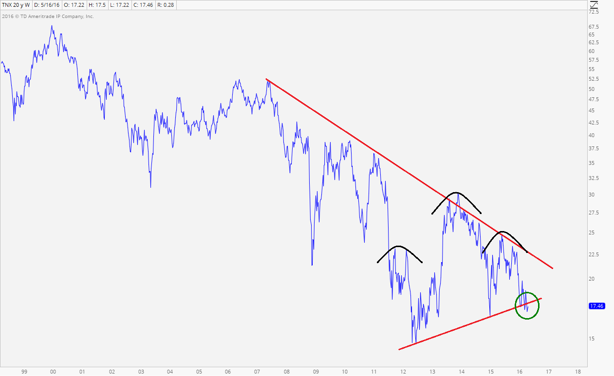
If yields are below the uptrend line from the 2012 lows, it’s hard to be bearish towards U.S. Treasury Bonds. Remember, they move inversely.
This is a chart that I think we all need to be watching. If the stock market is going higher, I think we need to see yields at least hanging in there, if not rising. So far this appears to be a break of key support.
If you’re a stock market bull, you do not want to see yields breaking to new lows. That’s how I see it.
Would you like regular updates to this chart? Click Here to become a Member of Allstarcharts today! You will also receive regular updates on when and how to short the U.S. Stock Market Indexes, Sectors and individual stocks.
Start Your 30-Day Risk-Free Trial Today!
Tags: $TNX $SPY $TLT